

WHO CREATE WHEN THE
Coffee is the medium. The real product is momentum. 1 AM transforms an everyday beverage into a badge of ambition for people whose most productive hours begin when the rest of the world switches off.
Coffee is the medium. The real product is momentum. 1 AM transforms an everyday beverage into a badge of ambition for people whose most productive hours begin when the rest of the world switches off.

The Making of
A Cold Coffee
Brand 1 AM.
Turning an Hour Into a Brand.
The night looks different when you're building something.
1 AM speaks to a generation that works late, thinks differently, and turns quiet hours into productive ones. We brought that attitude to life through a complete brand identity, creating the logo, visual language, can design, and website as one cohesive experience.
The goal was simple: make the brand as memorable as its audience.
FUEL YOUR
1AM SELF


1AM stands for momentum, not moderation


1AM keeps its coffee fam coming back every day.

The Thought Behind
Everything We Built.
The Idea. The Insight.
The Audience. Before the Brand Came Alive.
1 AM isn't a time on the clock. It's a state of mind.
While other cold coffee brands leaned into familiar, functional territory, we looked at the people drinking it. The creators, founders, gamers, coders, and dreamers who don't wait for inspiration, they chase it. 1 AM is their moment: when ideas become startups, side hustles become businesses, and tomorrow becomes right now.
1 AM was never about staying awake. It was about choosing to keep going.

The 1AM mark had to read like a timestamp and a statement. Built around a clock-cue wordmark, a colour system loud enough to stop a scroll — then stripped to nothing but essentials.
The 1AM mark had to read like a timestamp and a statement. Built around a clock-cue wordmark, a colour system loud enough to stop a scroll — then stripped to nothing but essentials.
The Identity Design
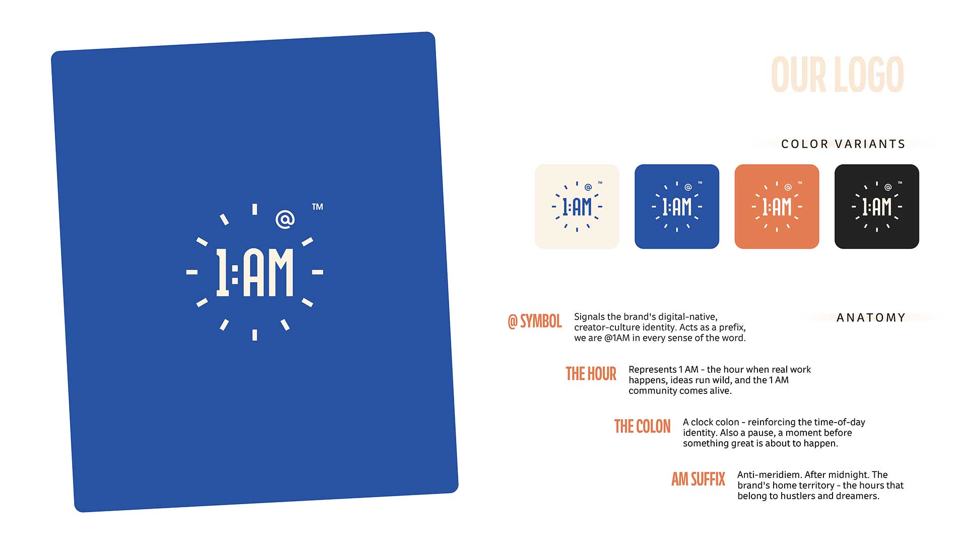
A Logo With Many Layers.
One Mark. Multiple
Meanings.
The challenge was turning an hour into an identity.
So we let the name lead. 1 AM became a timestamp: bold, minimal, and instantly recognisable. The monochrome palette kept it clean and timeless, while the radiating strokes added energy and movement. A ticking clock, a spark of inspiration, a mind switched on. The beauty was in not choosing just one.
Because 1 AM means all of it.
LOUD NOT MESSY
BUILT FOR THE GRIND

1 AM isn't a time on the clock. It's a state of mind.

A Brand Identity That Owns the Shelf.
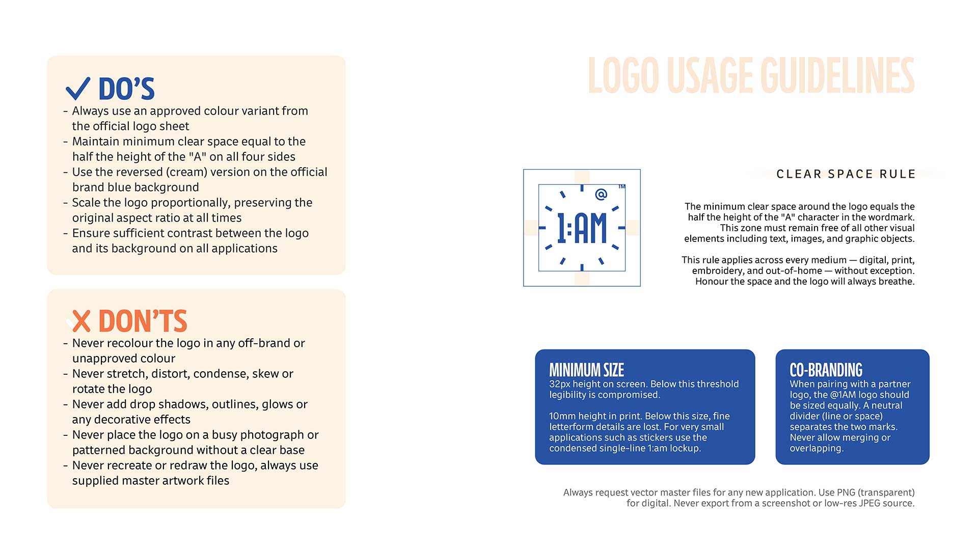

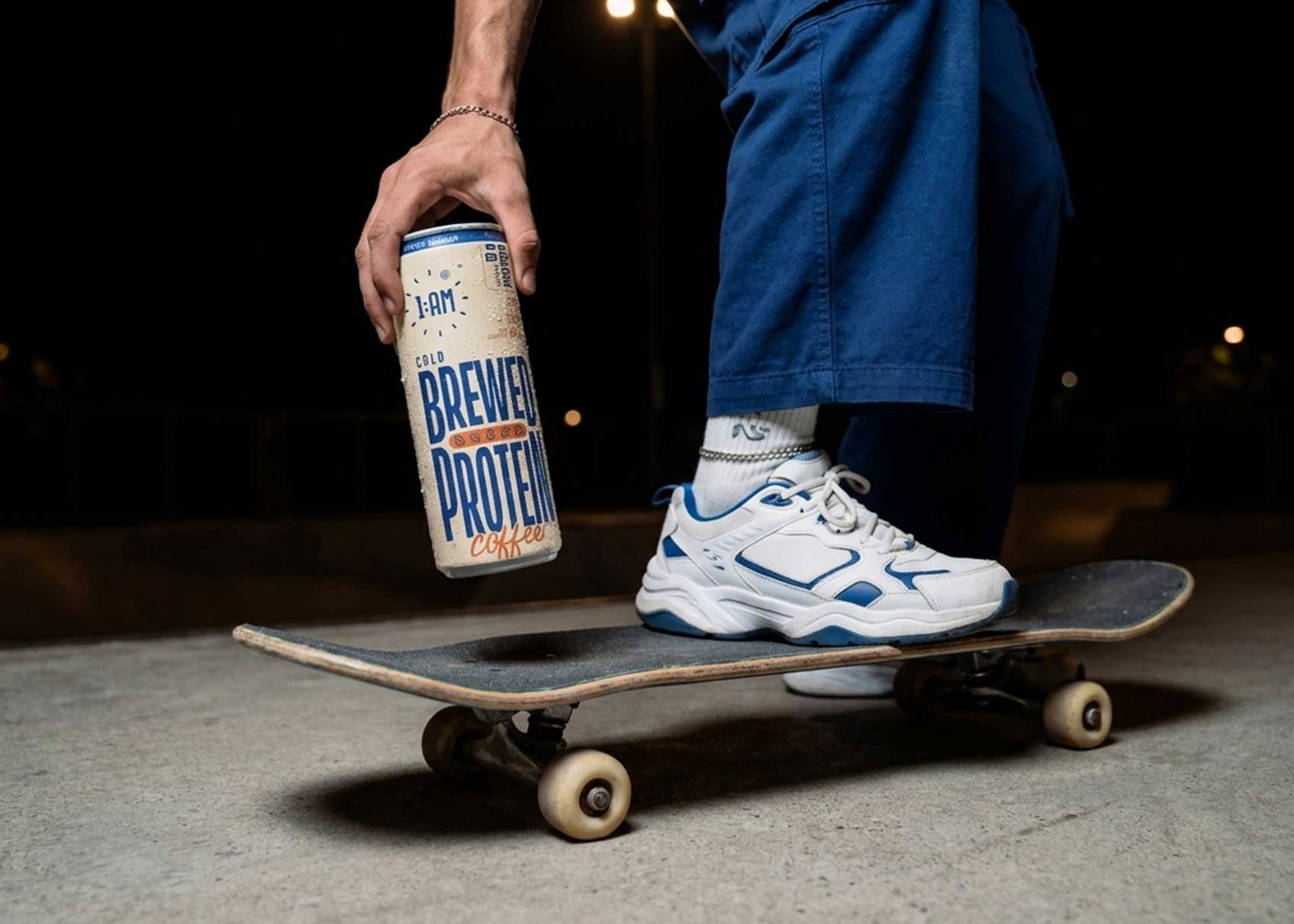
Every visual choice screams main character energy, period.

Can Design
Built to Command
Attention. Shelf Impact
Bold. Unmissable.
We didn't design a can. We designed a mini billboard.
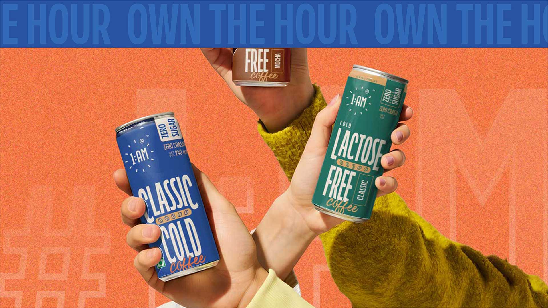
The idea wasn't to make 1 AM different. It was to make it impossible to miss. We kept the cans deliberately minimal, letting bold typography and vibrant colour create the impact. The product name takes centre stage, while each flavour gets a distinct colour personality. A consistent design system ties everything together, making every can instantly recognisable as part of 1 AM.
Minimal design. Maximum shelf presence.

Five SKUs. Zero identity compromise. A strict visual hierarchy — flavour name dominant, format and claims beneath, one colour per variant. Bold enough to own a shelf. Flexible enough to tell a story.
Five SKUs. Zero identity compromise. A strict visual hierarchy — flavour name dominant, format and claims beneath, one colour per variant. Bold enough to own a shelf. Flexible enough to tell a story.
DESIGNED
FOR THE DROP


DESIGNED
FOR THE DROP
BREWED PROTEIN
CLASSIC COLD
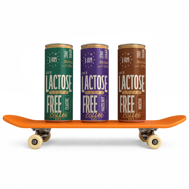
Lactose-Free Classic
Lactose-Free Hazelnut
Lactose-Free Mocha
Branding With More Kick
The oversized “BREWED PROTEIN” typography turns the functional proposition into the visual hero, with 18g protein reinforcing the product’s performance-led positioning. The cream-and-blue palette adds distinction, while handwritten “Coffee” brings back the playful 1:AM character.
Vibrant Coffee Branding
The blue-and-orange palette lends a bright, energetic presence, while the oversized “CLASSIC COLD” makes the core product instantly recognisable. The handwritten “Coffee” feels playful and human, while the orange coffee-bean graphic introduces a subtle category cue.
Distinct Yet Familiar
The teal-and-cream palette gives the variant a distinct visual identity. More importantly, the oversized “LACTOSE FREE” puts the key product benefit front and centre, while the vertical “CLASSIC” badge keeps the flavour immediately identifiable.
Premium, With Personality
The deep purple palette gives Hazelnut the most distinctive colour territory in the range, creating a richer, more premium feel. The vertical “HAZELNUT” badge makes the flavour easy to spot, while the warm accents add a subtle sense of indulgence.
A Richer Identity
The warm mocha-brown palette visually cues the richer flavour profile, giving it a more indulgent personality. The vertical “MOCHA” badge clearly indicates the flavour, while the dominant Lactose-Free messaging keeps the product’s key distinction impossible to miss.
.jpeg&w=3840&q=75)

the colour theory
COLOUR WASN'T DECORATION.
IT WAS THE ALARM.
We didn't pick colours that looked good.
We picked colours that couldn't be ignored.
Most brands chose colours. We chose weapons.
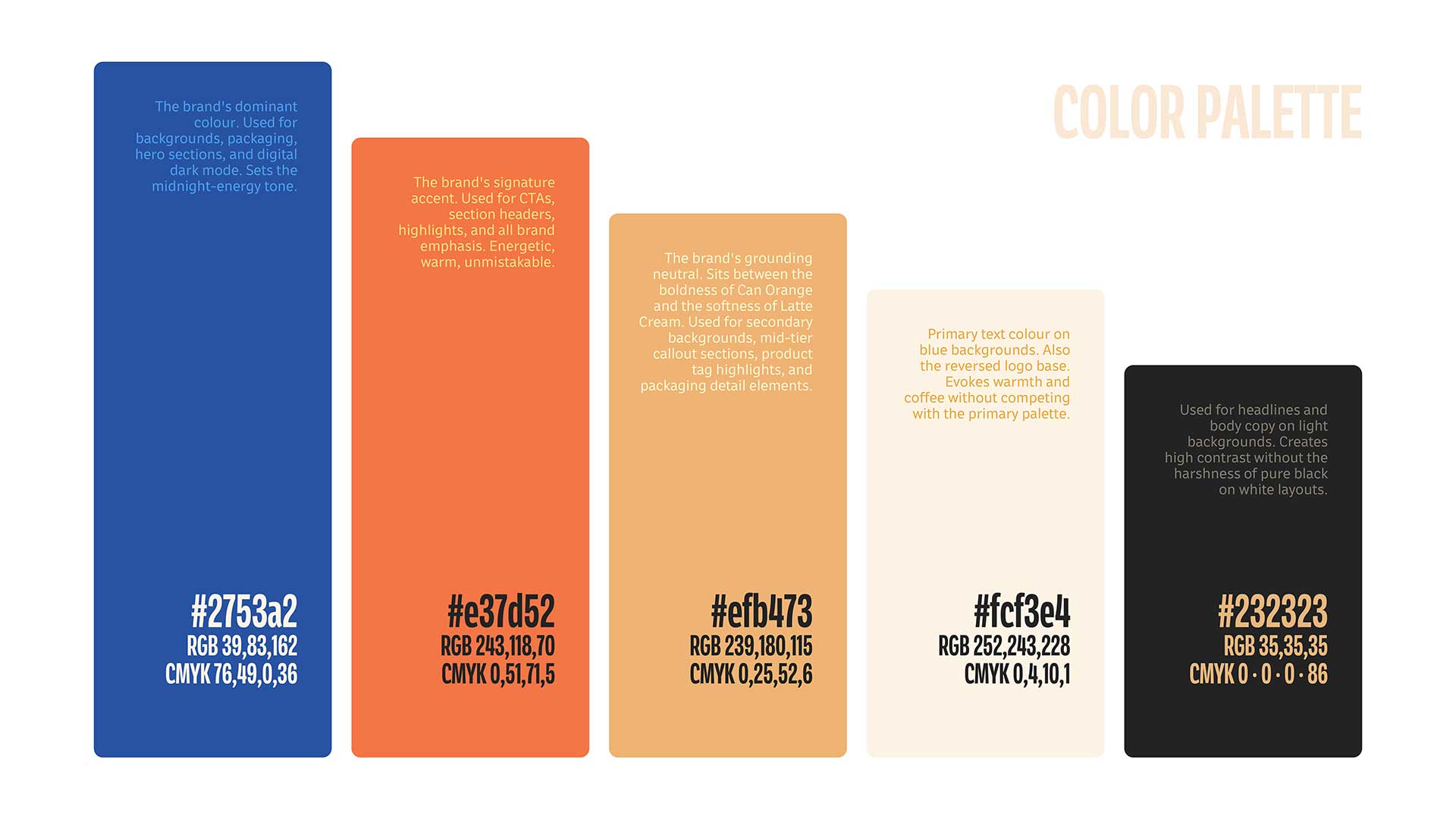
The brief was simple: win the first glance. On a crowded refrigerator shelf, looking good isn’t enough. 1 AM needed to cut through the noise, command attention, and create instant recognition. So we built a bold, high-impact colour palette designed to make the brand impossible to overlook. Each colour was chosen to create contrast, strengthen shelf presence, and give 1 AM a recognisable visual signature.
We didn’t just choose colours. We built a visual shortcut to the brand.
HOME OF THE
CLUB

This feed was built for the ones who never log off.

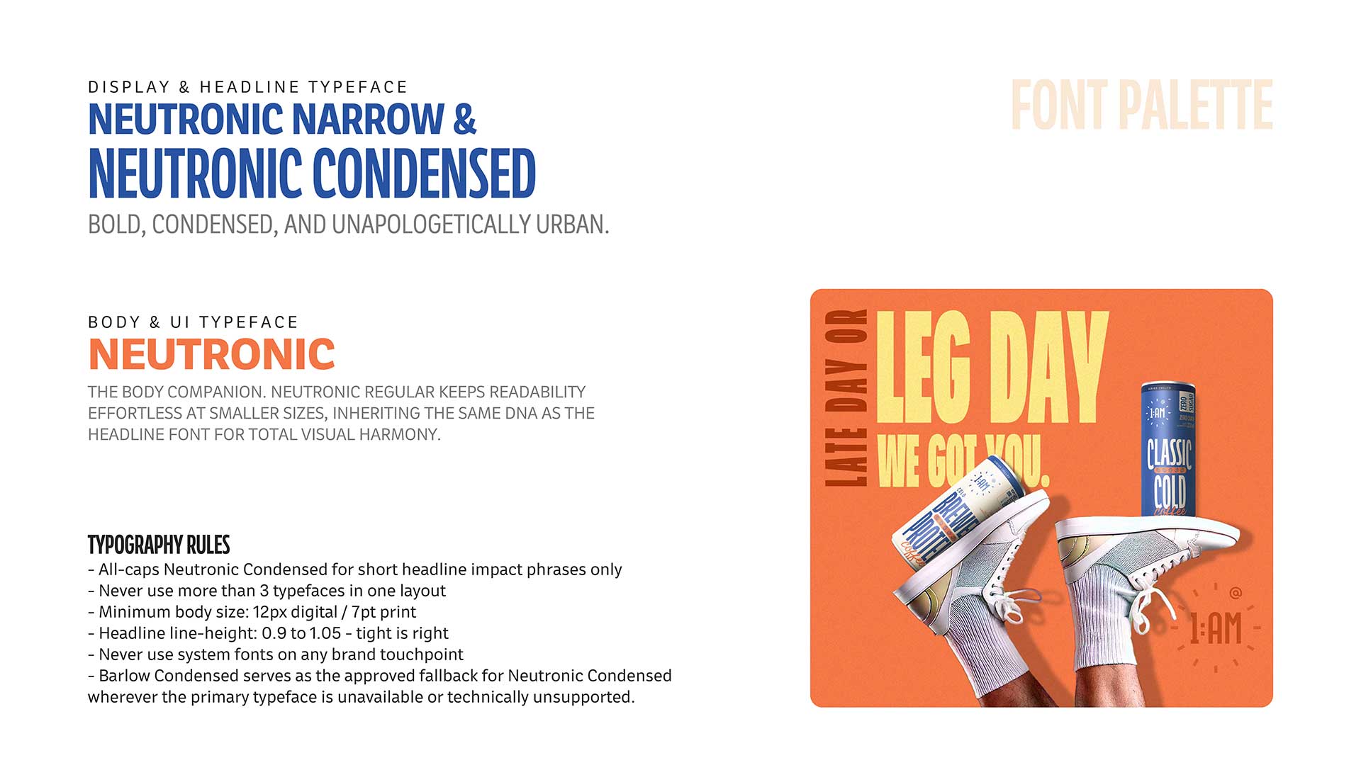
FONT palette
DISPLAY & HEADLINE TYPEFACE
neutronic narrow &
neutronic condensed
BOLD, CONDENSED AND Unapologetically URBAN
BODY & UI TYPEFACE
NEUTRONIC
THE BODY COMPANION. NEUTRONIC REGULAR KEEPS READABILITY EFFORTLESS AT SMALLER SIZES, INHERITING THE SAME DNA AS THE HEADLINE FONT FOR TOTAL VISUAL HARMONY.
abcdefghijklmnopqrstuvwxyz
abcdefghijklmnopqrstuvwxyz
aM
neutronic narrow
aM
neutronic condensed


brewing dreams one can at a time.

website design
Built to Keep the Energy Alive.
Digital Presence
Bold. Playful. Full of Energy.
The website couldn't be an afterthought to the can.
We translated the visual language into a bold digital experience, pairing oversized headers with dark, moody backdrops and expressive product moments. Rather than presenting every flavour the same way, we gave each one a distinct character and narrative creating a digital shelf that feels varied yet connected through one unmistakable 1 AM design system. Motion, colour, and copy work together so it feels just as alive, loud, and unmissable as the physical one.
The digital shelf matches the brand’s attitude.
BREWED FOR
THE HUSTLER


Built to Keep the Energy Alive

The digital shelf matches the brand’s attitude.


Turning an Hour Into a Brand

The night looks different when you're building something.