From Boring to Bold: Crafting a Fun Snacking Identity
Food
Makhana Brand
2025
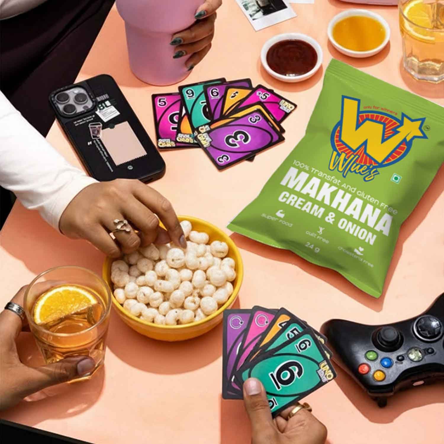
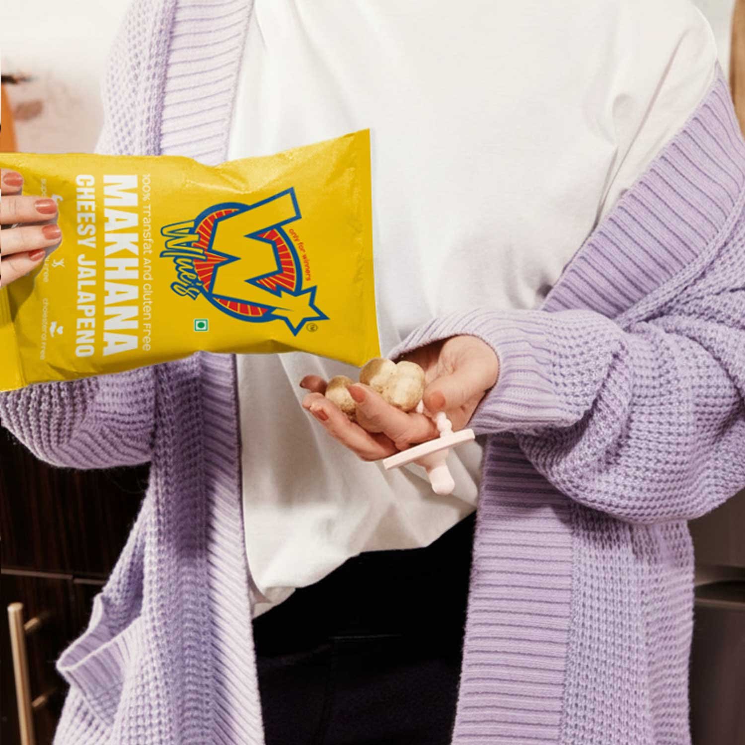
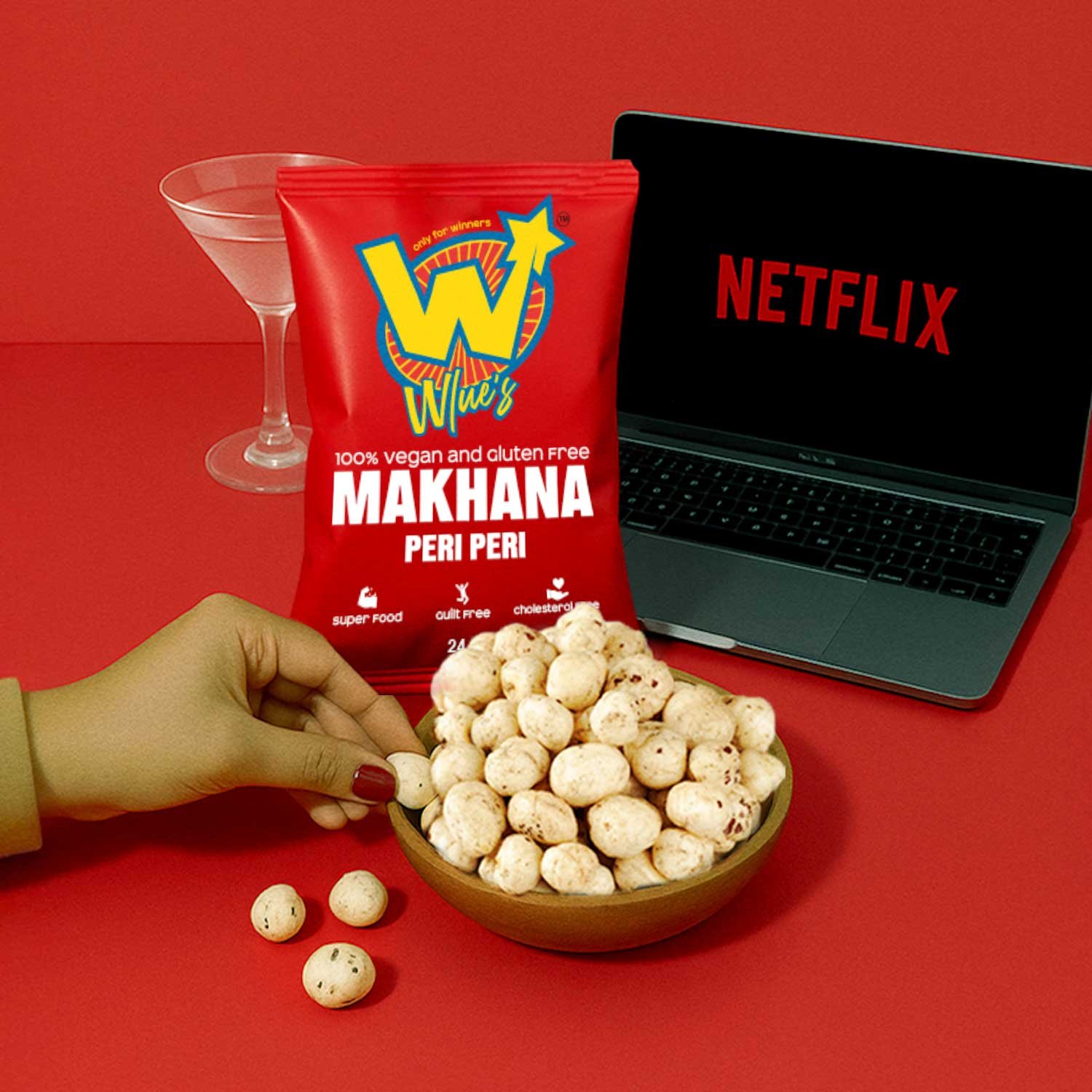
Wlue’s is new-age snack brand offering Makhana for the Gen Z consumers. It offers 3 flavours - Cheesy Jalapeno, Cream and Onion and Peri Peri Makhana.
Problem Statement
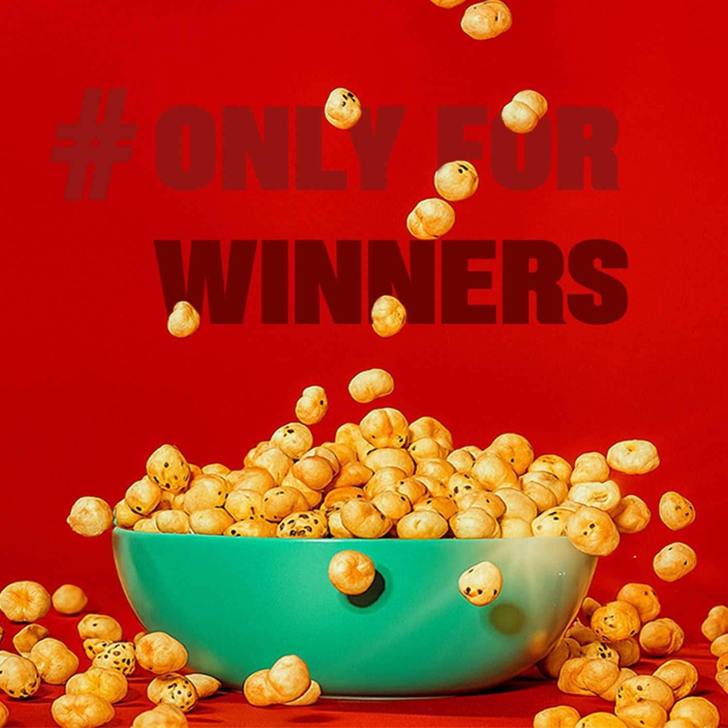
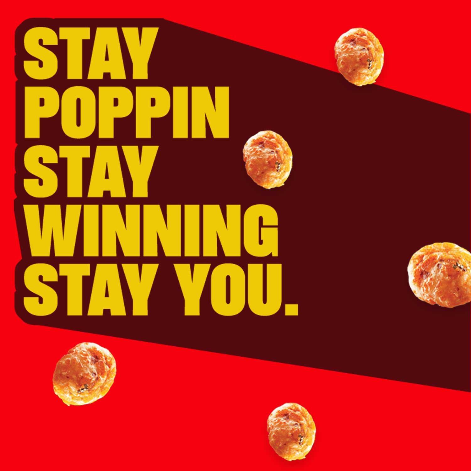
Unlike traditional Makhana brands that leaned into heritage and Ayurveda, Wlue’s wanted to position Makhana as a fun, modern snack for Gen Z. They had to break stereotypes, educate a new audience, and stand out in a crowded snacking market — all while balancing clean ingredients with bold, playful branding. The core challenge: making an ancient snack feel relevant, exciting, and snackable in today’s digital-first world.
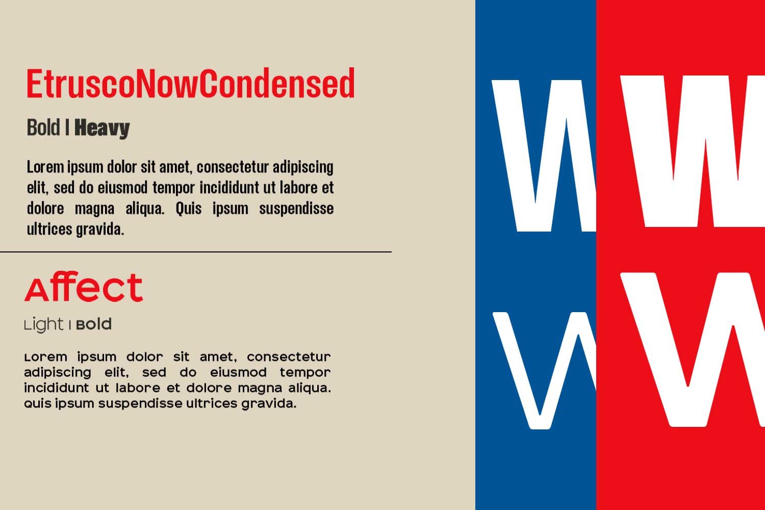
Our Approach
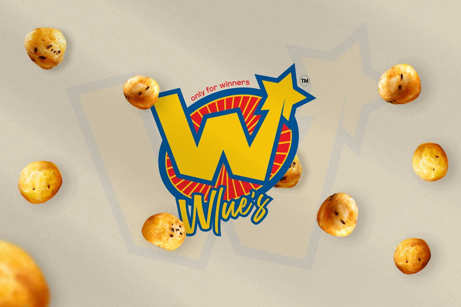
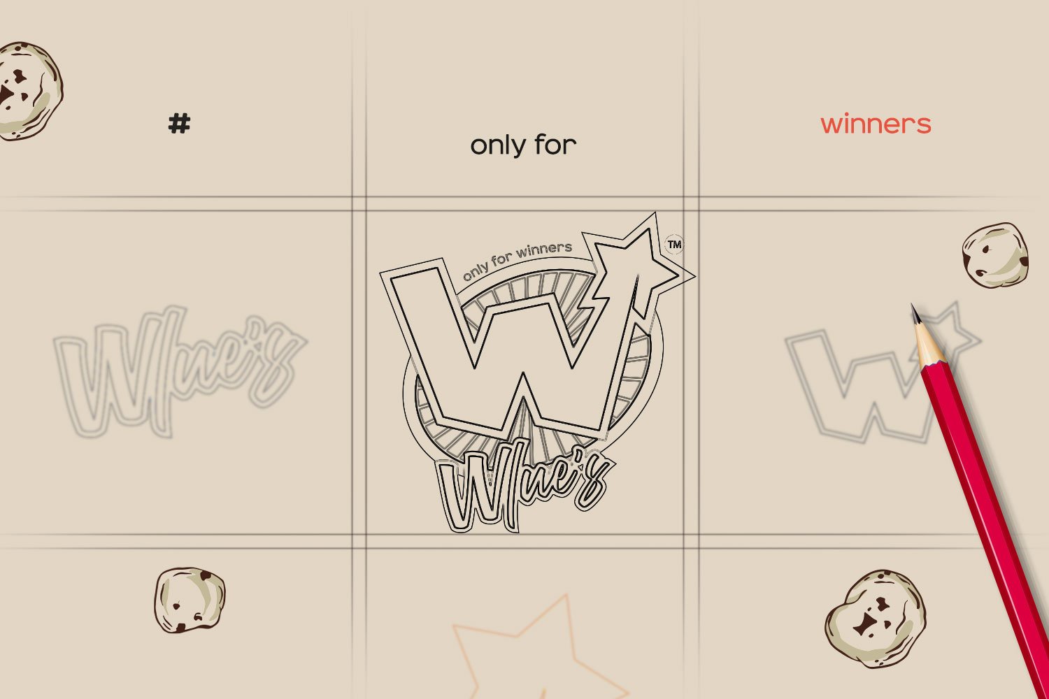
Logo Design
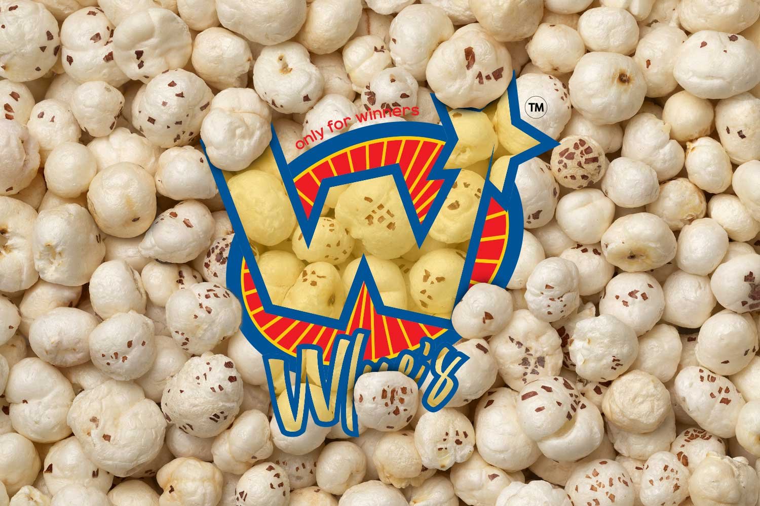
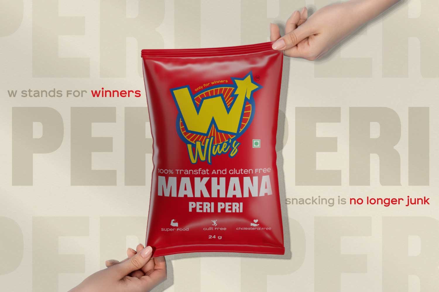
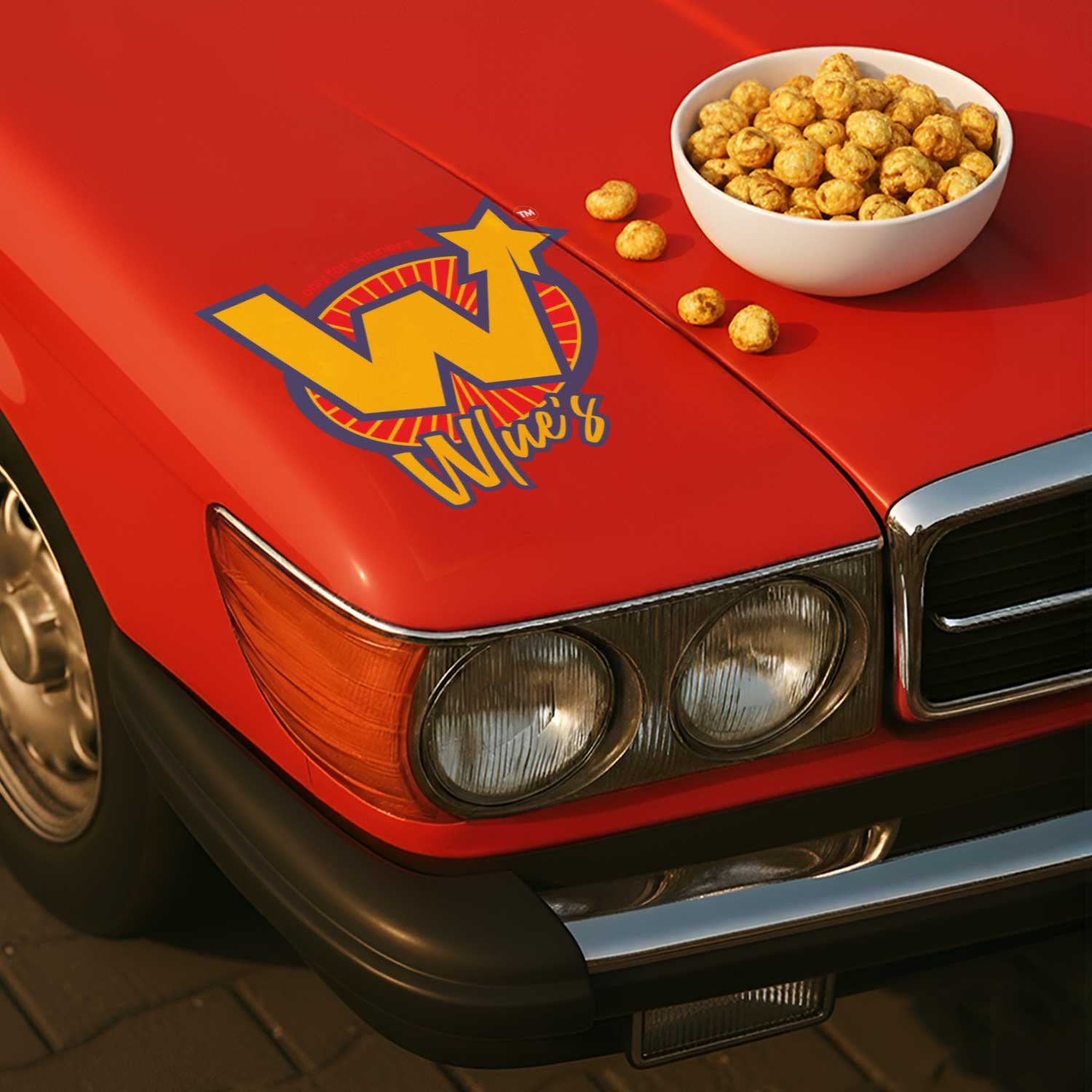
We designed a retro-inspired superhero logo featuring a bold star, symbolising victory and confidence. The design reflects Wlue’s bold, playful identity and positions the brand as a snack made for winners with standout energy.
Together, the packaging and the logo created a fun, energetic identity that made healthy snacking feel cool, not conventional.
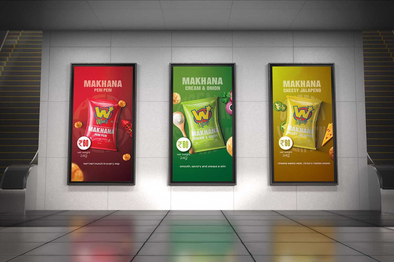
Our Approach
Packaging Design
To appeal to Gen Z, we created a playful and colourful packaging that brings Wlue’s bold personality to life across its three fun variants. Each design was built to grab attention on shelves, spark curiosity, and turn a simple snack into a statement.