


.webp)


.webp)


Let’s Discuss Over a Cup of Coffee
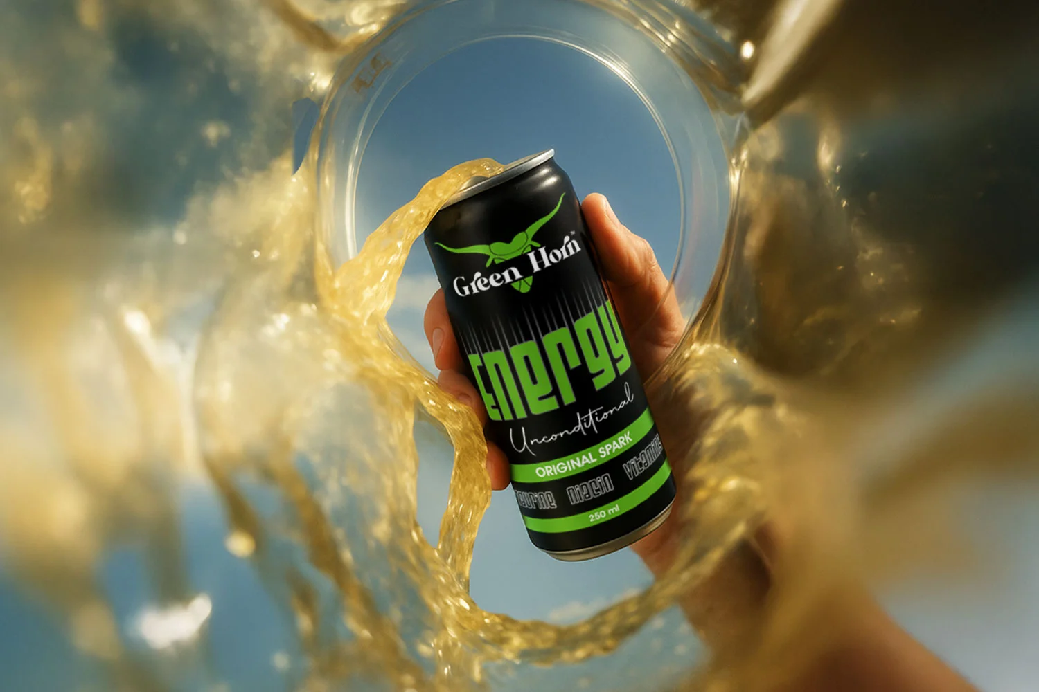
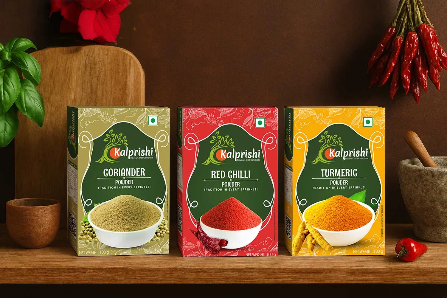
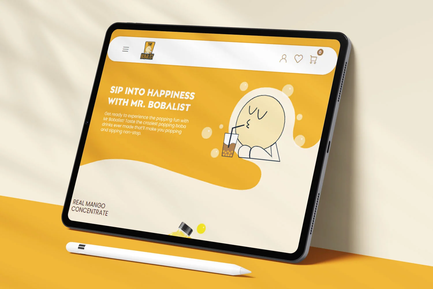
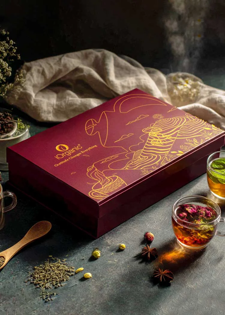
Some brands simply stand out! You recognise them, you trust them and you do not think twice before purchasing from them. That’s how powerful a brand can be! However, building such an influential brand is quite a task. No worries for you, though, for we are here to turn your dreams into reality. If you have the same vision for your brand, think no further. Just get in touch with us and tell us all you have in mind for your product.Let’s discuss how to make your brand something others love and envy.