Let’s Begin With Something Interesting
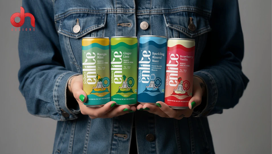
Let’s start with a 3D animation video that we created for one of our clients – Rithm’s Enlite. A functional beverage brand, Enlite wanted us to create an impactful video to increase their brand awareness and showcase their range of products.
Here’s what we created for them: a video that highlights every aspect of the can design – logo & character – as well as the product variants.
3D animation video is just one of the components of the branding services that we delivered to them. What we created for them was a comprehensive brand identity, including logo design and character design mentioned above. We additionally created their can design too. The aim was to create a unique brand identity and packaging design that helps them stand out in the market.
Planning to launch your own energy drink brand? Talk to Our Packaging Experts.
Let’s Begin With A Deep Dive Into Energy Drink Packaging Design and Branding
When you’re trying your best to conquer a gruelling day, an energy drink really comes in handy. But it’s not just you who loves energy drinks. Many do, and that’s why the beverage industry has become so competitive today. Standing out in such a competitive world is not an easy task.
If you plan to enter this industry and launch your own brand, your success significantly depends on how you brand and market your product. What you need is a creative energy drink packaging design to stand out in the cluttered market and an impactful brand identity to resonate with your audience.
This blog elaborates on everything you need to know about an effective energy drink packaging design and branding. Whether you want to understand in detail why the two are significant for the success of your energy drink, or you want to understand the key elements that make your brand packaging design click with the audience, we discuss everything. In addition, we uncover secrets that go a long way in creating a successful energy drink label design.
So, now, shall we start?
Why Does Your Energy Drink Packaging Design and Branding Matter?
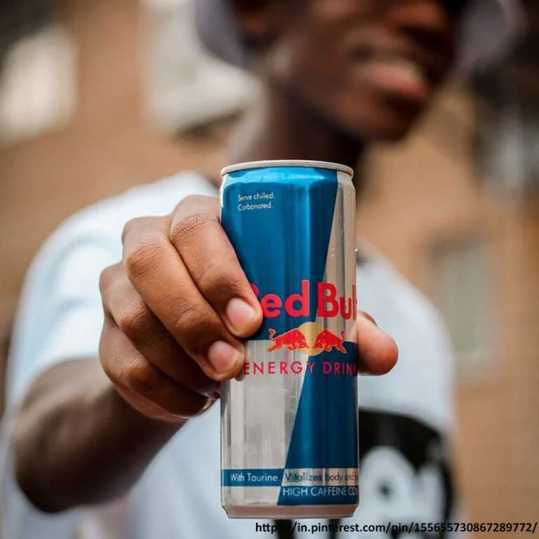
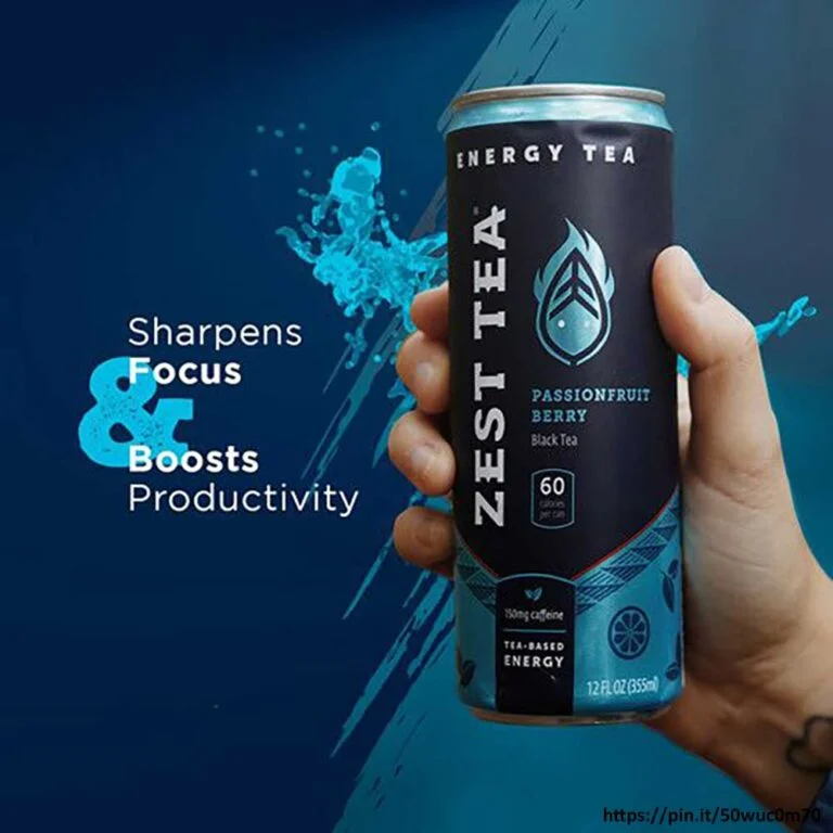
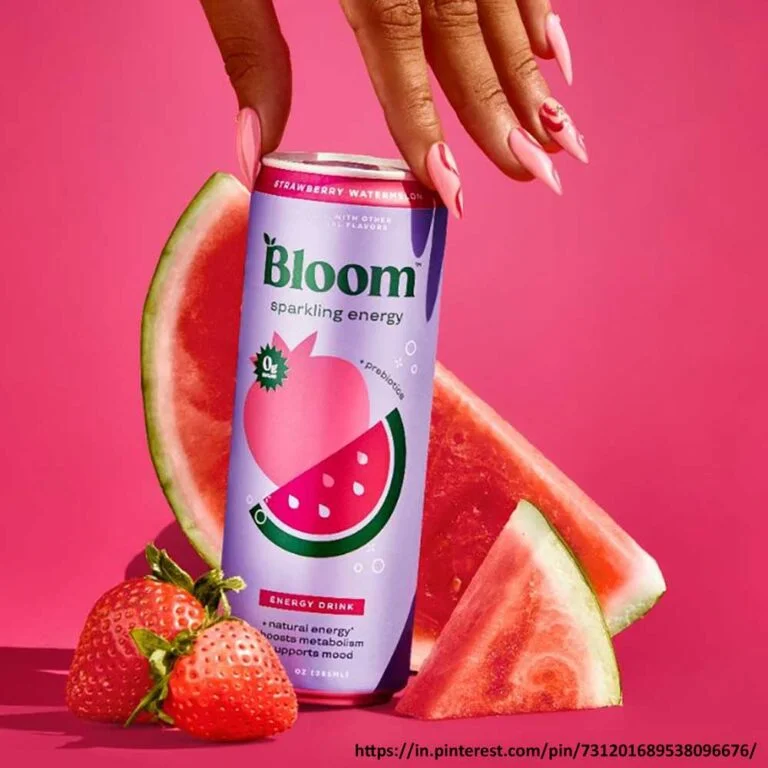
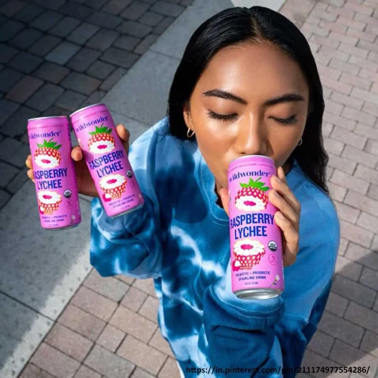
It’s simple. What is the first thing that commands your attention when you are in the middle of many products? Most of the time, it’s the product’s visual appeal. Right?
Similarly, your energy drink packaging design often makes your brand’s first ‘aha’ impression on people. Its visual aesthetics significantly affect whether a customer will pick it up or walk away.
However, looks are not the only deciding factor; it’s just the beginning. Beyond the wow visual aesthetics, your energy drink can design must convey who you are as a brand and what you stand for. This is important to connect with your target audience.
When your packaging design is appealing and effectively conveys your brand identity, it captures consumers’ attention, builds trust and encourages them to make a purchase.
Want packaging design that grabs attention in seconds?
Elements Your Energy Drink Packaging Design and Branding Would Be Incomplete Without
A To-The-Point Energy Drink Logo Design
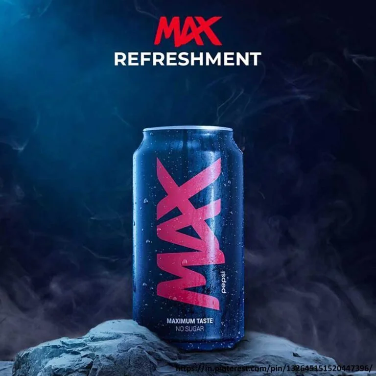
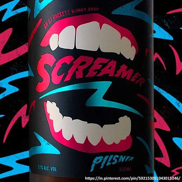
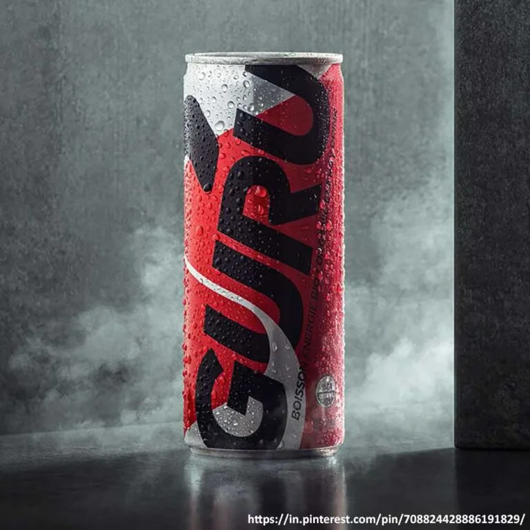
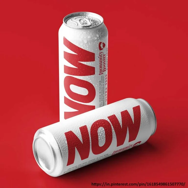
A logo design is the face of a brand and has the power to make you recognisable. Therefore, your energy drink logo design must not be just good; it should be impactful. It should be simple, clean, bold, and yet super practical. It must adapt well to different places, on the can packaging design as well as the billboard design.
A great energy drink logo design must reflect the soul (energy) of your brand. You could add sharp lines, dynamic shapes, bold fonts, or experiment with fun colours and typography. But eventually, you must keep it simple. It must be simple to understand at a glance and successful in establishing its unique identity among the crowd.
A Wow and Unique Visual Design
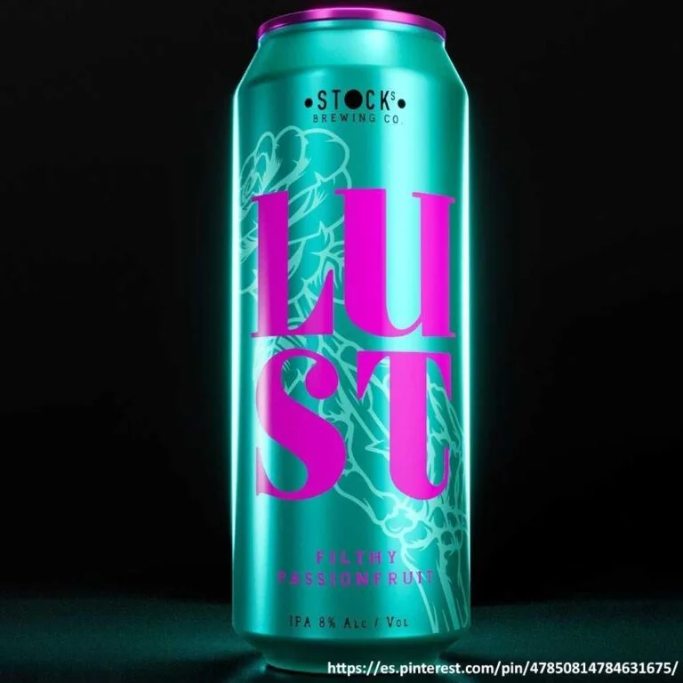
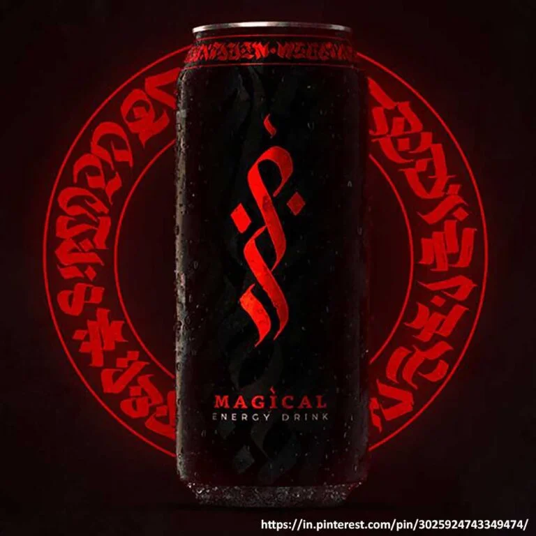
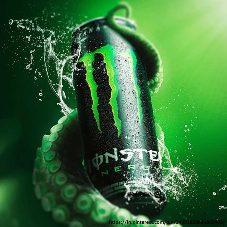
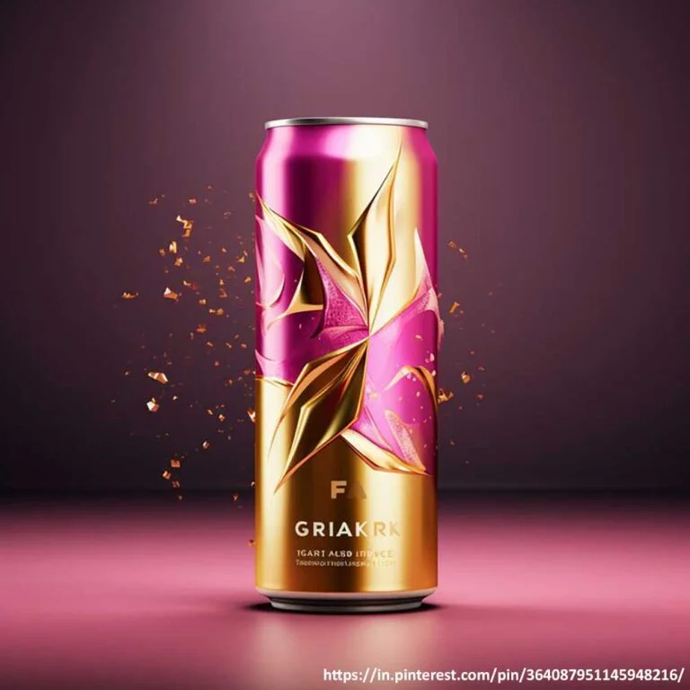
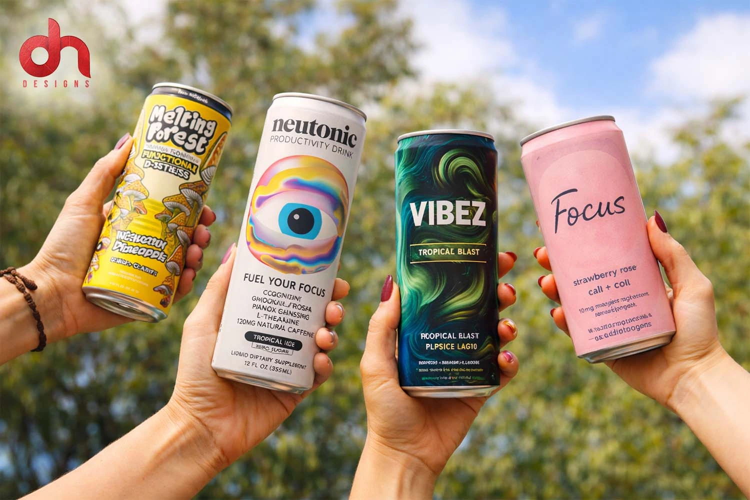
As discussed, a creative energy drink can design is often the first element that consumers interact with. Hence, it must be different and unique from the other products on the shelf.
You can choose to go with either a minimalist or a bold design, depending on what your target audience expects and likes. Decide if you want to target the economic or premium market, then settle for the design that would speak to your audience’s hearts accordingly.
For instance, if you decide to go for a bold energy drink label design, then high-contrast colours, strong typography, and dynamic graphics that instantly convey energy, power, and movement will really make heads turn.
An Informative Label
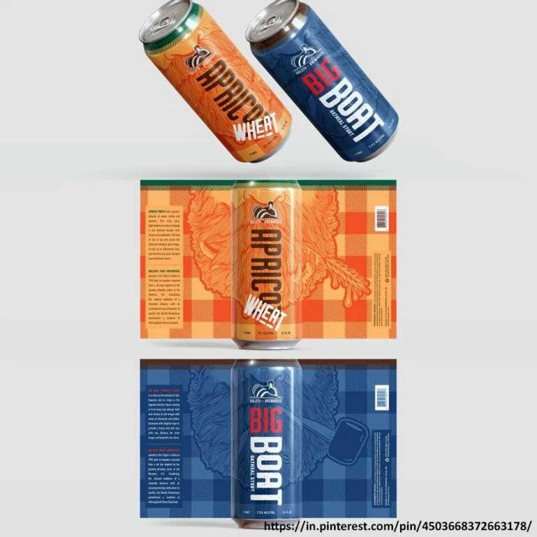
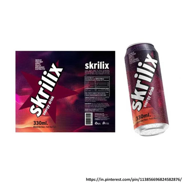
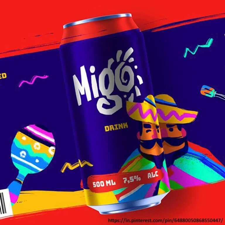
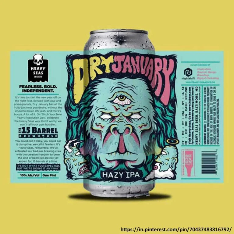
Usually, a label design helps people understand a product without even opening or using it. Hence, your energy drink label design must be created in a way that enables consumers to spot the necessary information about the product conveniently. It must contain important information such as legal disclaimer, ingredients, energy benefits, and nutritional values. All this helps customers make an informed buying decision.
Due to these factors, you must create an energy drink label design that is both aesthetically pleasing and practical.
Top 3 Secrets of Energy Drink Packaging and Brand Designs No One Tells You
Sensory Design Plays a Major Role in Energy Drink Purchases
.webp)
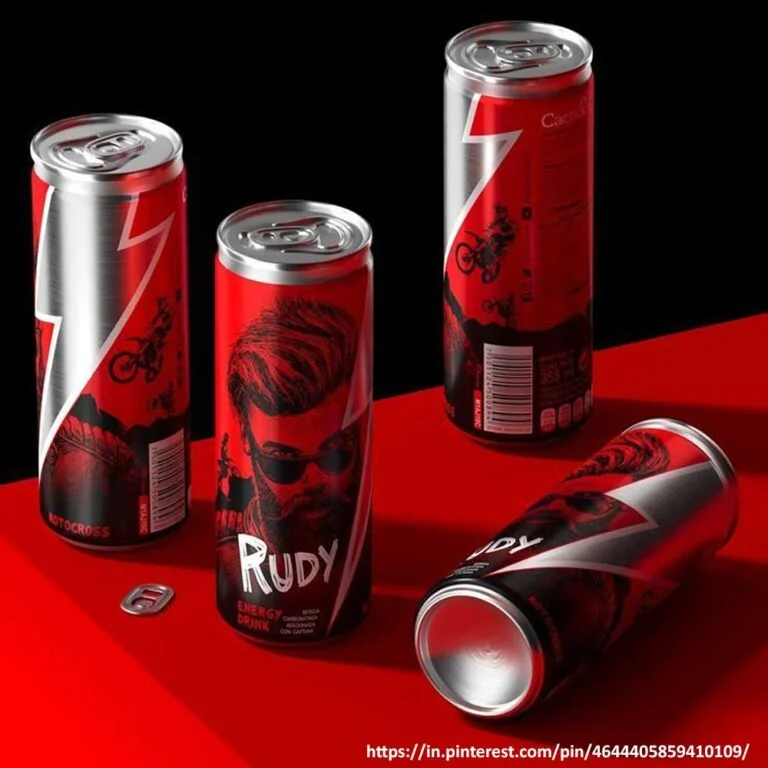
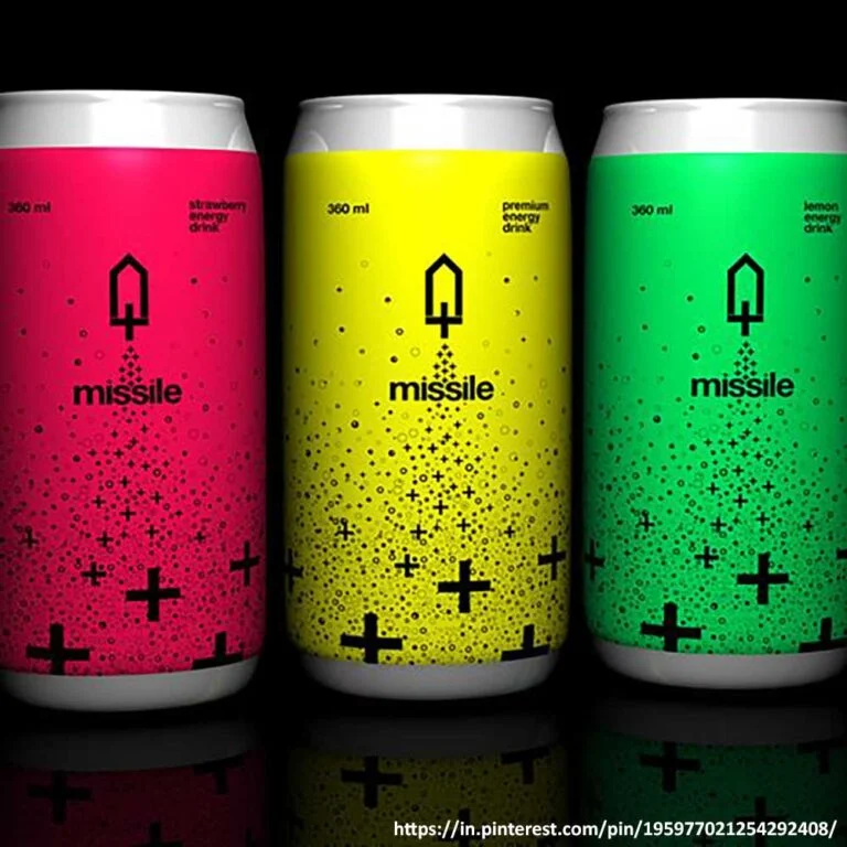
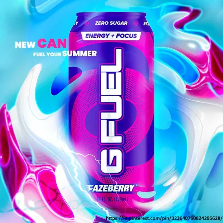
When customers make buying decisions, they consider more than just the aesthetics of your product. They also rely on sensory design, which involves using multiple senses beyond sight. Sensory design includes how your product smells, the sound a can makes when it is opened, and the texture of the packaging. You need to understand how these sensory elements shape buying behaviour and use them strategically in your energy drink packaging design.
Understand and Keep Colour Psychology in Mind
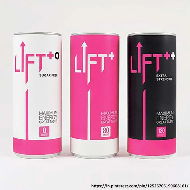
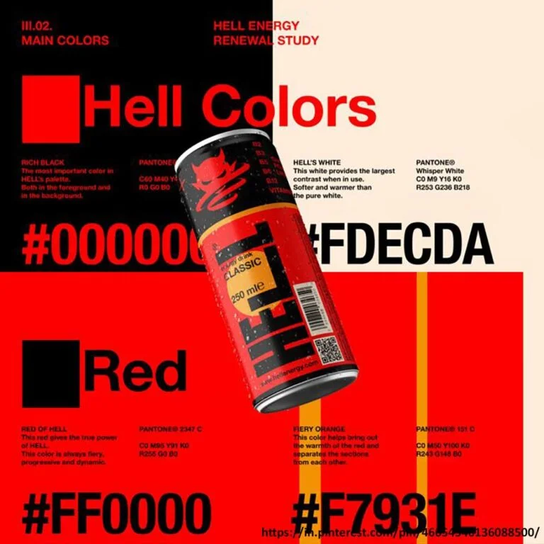
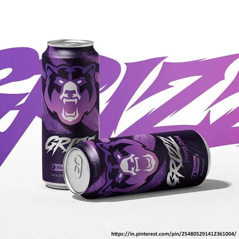
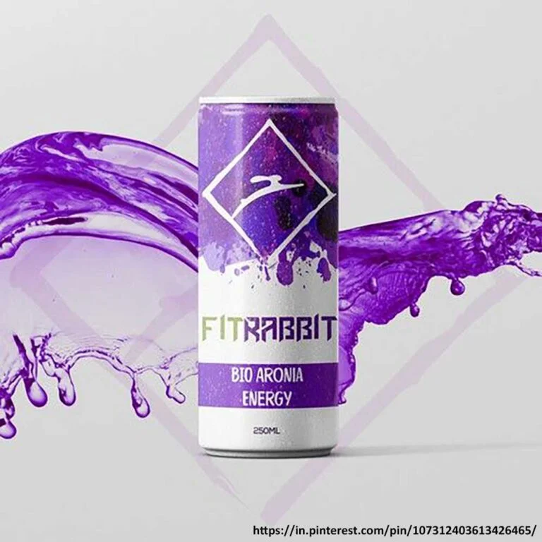
You must go beyond the usual colours red, blue, and green for your energy drink label design. Also, try to understand the colour psychology – how different shades of the colours can make a difference in customers’ brand perception and buying decisions. Go for a colour palette that speaks to the needs and preferences of your target audience.
One important thing you must consider is understanding colour in the context of cultural significance, since the meaning of colour changes with the region.
Remember, Storytelling Has Become More Important Than Ever
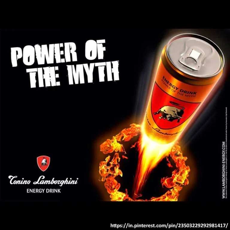
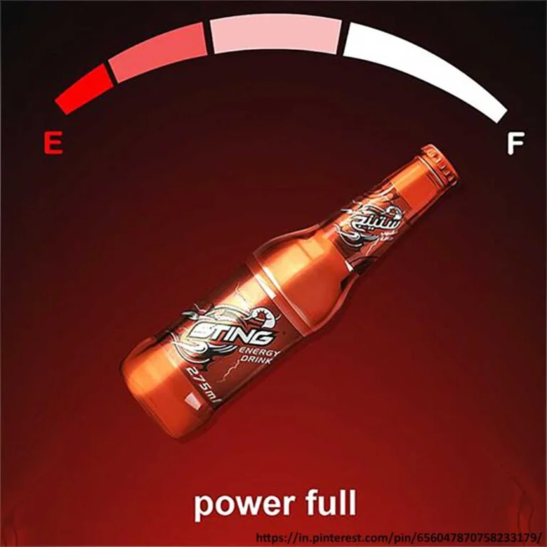
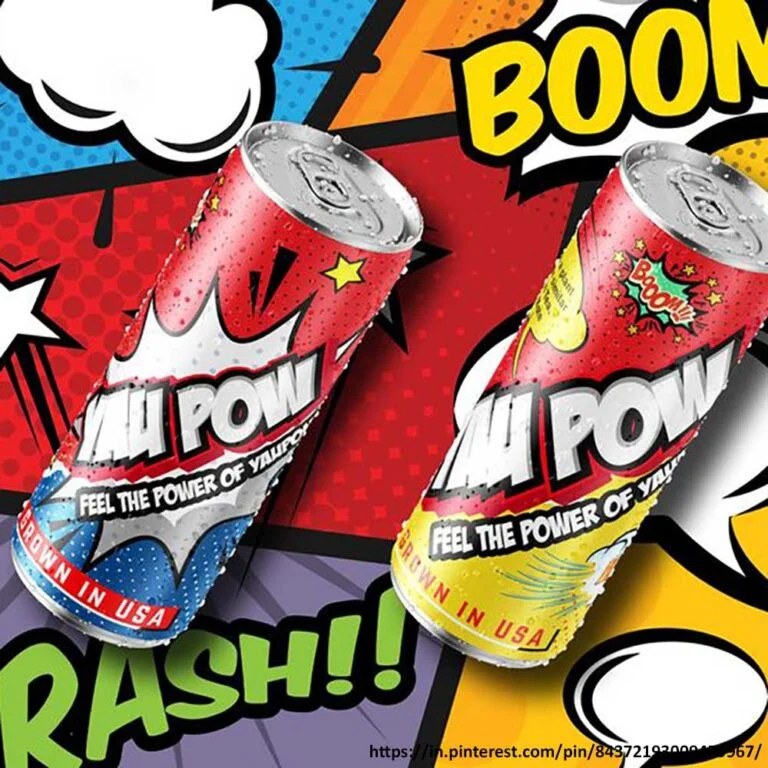
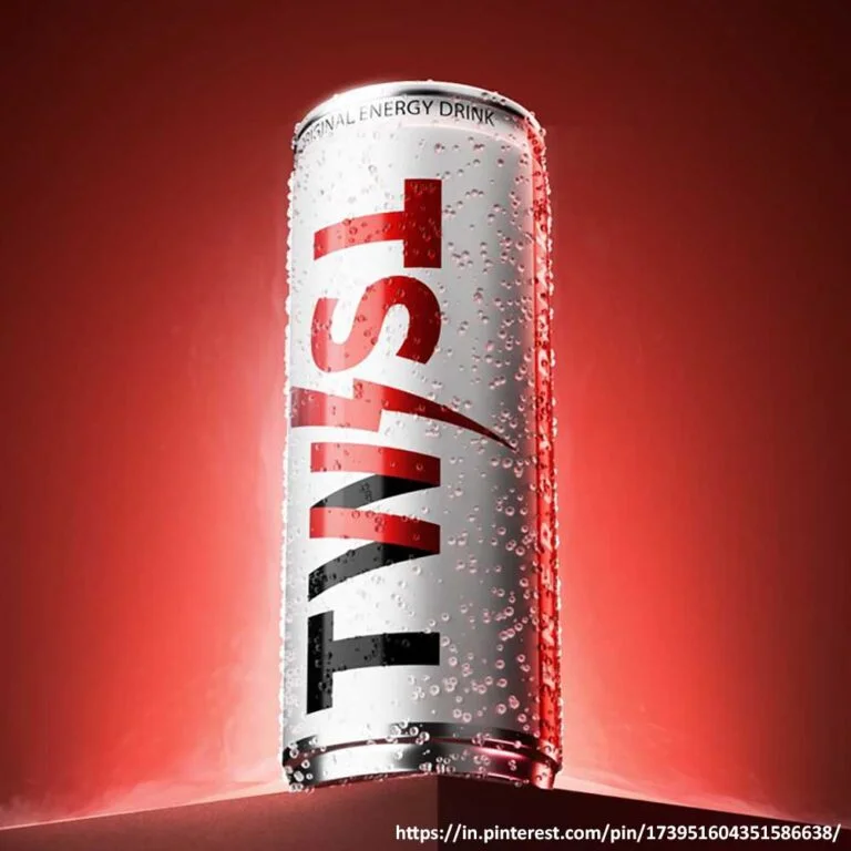
What matters above everything is what story you plan to weave with your product and brand. With that, every element of your branding, from your identity and design to messaging, must speak the same story and resonate with your audience. Brands with wow stories often win people’s hearts. Once you have pondered the story, ensure every element of your creative design, like the text, logo, tagline, icons, shapes, and graphics, aligns with it.
Have a Look at Sting’s Packaging and Brand Design. Simply Electric!
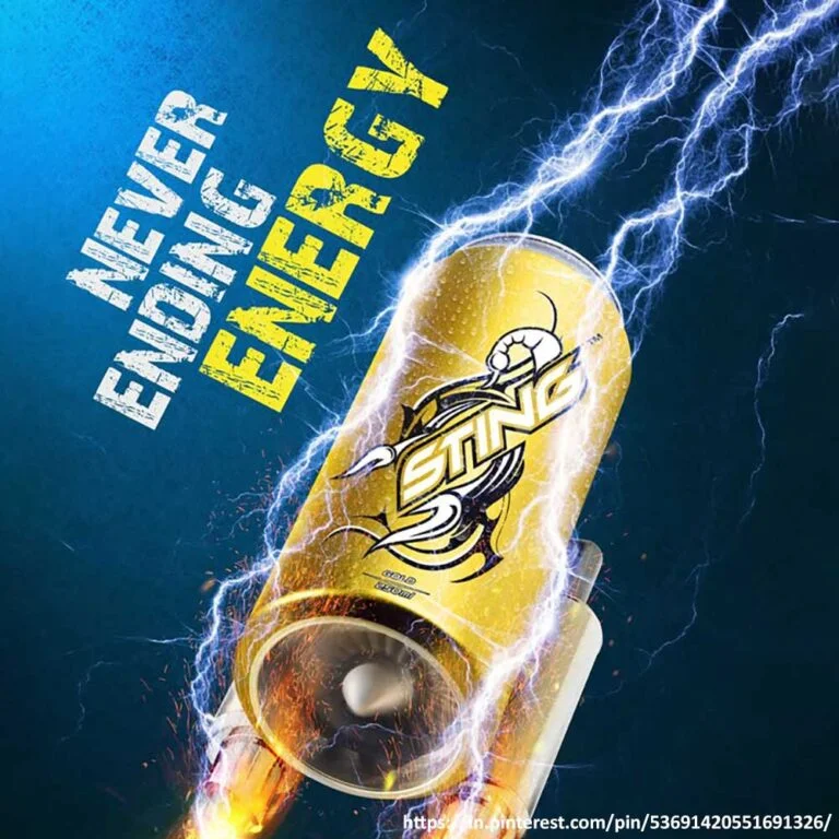
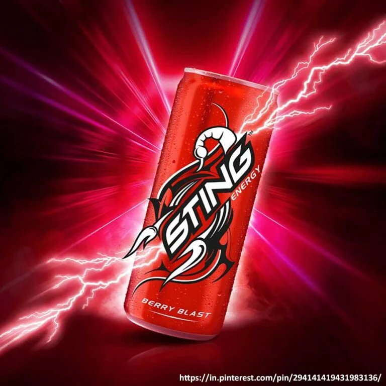
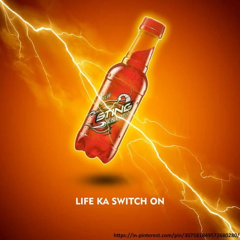
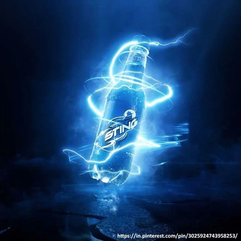
Sting, one of the most popular energy drink brands in India, held approximately 90% market share by volume in 2024 (it was launched in 2017).
However, what do you think is the cause of this achievement? Apart from factors like low prices (to suit the mass market), taste profiles developed for Indian customers, and PepsiCo’s strong distribution network, it’s the branding and packaging design of Sting that was, and is still, mind-blowing.
Sting, owned by PepsiCo, is the epitome of being uniquely bold. The brand design of Sting is such that it can grab your attention with just a glimpse. Its simple yet sophisticated logo design seems like a real lightning bolt. It loudly speaks of energy. Its label design is clean as it should be, with minimal text. And it has a glossy finish too, which lends it a premium feel despite being a low-cost product.
Even the colours – red, yellow and blue – of Sting’s flavour variants indicate something exciting and thrilling. Since Sting has a target audience of people around 18-25, it screams “pick me up” when placed between its competitors. Even among the big brands like Monster and Red Bull, Sting gives off a premium feel while being affordable.
Create A Cohesive Energy Drink Branding Experience
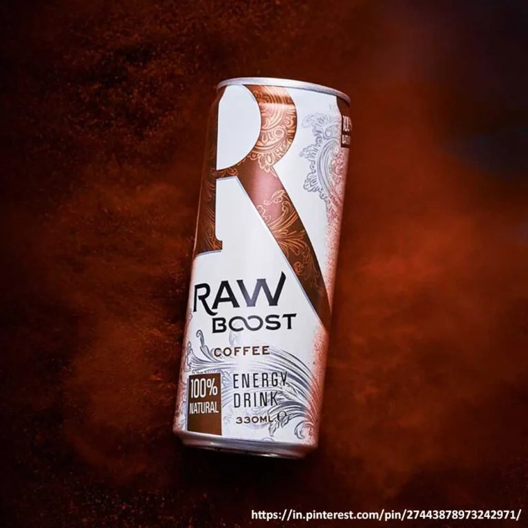
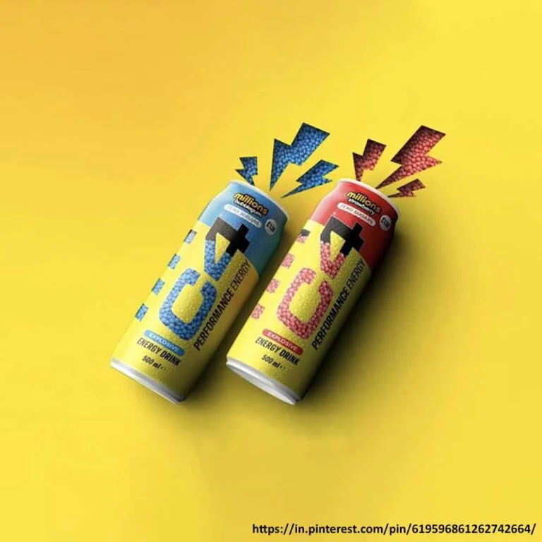
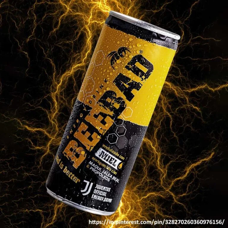
Once you finalise your energy drink logo, can and label design, it’s time to move forward and solidify your brand even more.
So, the next step in your branding endeavours is your endeavours is your website design. Your energy drink website design is very important because it provides people with the necessary information about your product, brand, and story, and also facilitates the purchase of your products.
Make sure the website design complements your overall brand design and, at the same time, is SEO optimised and easy to navigate and read.
Social media, an important aspect of digital marketing, must also be on your list when planning your energy drink branding strategy. Begin by choosing the social media platform you want to be active on. Then, plan a strategy for what content and visuals you would be posting and consider your colour palette, brand voice tone, and visuals throughout the process.
Ensure that your brand is presented consistently across your social media platforms and website.
From Our Beverage Packaging Design and Branding Portfolio
Brand Name
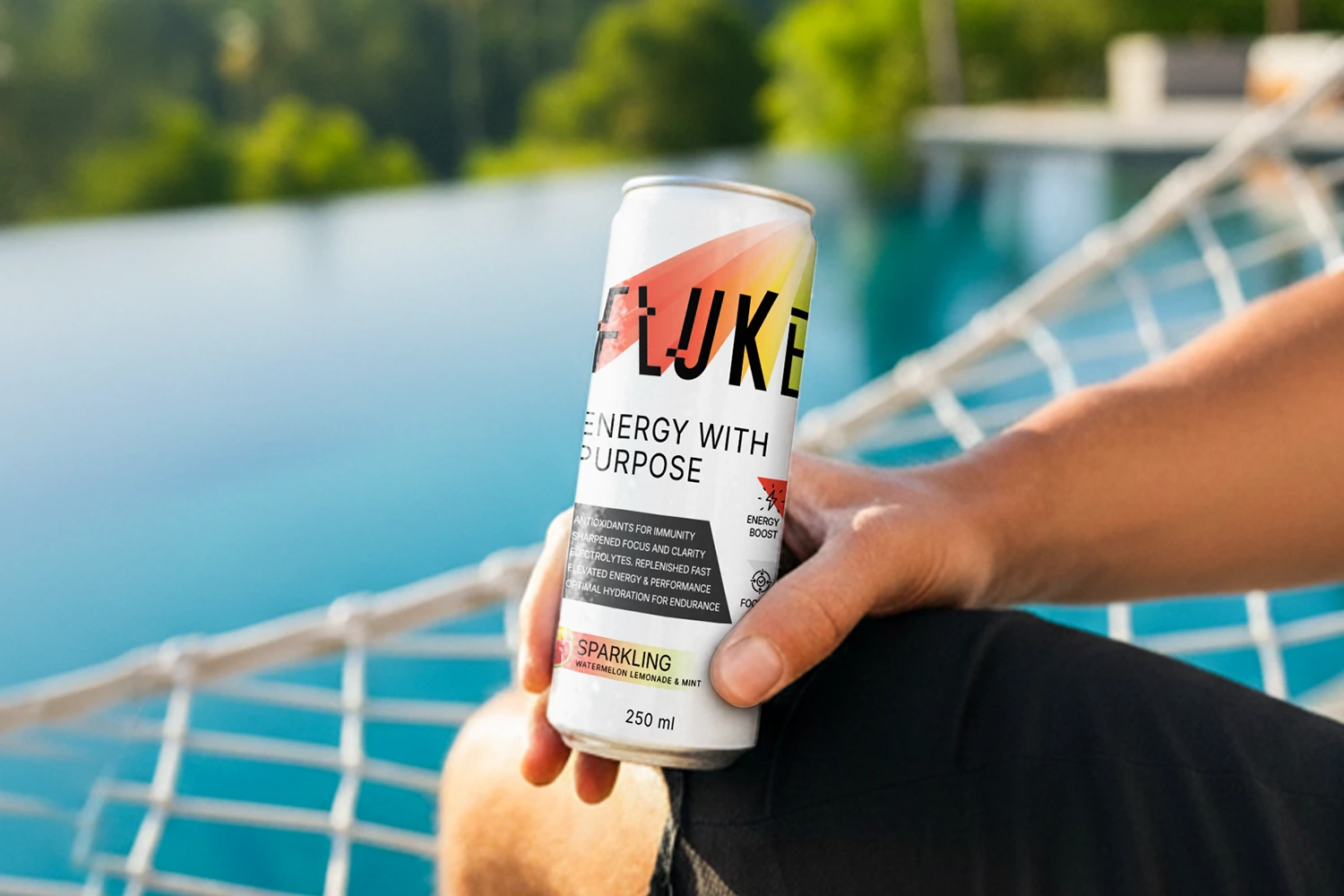
Fluke
Category
Functional Beverage
Product Benefits
Boosts energy, mental focus, hydration and immunity support.
Design Direction
Since this is a functional drink with clean ingredients, we crafted a clean and minimal label design for the brand. The subtle white background allows the other elements to shine through, especially the benefits of the beverage.
Distinct colour accents behind the logo highlight the flavour of the drinks – green for Green Apple flavour and red+yellow+green for Watermelon, Lemonade & Mint flavour. The colour of the flavour block at the bottom and the benefit icon on the side similarly highlight flavours through colours.
In the end, what we created for them was a clean, simple and yet impactful packaging design.
Inspired by our work for Fluke? Let’s build yours next.
Related Reading
Last Thoughts
Launching an energy drink brand is a long process demanding expert help. Whether you need help with packaging, branding or marketing your product, we, the leading energy drink branding agency, can help you with everything. Because we know that it is not just about understanding your audience but also resonating with them. Call us at +91 94160 11100 to build an energy drink brand that energises your audience both realistically and metaphorically.
