What is Beverage Packaging Design and Label Design?
Beverage packaging and label design is far more than just planning and executing visuals — it is about communicating what your product is, what its unique selling proposition (USP) is, and why it's better than its fellow products. It highlights important information about your product and, additionally, conveys your brand's identity and story.
Together, all the elements of your packaging design create a visual and emotional experience that compels consumers to look at your product and make a purchase. The important elements include:
- Visual Design — The creative graphics, typography, font, and colour palette that make your product appear attractive and grab attention.
- Brand Identity — Your packaging and label design convey your brand's identity, including logo, positioning, messaging, and values.
- Legal Compliance — Your beverage label design includes certain mandatory information: ingredient lists, nutritional values, veg/non-veg symbol, FSSAI logo & license number, manufacturer/marketer details, and net quantity.
Does Beverage Packaging and Label Design Really Matter?
Your beverage packaging and label design are your first opportunity to connect and communicate with your consumers. It is this interaction that eventually leads to sales. Good visuals on your design draw people in, but it is not just about the aesthetics. Your beverage label design shares the product's information with consumers, which in turn builds trust and loyalty. A strategic design also conveys a compelling brand story and message — something that builds real, lasting connections with consumers.
In short, your beverage packaging design can change the fate of your product. An effective one can persuade people to buy your product once and then encourage them to come back to it time and again. It can make your brand memorable.
03 — Design Across CategoriesPackaging Design That Sells: Beverage Design Across Categories
There are just so many beverages in the market. How do you establish a strong presence, increase visibility, and drive sales growth? Your packaging design is your silent superhero on the shelf. Below are design directions for each key beverage category — bear in mind these are general principles; your specific vision, market, and audience expectations may call for a different approach.
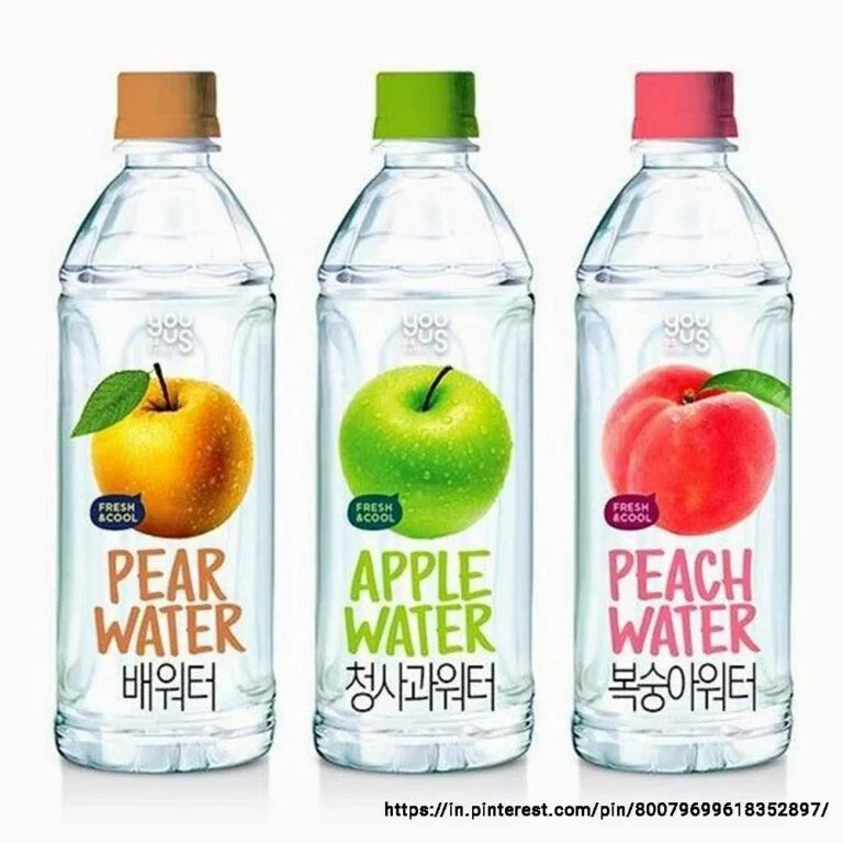
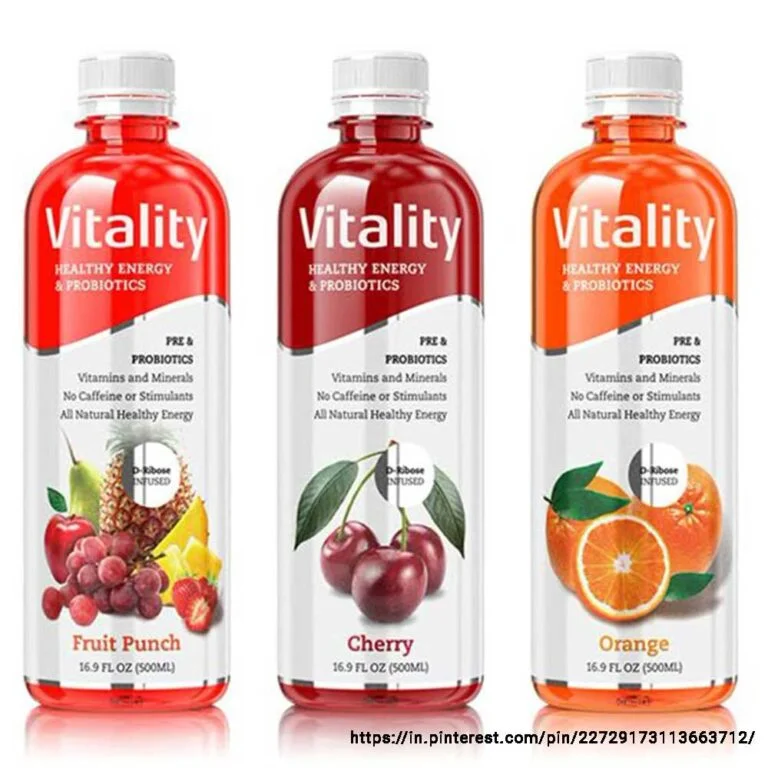
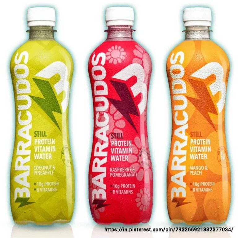
Vitamin Water and Protein Water Packaging Design
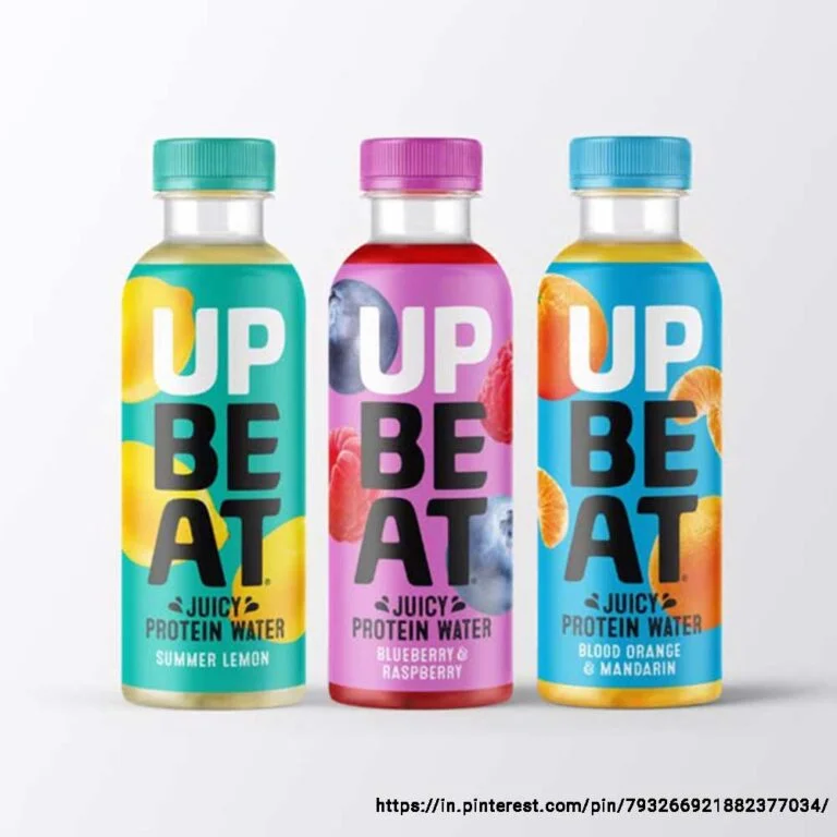
Vitamin water and protein water have become people's new favourites. Product packaging design for this category is based on one principle — simplicity. Today's consumers want to know the benefits of what they are putting into their bodies, so these beverage label designs must showcase those benefits clearly.
Vitamin water is meant to provide hydration and quick energy. Its design should convey freshness and goodness for every day — go minimalist with clear visuals, bright colours, and easy-to-read typography. Protein water supports muscle recovery & growth and is performance-driven — use strong typography, neutral colours, and clear information hierarchy. Make sure to highlight protein quantity prominently. For both, you can experiment with interactive elements like QR codes.
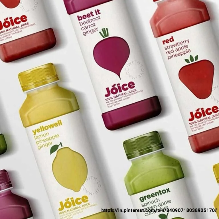
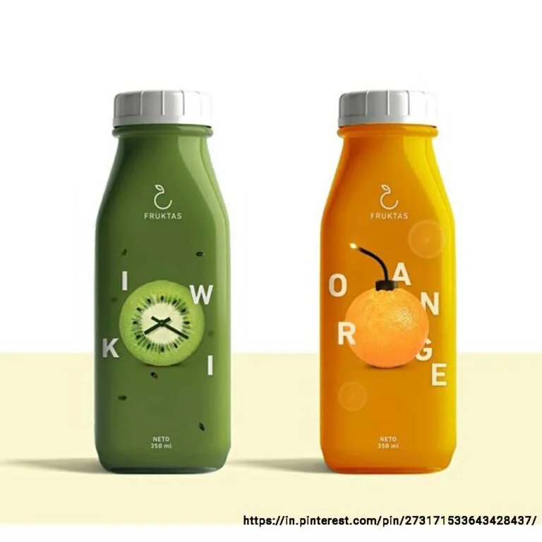
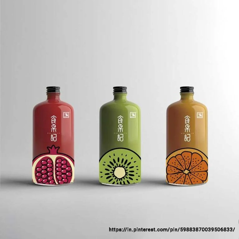
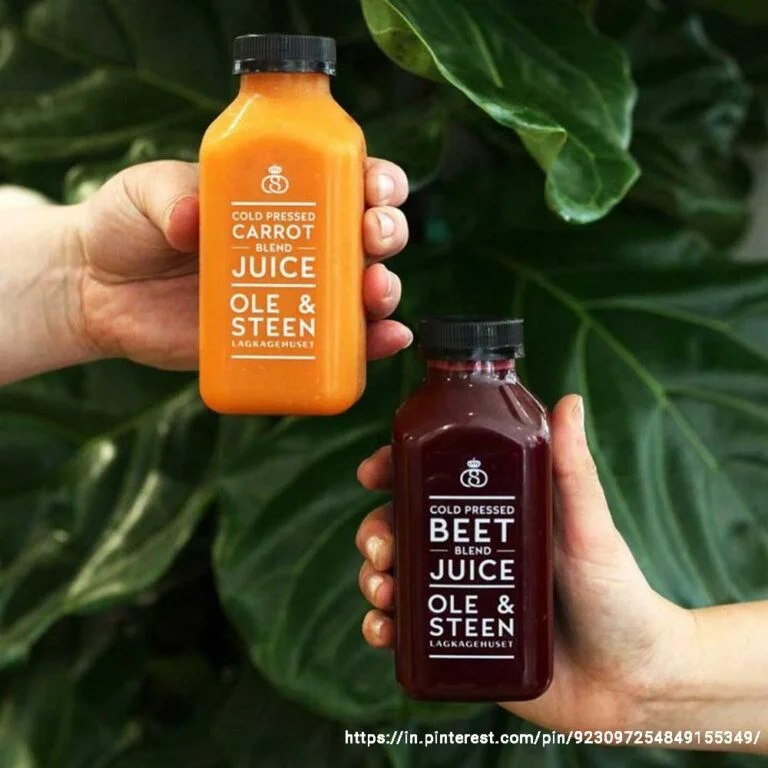
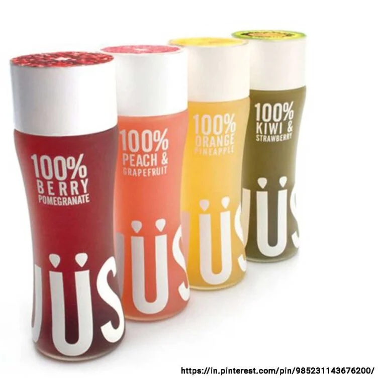
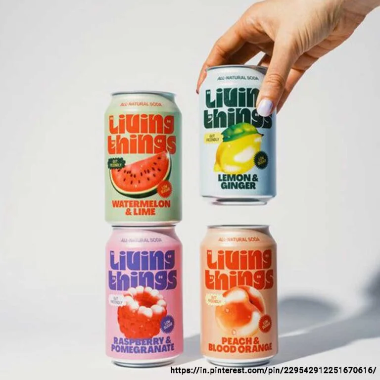
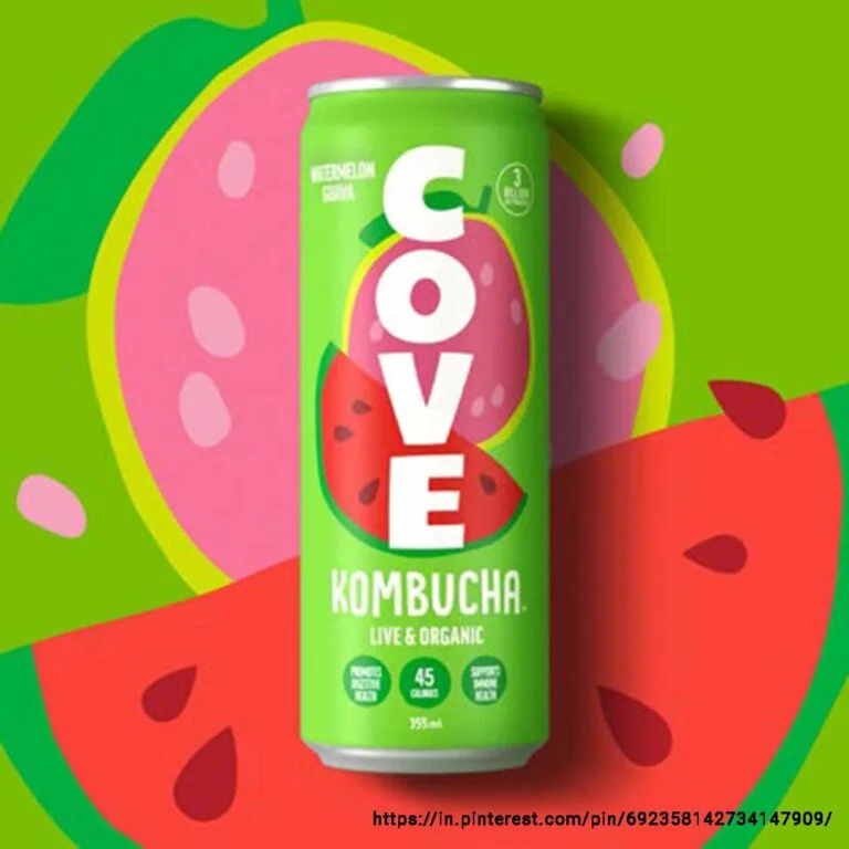
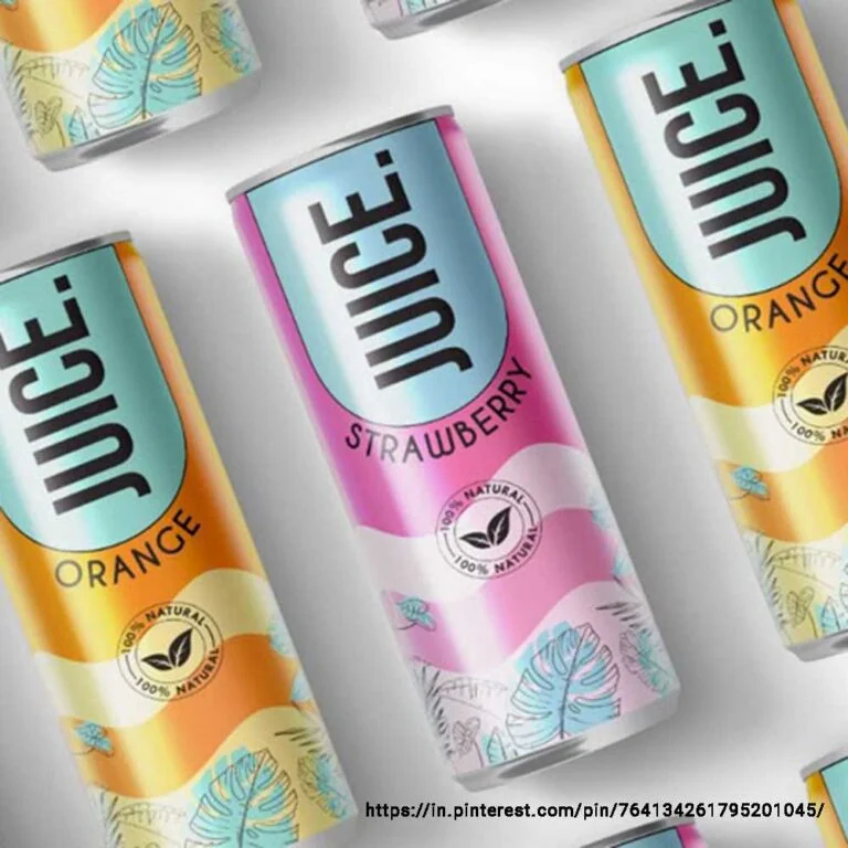
Juice Packaging Design
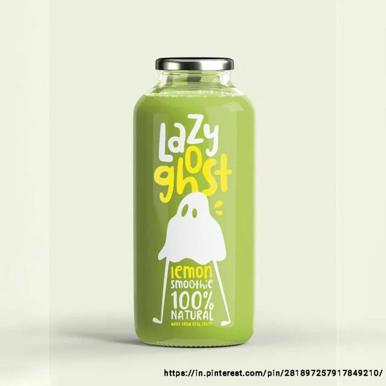
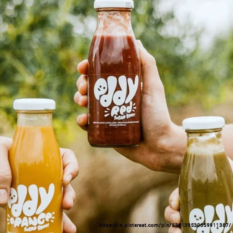
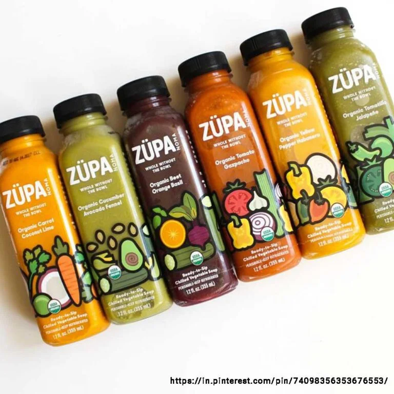
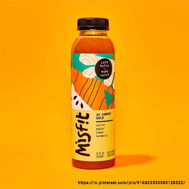
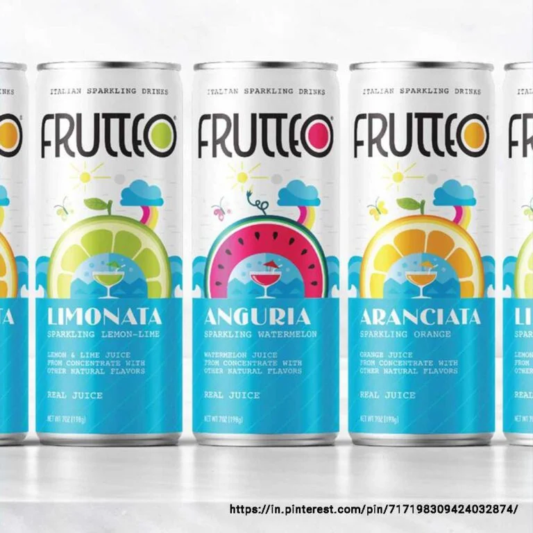
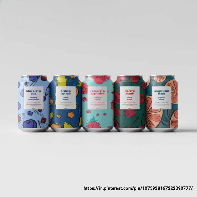
Juice stands for freshness and taste, so your juice label design or juice can design should evoke similar emotions. Use flavour-oriented colours and visuals for each variant — for instance, an orange juice bottle label design can have orange colour as well as visuals of the fruit. The layout must be balanced, and the information hierarchy should present brand identity and product health benefits clearly. Depending on your target audience, you can also refine your design to give it a more premium feel.
The fruit juice label design should feel uncluttered, pure and modern — persuading people to buy it and take a sip immediately.
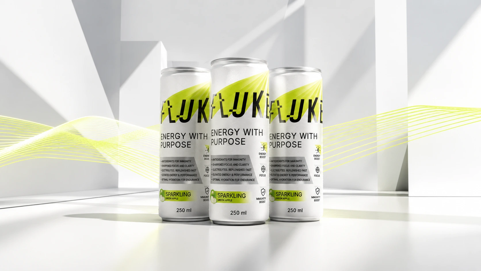
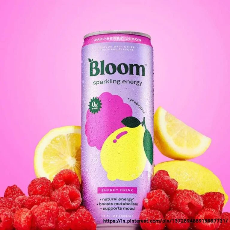
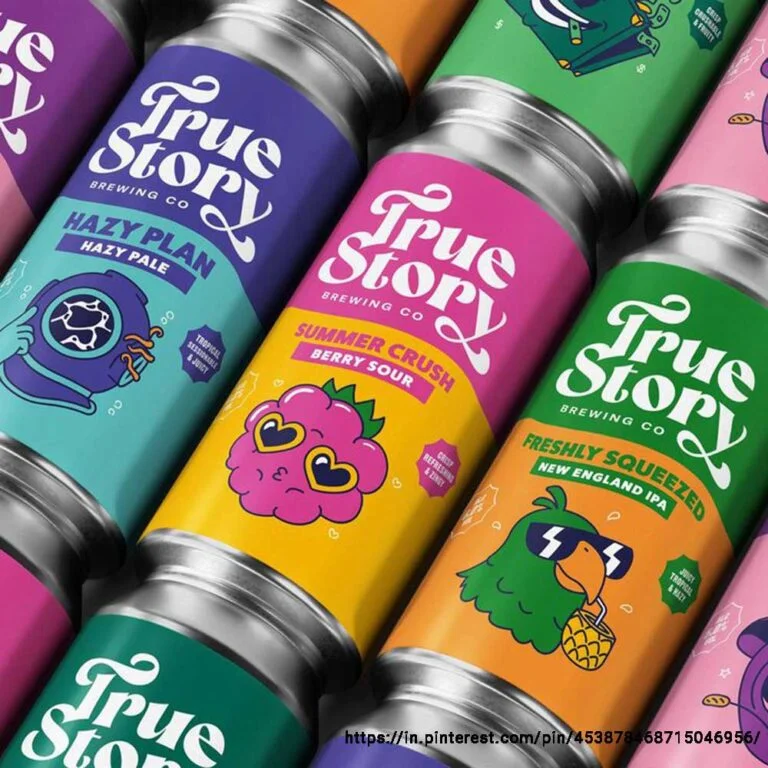
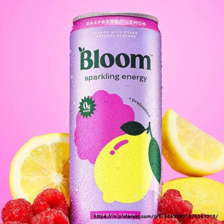
Energy Drink Packaging Design
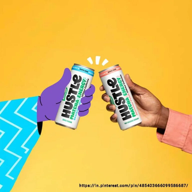
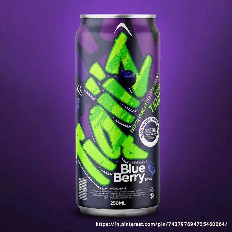
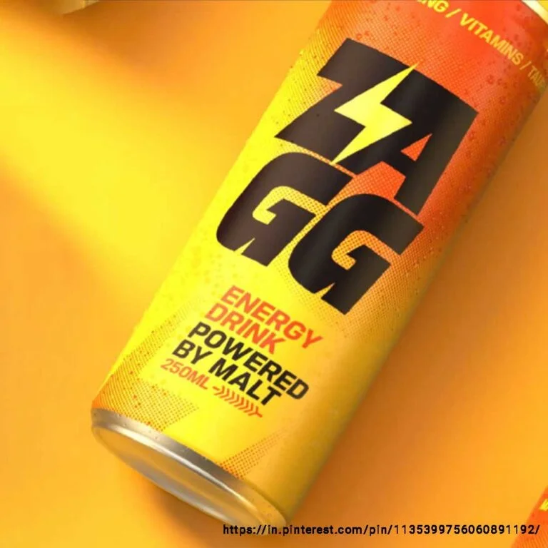
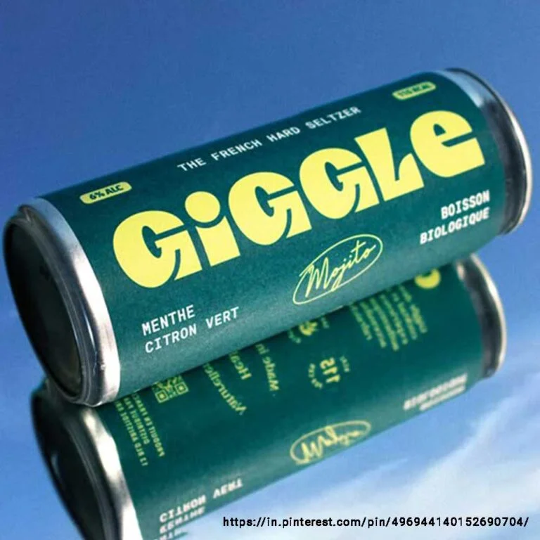
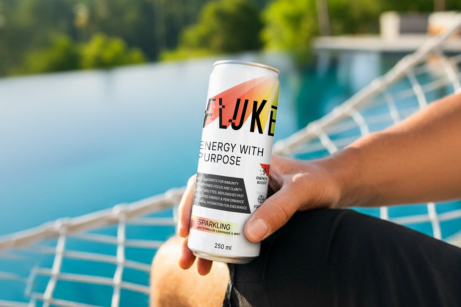
Energy drinks are meant to quickly increase mental focus, alertness, as well as physical performance and stamina. So, your energy drink packaging design must feel bold, powerful and energetic to resonate with your target audience — gym lovers, athletes, or working professionals.
Go for high-contrast colours (like blue/orange or red/green) and strong but clear typography. Draw clear attention to the energy factor and vital functional claims (such as the presence of B-Vitamins and Zero Sugar). You can also introduce limited-edition packaging designs inspired by popular festivals, events and pop culture to spark curiosity and form an emotional connection — but the brand identity and energy factor must never get lost in the process.
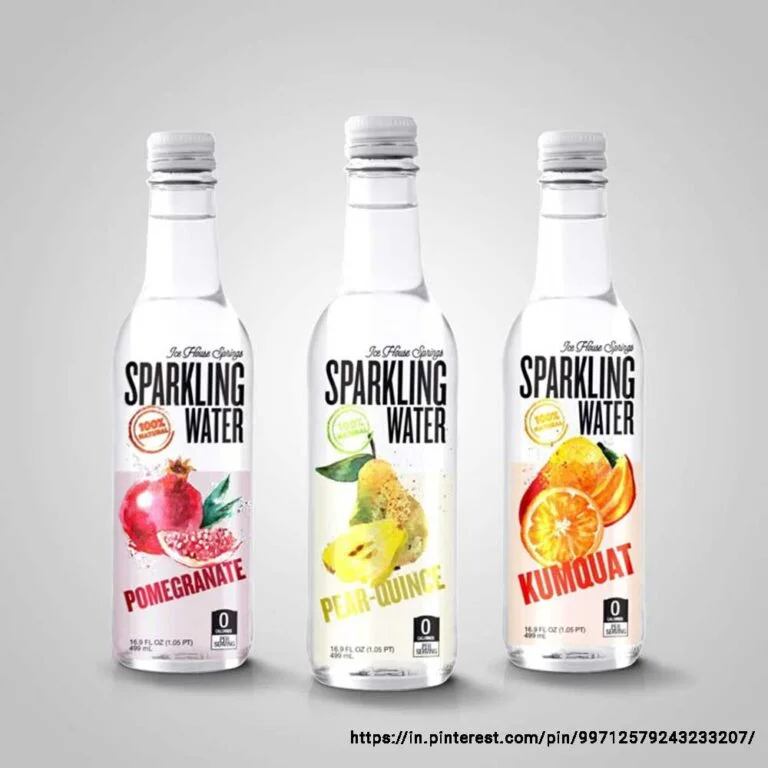
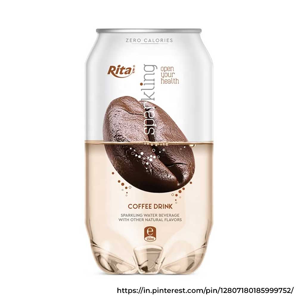
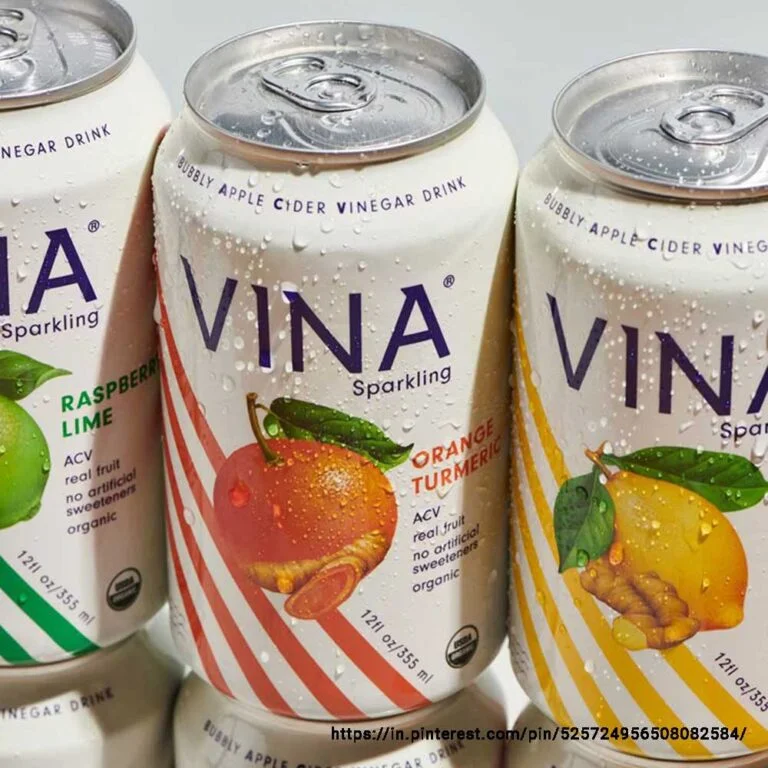
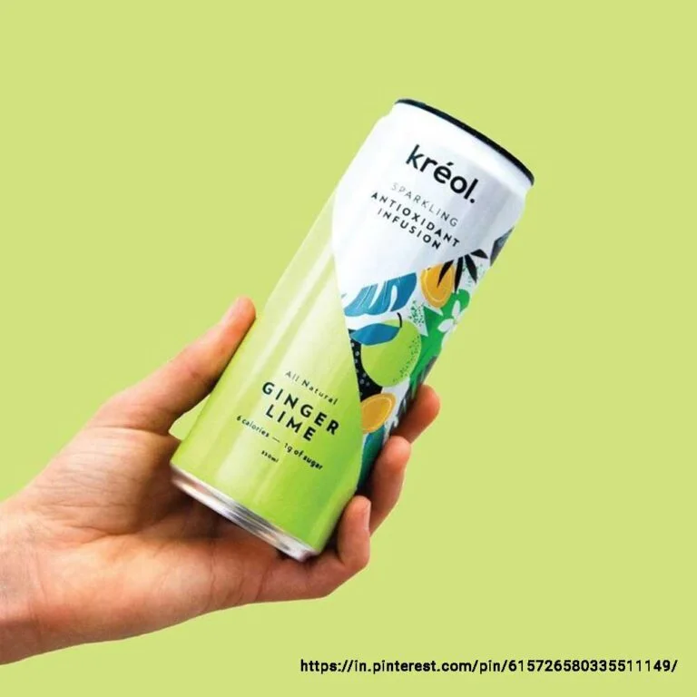
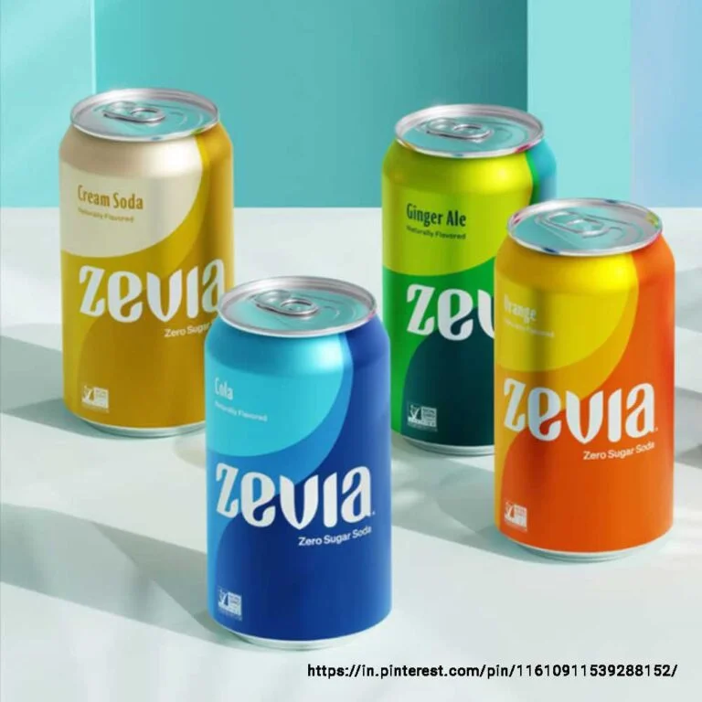
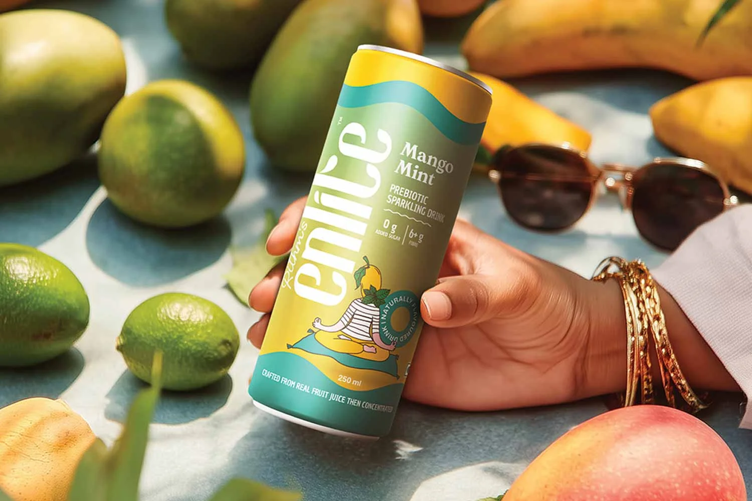
Sparkling Water Packaging Design
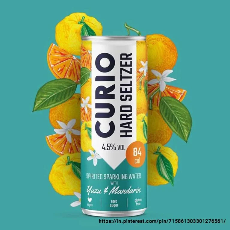
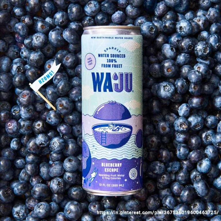
Sparkling water is steadily making its place in the beverage market. Since it is calorie-free, sugar-free, and a clean fizzy beverage, its packaging design must feel pure, premium, and refreshing. Soft, pastel-hued colours with minimal abstract graphics (waves & bubbles) lend a sense of calmness, while elegant typography and generous negative space make it appear clean and sophisticated. The design should feel fresh, pure and restrained.
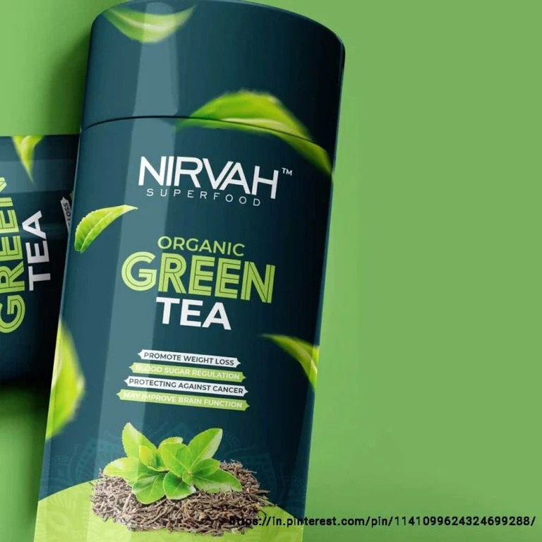
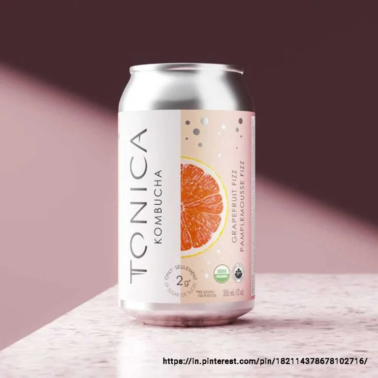
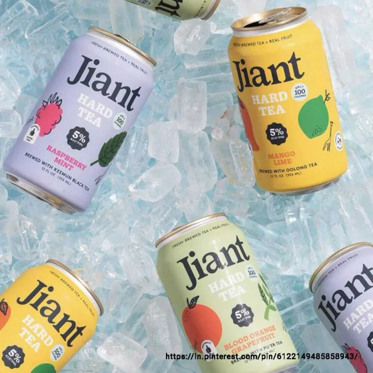
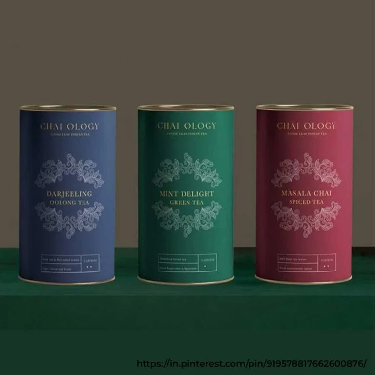
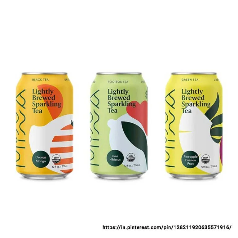
Tea Packaging Design
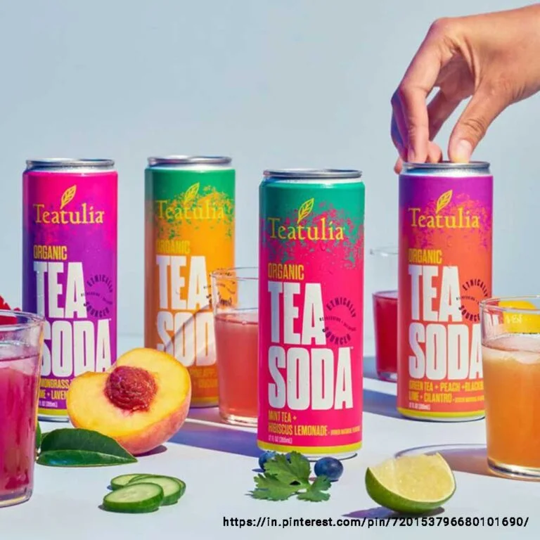
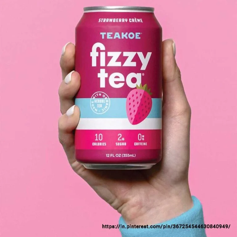
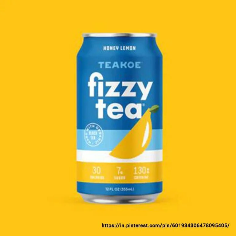
Tea comes in two different forms — the traditional form (tea leaves or bags meant to be brewed at home), and the fast-growing RTD (ready-to-drink) format.
For the former, the packaging design must reflect tradition, trust and quality with modern minimalism. The colour palette should have warm, natural tones, and the imagery should reflect tradition & nature — hand-drawn botanical illustrations with clean fonts put the spotlight on flavour and health benefits. Keep the focus on simplicity without forgetting the 'luxury' factor.
The RTD tea packaging design should feel refreshing and appear premium and modern. Use colours and graphics that highlight the fruit or tea flavour, and highlight key information like flavour and quality claims (such as no added sugar or cold-pressed). The tea label design should attract customers within seconds and persuade them to make a purchase.
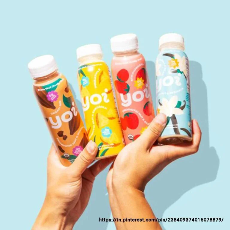
Yoghurt Drink Packaging Design
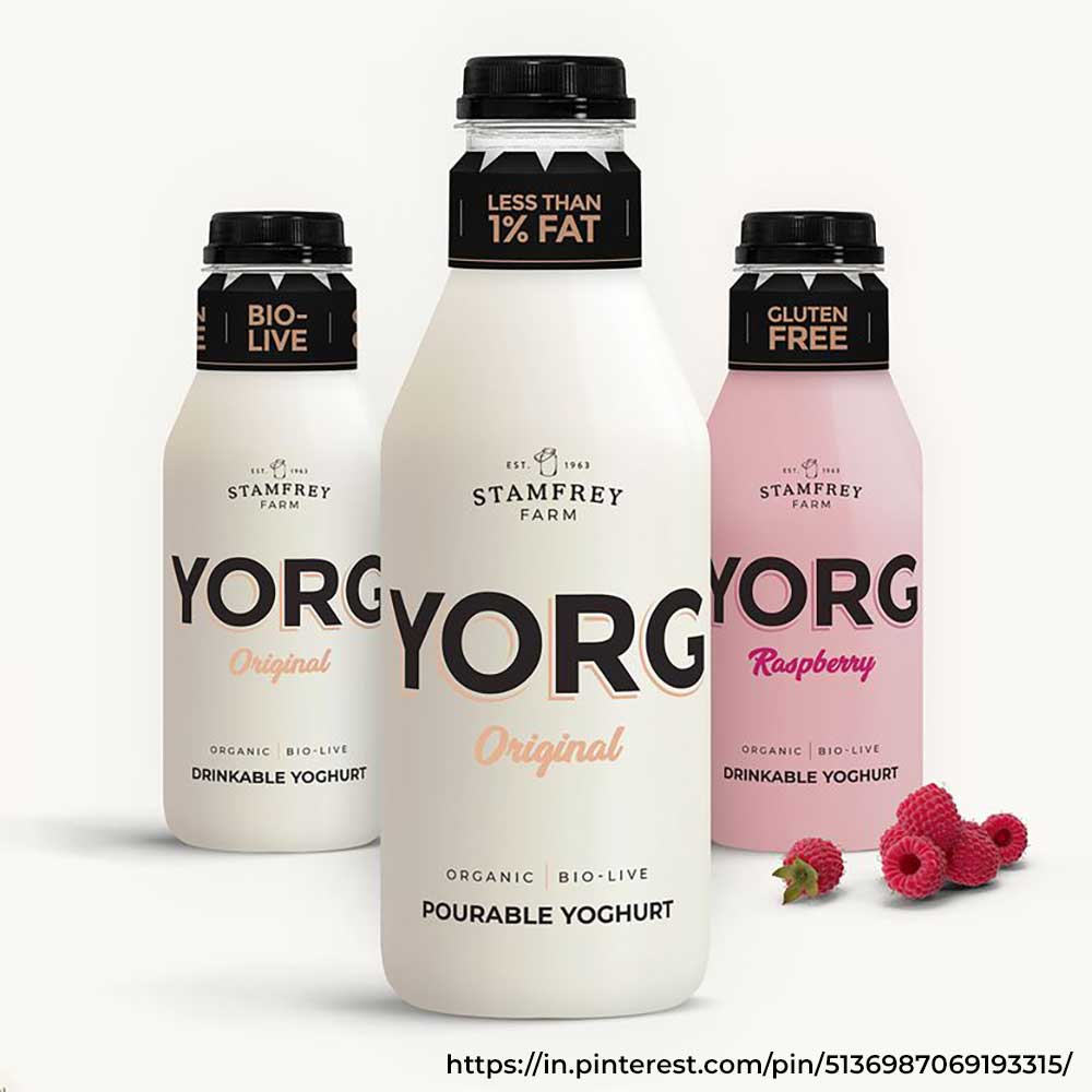
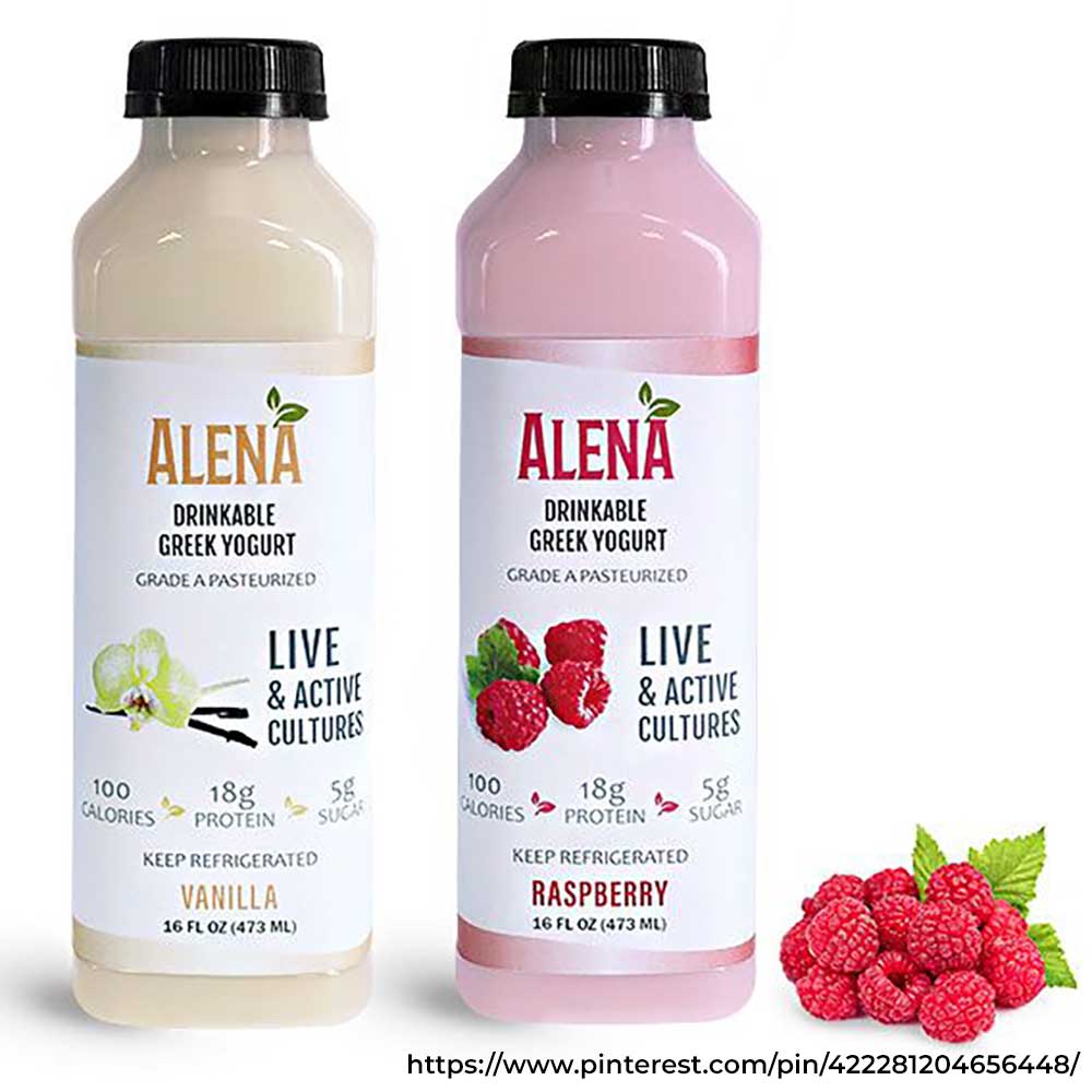
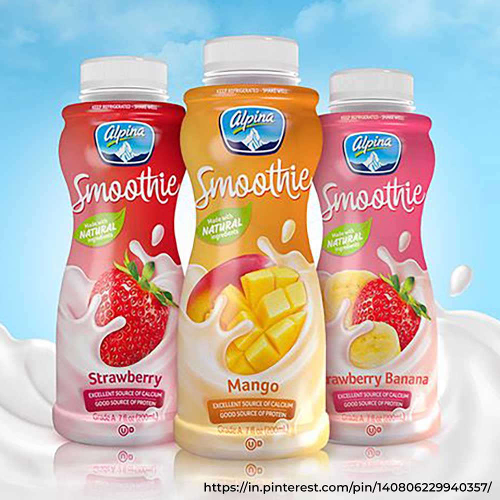
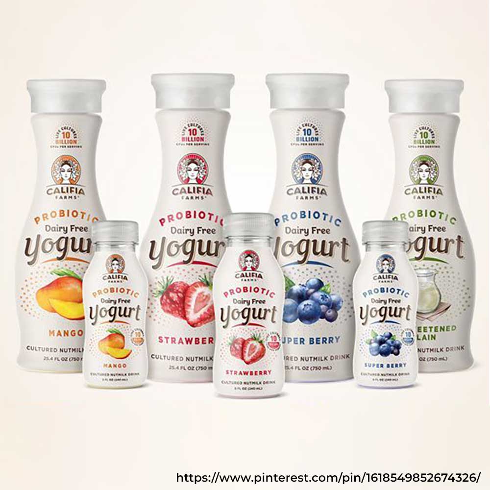
Sweet and savoury yoghurt drinks — lassi, buttermilk/chaas and smoothies — are a hit amongst people of all age groups, especially in summers. The packaging design must communicate a sense of freshness, health and taste.
For buttermilk, use cool and earthy colours paired with traditional images like leaf motifs. Lassi is richer and more indulgent, so go for a slightly richer colour; flavoured variants can include fruit images and illustrations. Smoothies call for bright, bold and high-energy colours with visuals that highlight the ingredients. The messaging, features and benefits for each should appear prominently — cooling and digestive for buttermilk, thick and creamy for lassi. All three must appear modern, minimal and clean.
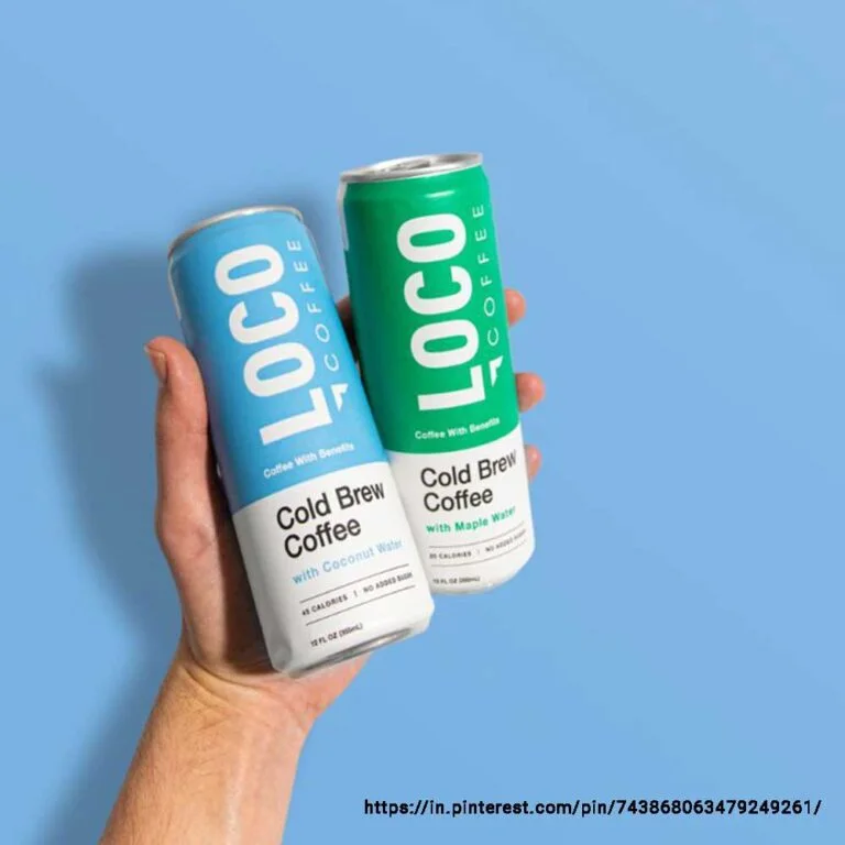
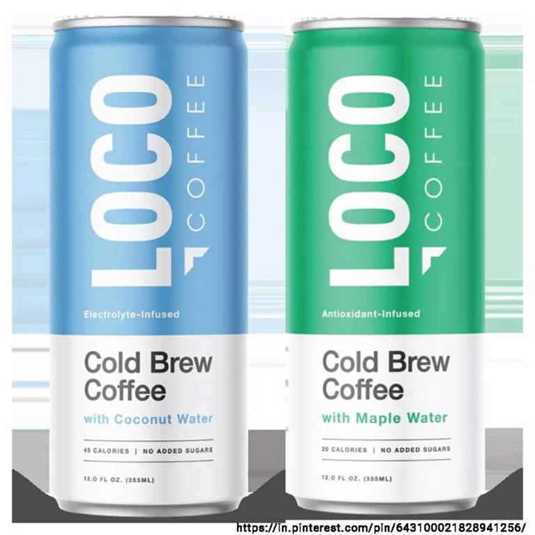
Coffee Packaging Design
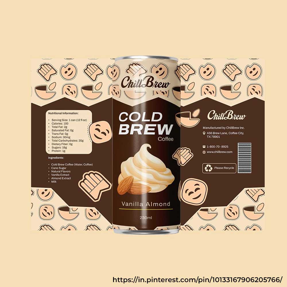
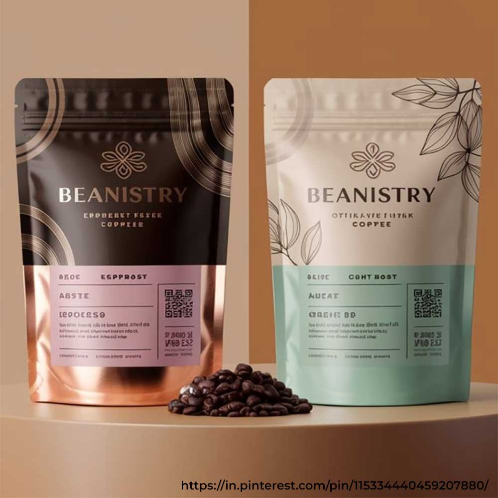
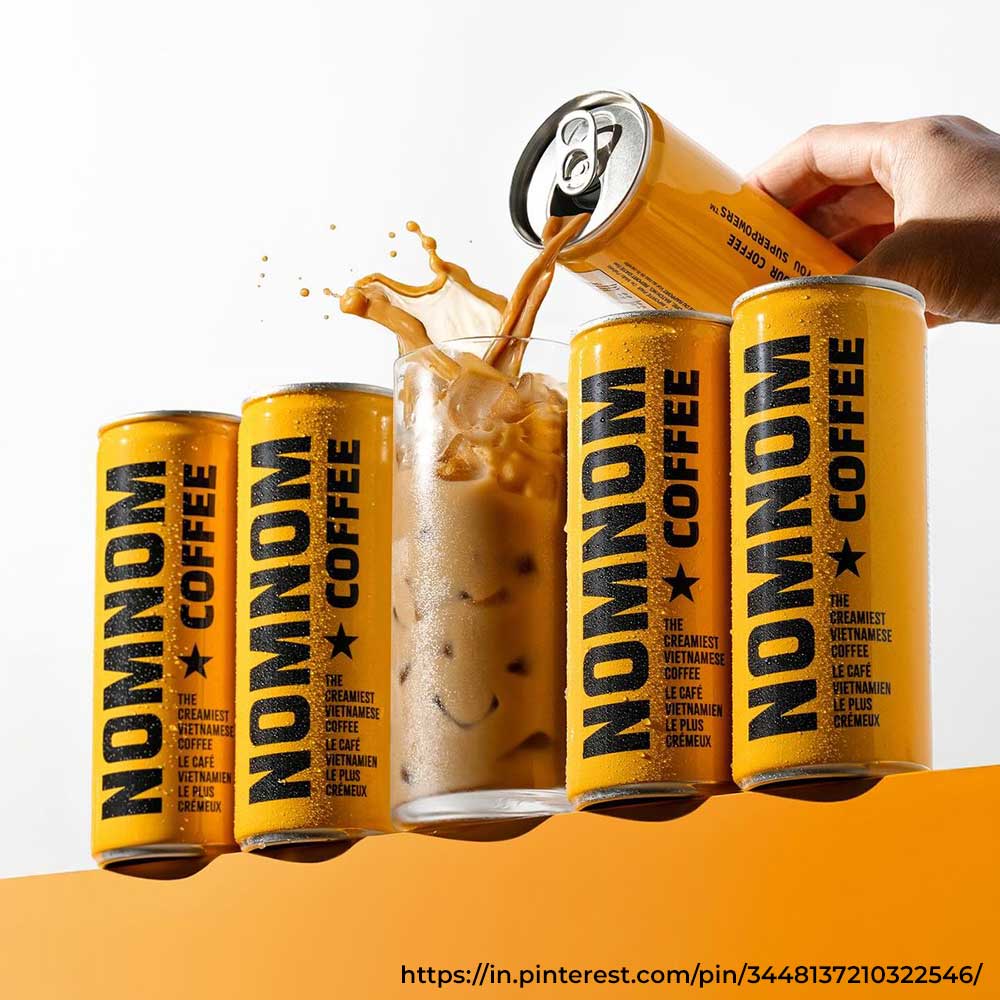
Coffee packaging design should appear premium, bold and confident — clean and exuding energy and trust. Colours should be inspired by the type of coffee: darker shades for cold brew, softer tones for milk coffee/latte. Use strong and clean typography. This beverage label design should clearly indicate strength, flavour, and lifestyle.
04 — The Agency AdvantageWhy Does Your Beverage Brand Need a Packaging and Label Design Agency?
Sure, you can make your packaging and label design work all by yourself, but the real magic happens when experts step in. An expert food and beverage packaging design agency can work to make your product hard to ignore. Here's why your beverage brand needs one.
Your Packaging Conveys Your Brand's Identity
Your beverage packaging and label design are an important aspect of your brand identity. When used strategically, it can effectively communicate your brand's personality, message, and values. A well-designed beverage packaging design can tell your brand's story at a glance, which helps connect and engage with your target customers. A creative agency knows exactly how to communicate through design — crafting a visual language that directly speaks and resonates with your audience.
Agency Experts Know the Trends and Even Set Them
Beverage packaging design trends continue to evolve. What was trendy a few years back may not be relevant today. A food and beverage packaging design agency keeps up with these changing trends and even sets them — helping you create timeless yet relevant designs that make your brand stand out, not blend in.
They Ensure Consistency Across Your Product Line
Do you have multiple product lines, such as protein water, energy drinks, and sparkling water? Though each product must have its own unique identity, it must also feel like it's part of your brand. A food and beverage branding agency can maintain consistency across your entire product line — both existing and new — ensuring each product appears unique while still carrying a cohesive brand identity.
You Need to Claim the Power of First Impression
A professional design agency understands consumer psychology and knows how to capture your audience's attention and make them buy your product. They know how to create a beverage label design or beverage can design that pops and wows while communicating your product's key information — it's more than looking aesthetically good; it's communicating everything people must know about your product in a split second.
An Agency Helps You Break into Niche Markets
Whatever niche market you are planning to target — eco-friendly, athletes, or another — your packaging and label design should be designed accordingly. A creative design agency can customise your beverage packaging design for these specific markets, ensuring a nuanced design that speaks and engages with your target audience.
Want a Winning Beverage Packaging Design? Talk to Our Packaging Experts.
Talk to ExpertsTake a Look at Some of Our Selected Projects
We have worked with beverage brands from India and internationally — across functional drinks, energy drinks, RTD beverages, and more. Here's a snapshot of four projects.
 View Case Study
Your Packaging and Label Design Is Something You Cannot Afford to Overlook.
DN Designs can help your brand not just stand out — but win minds, hearts, and shopping carts.