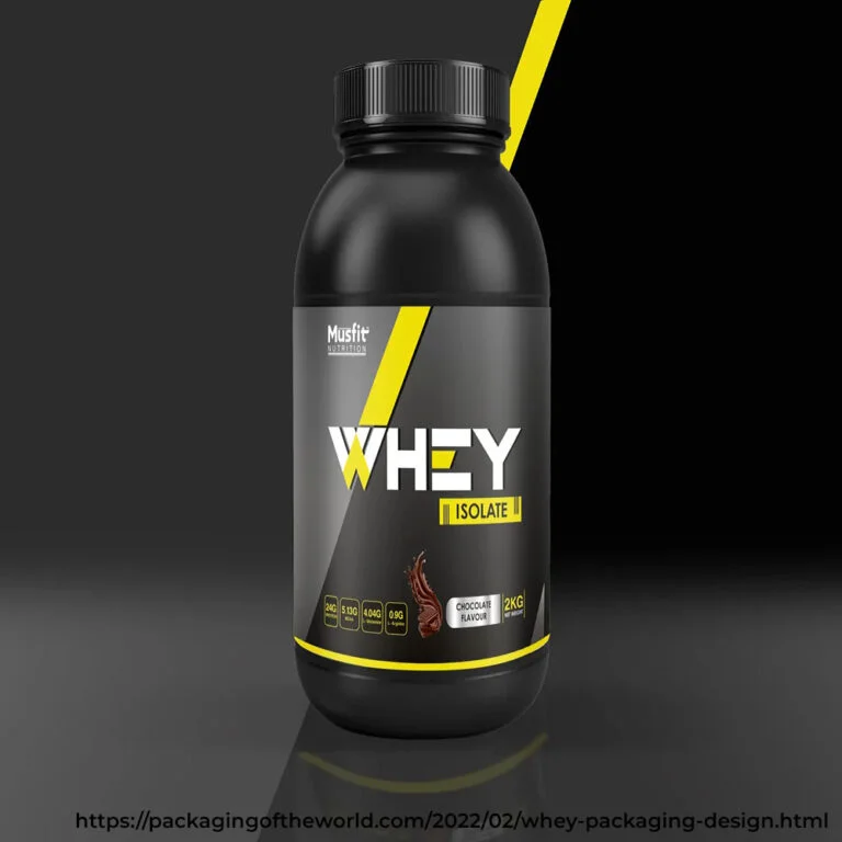
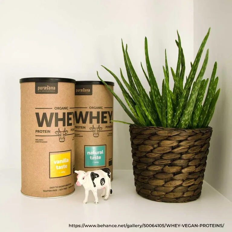
Critical Elements of Whey Protein Logo Design You Must Consider

Multiple factors must be considered to attract and retain your whey protein consumers in this fiercely competitive market. Some of these include:
Brand Value and Identity
Before you design your logo, it is indispensable to understand your brand identity. Who is your target audience — general fitness lovers, gym freaks, or bodybuilders? How are you positioning yourself as an economical or premium brand? Questions like these will help you contemplate your brand identity and resonate with your target audience.
Typography
The typography used in your whey protein logo design is as essential as aesthetics. Different typography speaks to other emotions. For instance, sans-serif fonts seem more approachable and modern, while serif fonts look more trustworthy. In whey protein design, sans-serif fonts are preferred since they communicate strength and stability, which are indispensable characteristics of the supplements.
Colour Palette
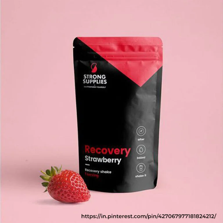
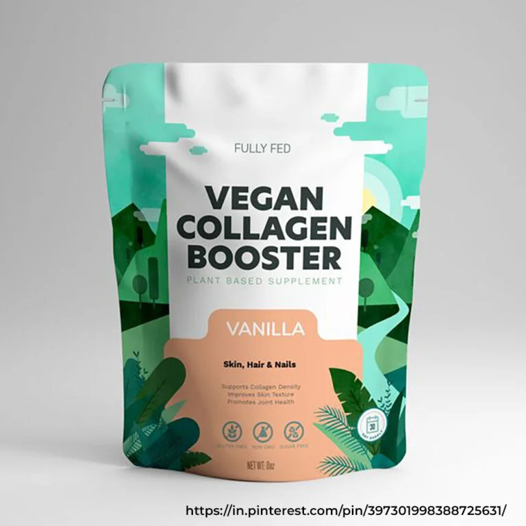
Colour psychology is an essential factor worth considering in your logo design. Red, black, or blue may be used for your whey protein packaging design since they imply energy, power, and trust. Even green is famous for brands that offer health-conscious whey protein. Choosing a colour palette that may resonate with your target audience is essential.
Simplicity
Simplicity is the key to whey protein or any other supplement design. A simple and clean logo is easily recognizable, more accessible to print, and versatile. Go for simple yet straightforward designs to ensure they work well on all platforms, whether it's your whey protein pouch design or your website.
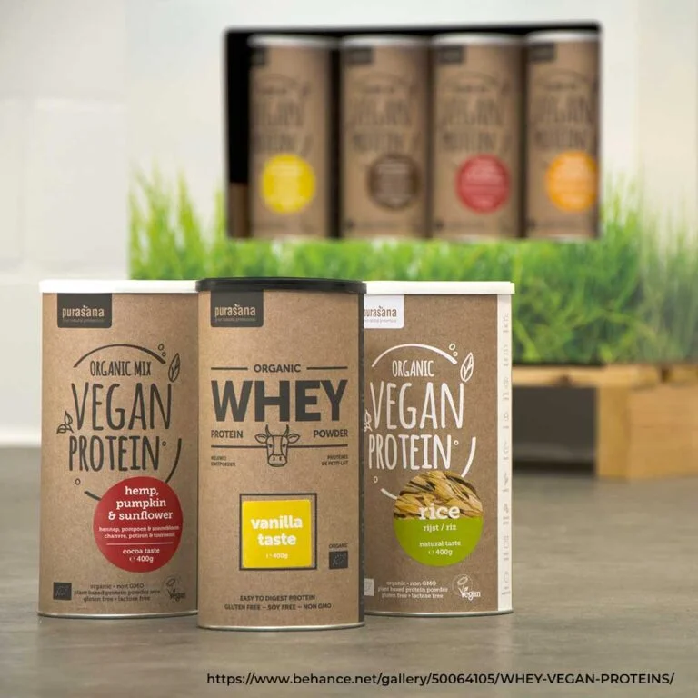
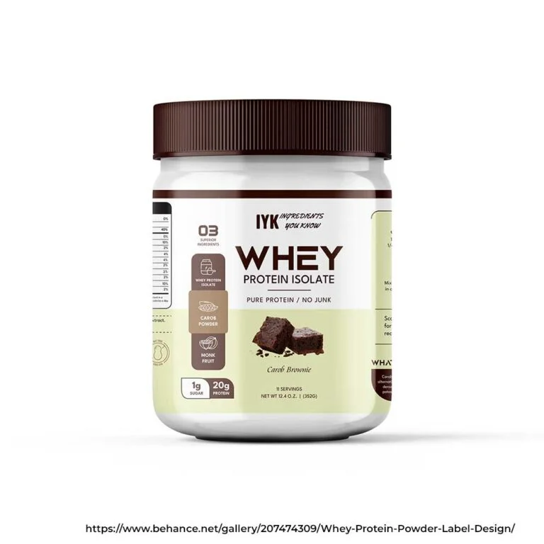
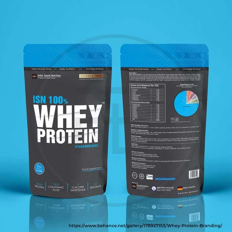
02 — Label DesignImportance of Whey Protein Label Design You Must Know About
After your logo design, consumers scan the label. A thoughtfully designed label grabs people's attention, communicates the product's information, and speaks to your brand identity. Multiple factors must be considered when planning your whey protein label design to make your product stand out.
Key Information Placement
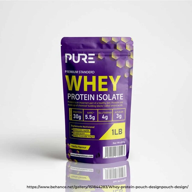
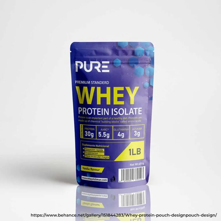
This is the most important part of your label design, precisely communicating your product's information. Key information placement includes your brand name and the product type, the ingredients used, their nutritional information, certifications like non-GMO and gluten-free, and the benefits.
The structure of your key information placement should be systematic and understandable so that a consumer can find the necessary information without getting overwhelmed. It would be best to make it easier for people to find the information they seek since this increases their chances of buying your product.
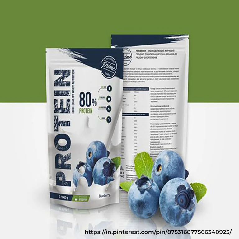
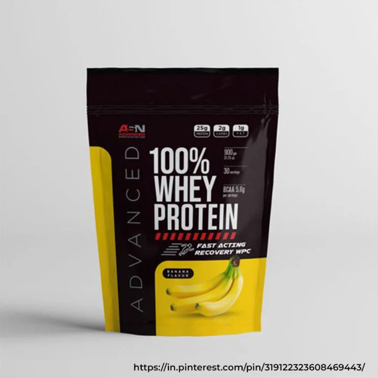
Visual Appeal
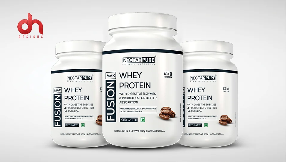
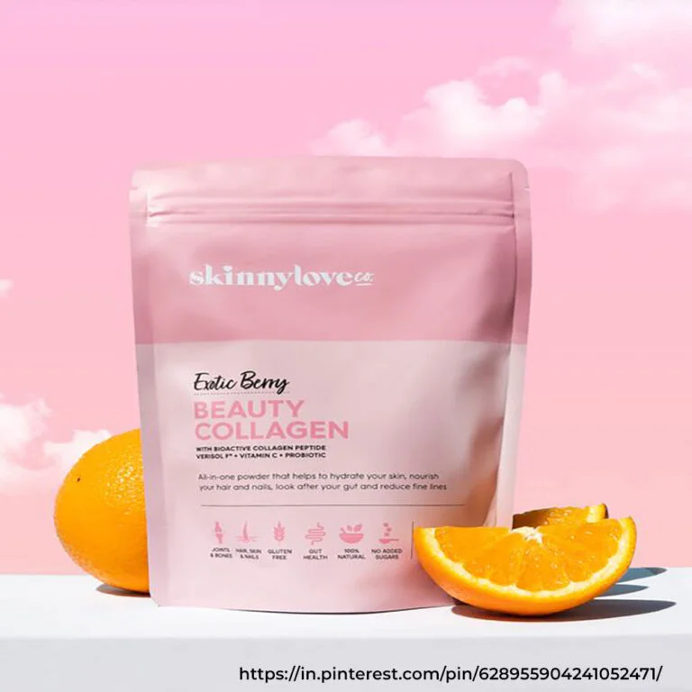
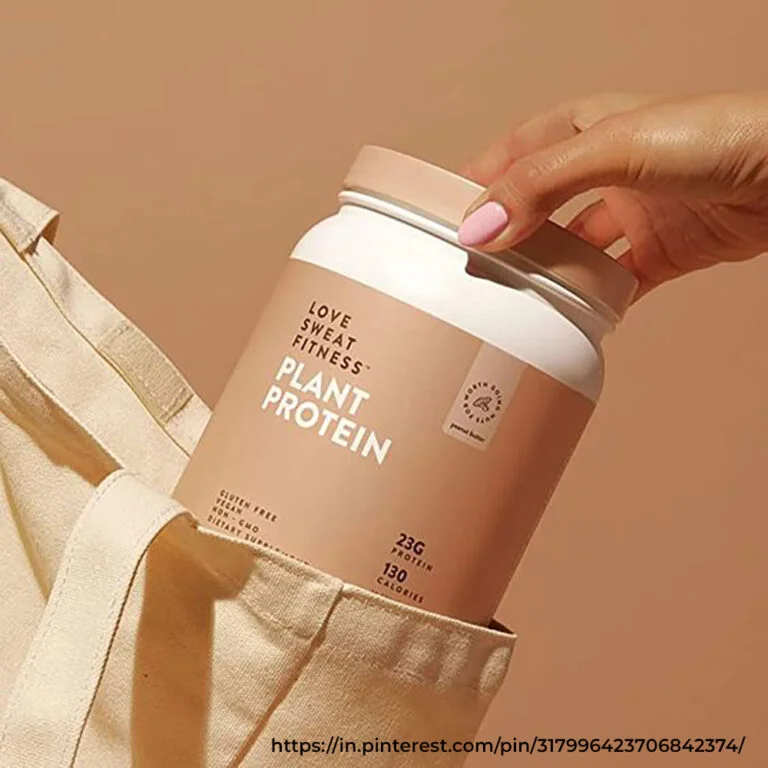
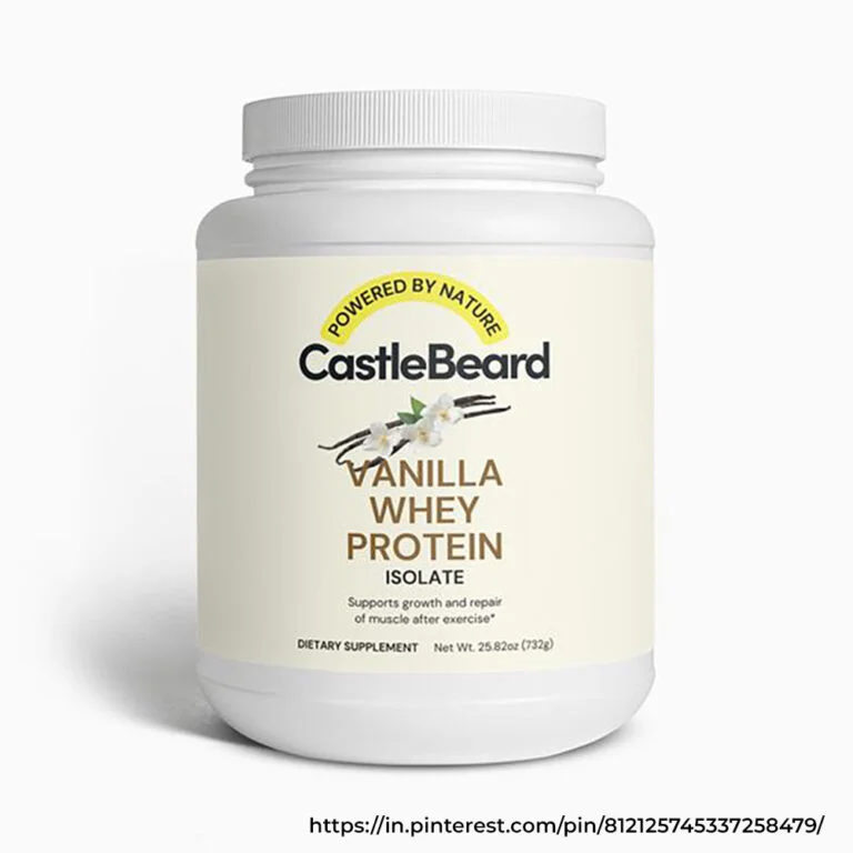
How your label design looks is as important as your logo's aesthetics. Your whey protein label design must have high-quality images, the right colour palette, and typography that speaks to your brand's message. If you're a premium brand, your packaging design must be clean, while if you offer an affordable whey protein, you may choose a bold design.
You may use icons like muscle or a scoop to subtly suggest what your product is about and who can consume it. This adds to the functionality of your whey protein packaging design.
Typography and Readability
The font used on the label significantly determines its readability. The nutritional value of the product must be clearly stated. You may use headings and subheadings to differentiate the text and make the information accessible.
The front of your whey protein pouch design should be left for the most critical information, such as the product name and tagline. The back can be kept for ingredients, nutritional facts, and usage guides.
Compliance and Regulations
These are crucial aspects of whey protein packaging since the supplement industry requires strict compliance regarding what information should be added to the label. Ensure your whey protein label design meets all health and safety regulations. These guidelines include certifications, ingredients, and allergens.
"In the supplement aisle, your label has three seconds to earn trust. Every element — from font weight to information hierarchy — either builds that trust or loses the sale."
DN Designs
Want Packaging That Stands Out in a Competitive Supplement Aisle?
Talk to Experts7 Key Whey Protein Label and Packaging Design Trends Shaping 2026
The supplement industry is highly competitive, and to make a place in it, you must connect with consumers and tell them why and how you are better than your competitors, building trust and loyalty. For this, you must keep up with the latest trends in whey protein powder packaging in 2026.
Minimalism is the Key
The most significant trend in whey protein powder packaging design is minimalism. Consumers nowadays are more drawn to clean designs that highlight crucial information. Minimalism in colour palette, typography, and layout often creates a sophisticated look. This trend is usually for health-conscious consumers who prefer a straightforward design presentation.
Because of this, brands are now moving away from complex and overly complicated designs to simple but impactful ones that are easy to recognise and remember. This approach to minimalism reflects professionalism and a modern brand image.
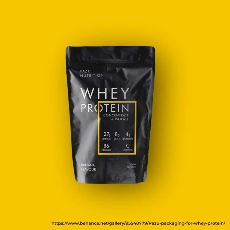
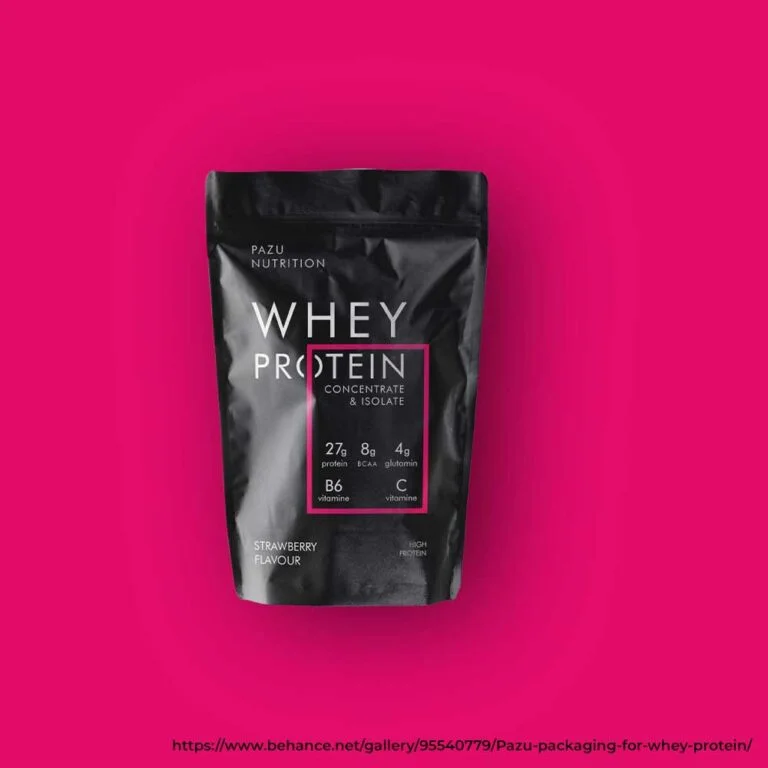
Bold Typography Means More Impact
When discussing whey protein label design, use bold typography and eye-catching fonts to get the spotlight. Clean yet large fonts often stand out in the product aisle and quickly communicate the product's unique selling propositions, like 100% Whey Isolate, high protein, and low sugar. This trend often goes hand in hand with minimalism since minimalist design with bold typography compensates for disproportionate graphics.
Adding a bold font to the design makes your brand look stronger and increases its chances of having a solid brand presence. Whether a modern font or sans serif, the right choice can convey strength and reliability that often appeal to fitness lovers.
Use Geometric Shapes and Lines to Speak Dominance
Geometric shapes and lines are becoming dominant in whey protein packaging design. These elements create a more organised and structured look to cater to the consumer's desire for clarity and simplicity. You may use geometrical patterns to convey important product information that quickly grabs consumer attention to the product certification or content.
In the context of whey protein logo designs, geometric shapes often create an innovative and timeless modern logo. No matter if it's sharp triangles or bold circles, geometric shapes maintain order and create consumer trust in the brand.
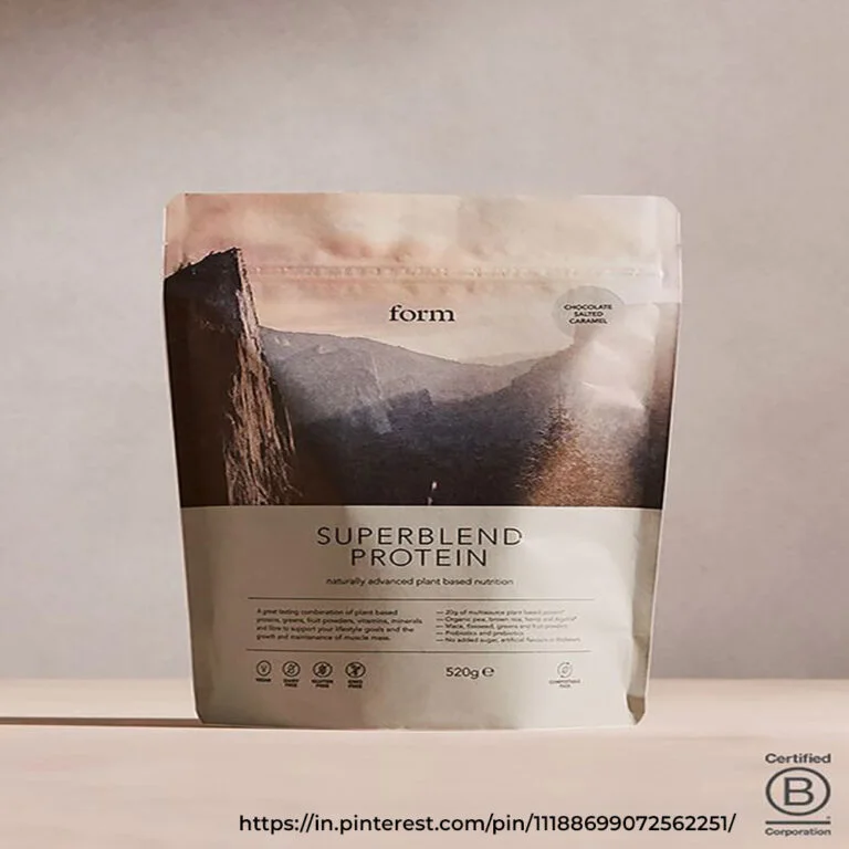
Keep the Spotlight on Health Visuals
Another trend worth discussing is health visuals that subtly indicate how the product can add to your health. Icons like a scoop, muscle, mountains, or fitness figures reflect health and strength. These visuals speak about the product's identity without adding too much to the design. All this eventually bridges the gap between your product's identity and the consumer health and fitness goals.
Go for High Contrast Colour to Grab Attention
Contrast and bold colours often grab more attention than subtle colours and create a lasting visual impact. Colour combinations like white and red, blue and black, and neon usually signal an energetic feeling.
Going for a high-contrast colour, even for your whey protein logo design, can make you stand out from your competitors. You may go for a two-tone design or a contrasting colour splash right behind your brand name to ensure your product is easily recognisable to your audience.
Storytelling is Still Important
Storytelling holds an important place in marketing and design. Customers now don't just look for a product but a resonating story. The storytelling in your whey protein powder design must surpass the functional aspect and also consider the emotional factor. Highlighting your commitment to quality, ethical sourcing, or the brand origin story will improve your narrative.
You may even add storytelling behind your logo design. For instance, logo design with natural elements that show the brand uses organic ingredients and stands by the highest quality builds trust. These types of logos better connect with the consumers.
Don't Forget About Transparency
Transparency is another significant trend in whey protein label design. However, transparency is not only limited to design but also messaging. With traditional visual design, your product design must provide precise information about the product's nutritional value and ingredients. Labels with semi-transparent or transparent elements like simple overlays and clear windows may help.
In the same way, logo design for whey protein, with simple symbols and no overcomplicated graphics, reflects authenticity and simplicity. Again, this trend applies to people who prefer brands honest with their product offerings.
04 — Final ThoughtsIn Summary
A thoughtfully designed whey protein logo and protein powder label design communicate brand value, attract your target audience, and build trust. Incorporate clear typography, a strong colour palette, and compliance-friendly layouts to create labels that stand out in the competitive whey supplement market.
At DN Designs, we help whey protein brands create packaging that attracts attention and inspires loyalty. Call us today at +91 94160 11100 to elevate your brand and make your whey supplements a consumer favourite.
Build a Whey Protein Brand That Wins Before the Lid Opens.
Let’s design packaging that stops the scroll, builds trust, and drives repeat purchase.
Frequently Asked Questions
What elements must be added to a whey protein logo to differentiate it from others?
Add fitness-related visuals and bold typography to make your whey protein logo design stand out. Choose colors like black, red, or green to resonate with your audience while keeping the design simple and versatile for use across your protein powder label design and supplement packaging.
How can I ensure my whey protein label design meets industry regulations?
Your protein powder label design should include ingredient lists, nutritional information, serving sizes, and essential health claims verified by regulatory bodies like FSSAI and the FDA. Staying updated with whey supplement packaging design regulations ensures compliance and prevents legal issues.
How can my whey protein logo and protein powder label design attract my target audience?
To make your whey protein logo and protein powder label design appealing, first understand your audience's preferences. Highlight key benefits like high protein content or natural ingredients to convey expertise, build trust, and create an attractive whey supplement packaging design.
What should be the ideal size of the logo in the whey protein packaging design?
The ideal logo size varies, but it should be easily recognizable without being overwhelming. Typically, logos are placed at the centre or top of the packaging to ensure their visibility.
How can I stand out with my whey protein label design?
Use a unique color palette and typography to make your product stand out and showcase its premium ingredients. Simple, clever, and eye-catching designs give consumers a compelling reason to choose your product over competitors.