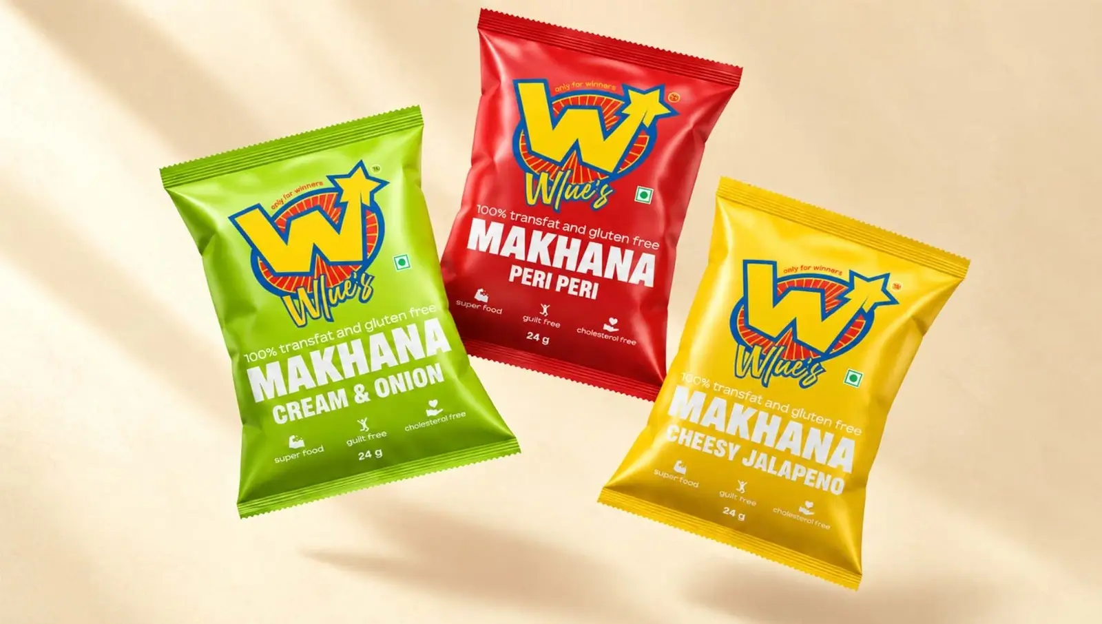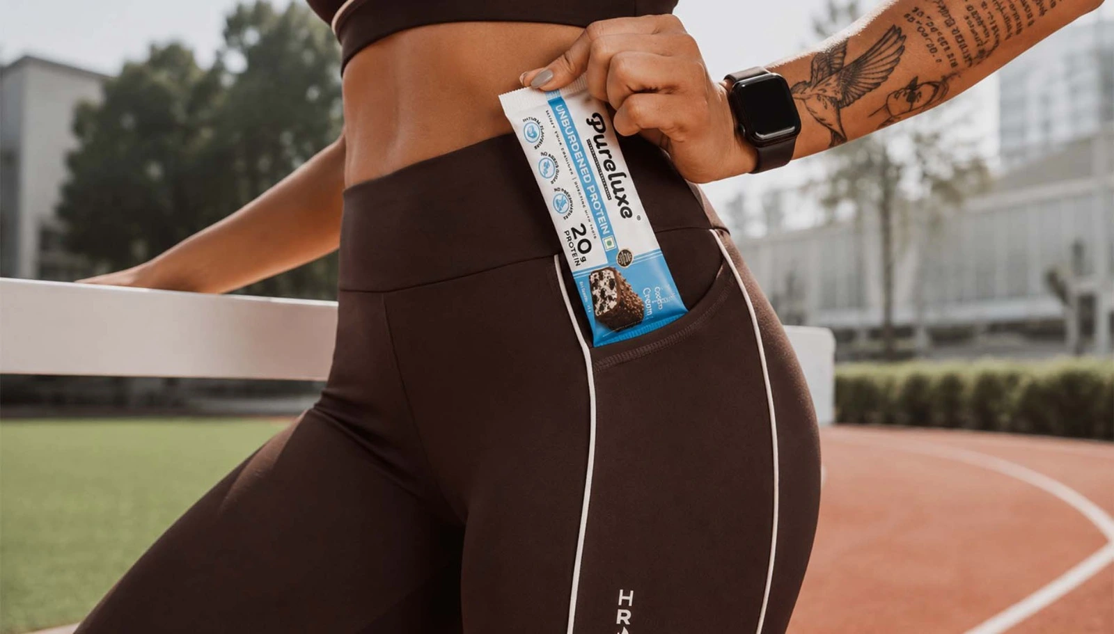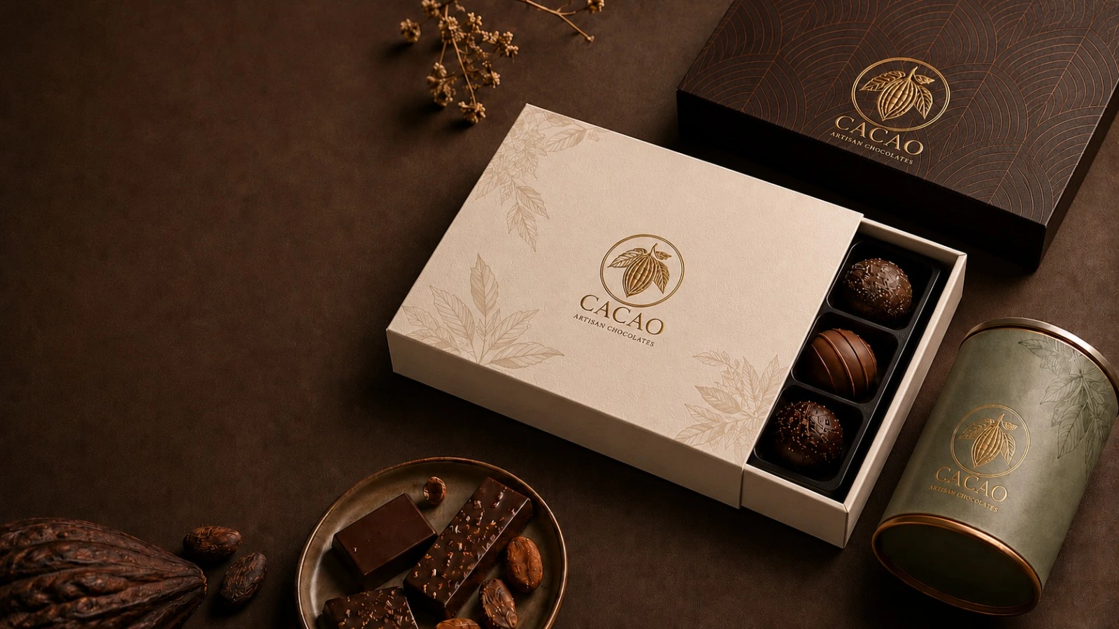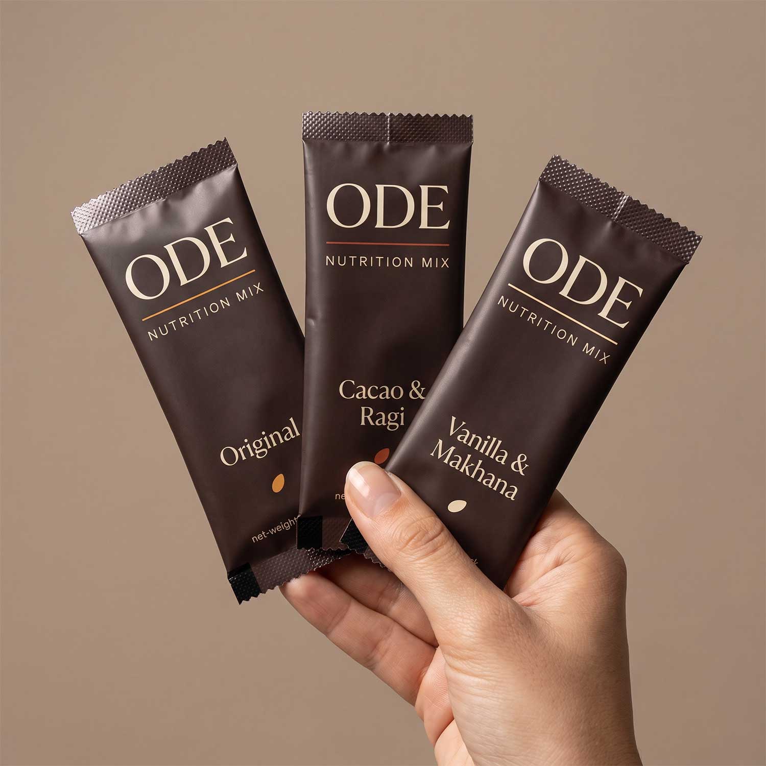
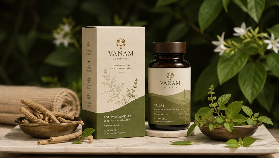
The Product Isn't the Problem. The Shelf Story Is
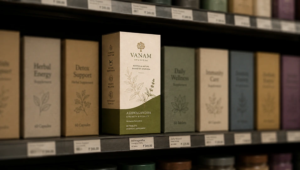
Ayurveda sells trust before it sells anything else. A buyer standing in front of a shelf or scrolling past a hundred product cards is making a snap decision about whether this brand understands the tradition it's borrowing from or not.
Cheap packaging says one thing loudly: this brand didn't think this through.
And if a brand didn't think through the box, the customer assumes it didn't think through the formula either.
Unfair? Maybe. But that's how people shop.
A few things buyers are silently judging in under three seconds:
- Does this look like a real ayurvedic product or a generic supplement wearing ayurvedic branding?
- Is the label design legible, or is it trying too hard with gold foil and Sanskrit fonts?
- Does the packaging match the price point it's asking for?
- Is it trustworthy enough to put it in body?
That last one is the whole game.
Ayurvedic product packaging design isn't decoration. It's the first ingredient list a customer reads, even before they read the actual ingredient list.
02 — The FunctionSo What Does Good Ayurvedic Packaging Design Actually Do
Let's get specific, because "make it look premium" is advice that helps nobody.
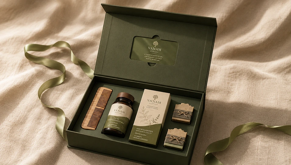
Strong ayurvedic packaging designs work on three levels at once.
They signal authenticity without leaning on cliches
Turmeric-orange gradients and lotus motifs were fresh a decade ago. Now they read as stock. A brand that wants to stand out needs visual language rooted in the actual ingredient story, not the category's default aesthetic.
They carry information without becoming cluttered
This is where ayurvedic label design gets tricky. There's dosage, ingredients, certifications, usage instructions, sometimes Ayush licensing details. Cramming all of it onto a small label while keeping it clean is a real design skill, not an afterthought.
They build a shelf system, not a single SKU
One good box is easy. A packaging family that scales across ten SKUs, stays recognisable and still lets each product breathe on its own, is where most in-house attempts fall apart.
We've watched founders spend two years perfecting a formula and two weeks on the box that's supposed to sell it. The maths never works out in their favour.
03 — The PayoffAnd Where Strategic Ayurvedic Packaging Design Delivers
Let's talk numbers for a second, because pretty packaging that doesn't convert is just an expensive hobby.
Premium ayurvedic packaging design earns its cost back in a few concrete ways:
- Higher perceived value lets brands price closer to what the formulation is actually worth, instead of competing on discount.
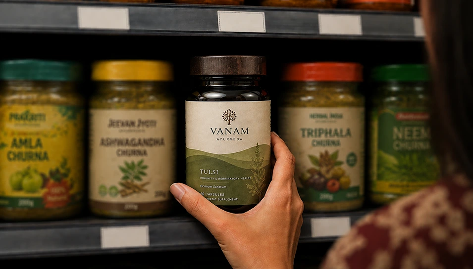
- Better shelf pickup rate in retail, because design is doing the job a salesperson would do in-store.
- Lower return rates online, since accurate, well-designed labels reduce confusion about what the product actually does.
- Stronger repeat purchase because a well-designed unboxing experience reinforces the trust that got the first sale.
None of this is theory. It's the difference between a product that gets tried once and one that gets restocked.
04 — By CategoryAyurvedic Packaging Looks Different Depending on What's Inside
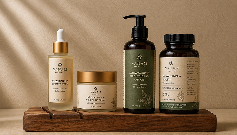
Ayurveda isn't one category on a shelf. It covers skincare, haircare, and medicinal or healing products, where the packaging, sometimes searched for as herbal packaging design, has to flex differently for each one.
Skincare
Skincare needs a softer, sensorial design language. Texture, colour, and ingredient story matter more here, because the product is competing on a vanity shelf, not a medicine cabinet.
Haircare
Haircare leans bolder and more claim-led. Bottles are handled roughly, live in humid bathrooms, and need packaging that survives daily wear without losing shelf presence.
Medicinal and Healing Products
Medicinal and healing products carry the heaviest compliance load. These fall under the Ministry of AYUSH and the Drugs and Cosmetics Act, which means labels legally need accurate dosage, ingredient, and therapeutic claim details, not just good visual design.
Skincare and haircare products, classified as cosmetics, don't carry the same regulatory weight unless they're being exported. That gap is exactly where ayurvedic medicine label design gets strict fast.
A brand that runs the same packaging formula across all three usually undersells at least one of them. What reads as premium in a skincare serum can feel wrong in a medicinal syrup, and what works for a haircare oil often looks under-designed on a skincare line.
Knowing which category a product sits closest to before the design work starts is what keeps ayurvedic and herbal packaging design decisions sharp instead of generic.
05 — What Goes WrongAyurvedic Product Packaging Design Mistakes That Quietly Kill Conversion
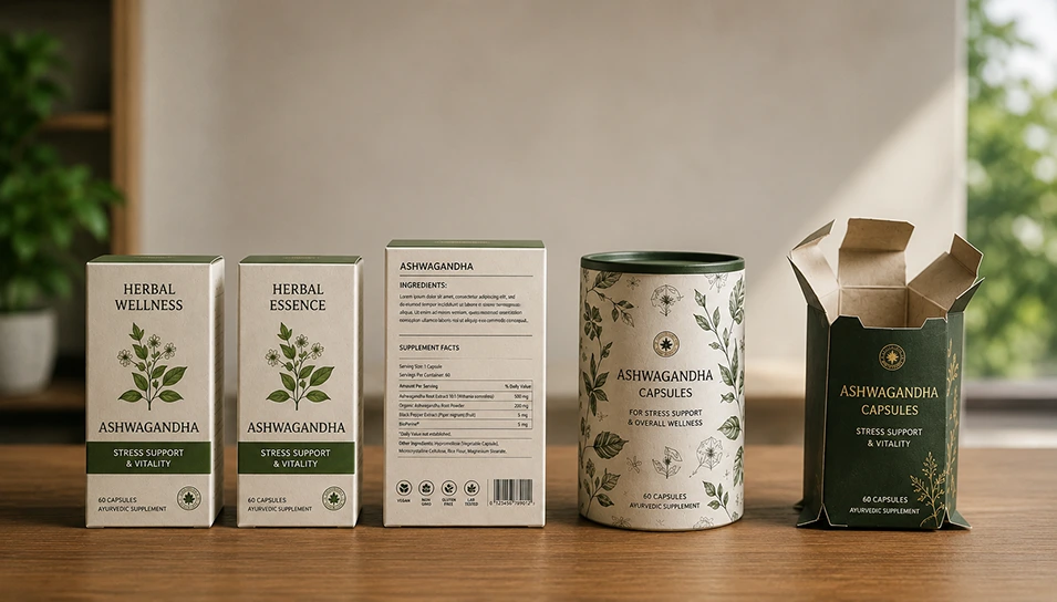
A few patterns show up repeatedly when brands try to handle packaging in-house or hand it to whoever's cheapest.
- Copying a competitor's look almost exactly, then wondering why buyers can't tell the two brands apart on a crowded shelf.
- Prioritising the front panel and ignoring the back, even though ingredient transparency is often what closes the sale for a first-time ayurvedic buyer.
- Using stock illustrations of herbs instead of photography or illustration tied to the actual sourcing story.
- Skipping structural testing, so a box that looks great in a render turns out flimsy or hard to open in someone's hands.
Every one of these is fixable. None of them gets caught by a Canva template or a generic freelancer working off a brief with no category context.
06 — The First StepSo, Where Do You Actually Start
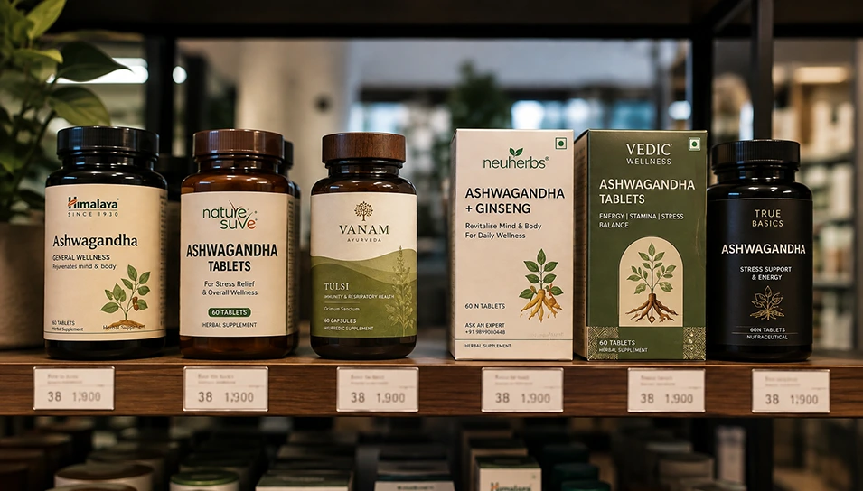
If you're staring at your current packaging wondering whether it's the reason growth has stalled, start here.
- Audit what's already on the shelf: Photograph your product next to five competitors. Look at it the way a first-time buyer would, cold, with no context.
- Get honest about your label: Is someone squinting to find the dosage information? That's a design failure, not a customer's patience problem.
- Decide what tier you're actually competing in: Mass-market, mid-premium, or genuinely premium ayurvedic. Packaging decisions change completely depending on the answer.
- Bring in ayurvedic packaging design agency support before your next print run, not after a bad one. Reprints are expensive. Getting label design and structural packaging right the first time isn't.
What an Ayurvedic Packaging Design Agency Actually Does
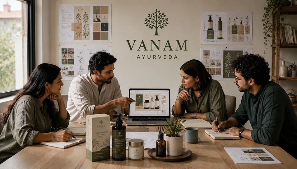
A lot of founders picture an agency as "the people who make it pretty." That's maybe 20% of the job.
Here's the fuller picture of what an Ayurvedic packaging design agency actually handles:
- Category research: studying what's already crowding the shelf so your brand doesn't accidentally blend into it.
- Structural packaging: box formats, unboxing sequence and tactile material choices that match the price tier.
- Label architecture: organising ingredients, claims, certifications, and dosage info so the label design work stays legible under regulatory constraints.
- Brand system building: creating a visual identity that scales across your whole SKU range, not just the hero product.
- Print production guidance: foiling, embossing, and vendor coordination so what's approved on screen actually looks right in hand.
That last point trips up more brands than you'd expect. A design can look flawless in a mockup and fall apart the moment it hits print run, with the wrong paper stock or a foiling process the printer can't actually execute cleanly.
This is the difference between working with an ayurvedic product packaging design agency and hiring a freelancer off a marketplace. An agency carries the process from concept through to the physical product landing in a customer's hand, including working on the mistakes that only show up at the production stage.
08 — Work With UsHow DN Designs Approaches Ayurvedic Packaging Design
DN Designs adopts a blend of strategic and creative approaches when designing the product packaging for ayurvedic and herbal wellness brands. That focus shapes every step of the process.
- Shelf-first, not mood-board-first: We map where your product actually sells: retail, quick commerce, or D2C, before a single concept gets drawn.
- The label does two jobs at once: An Ayurvedic product label has to satisfy compliance and still win the shelf in under three seconds.
- Systems, not single packs, boxes or cans: Packaging built to scale across your full SKU range from day one.
- We stay through production: Paper stock, foiling, print vendors, so what's approved on screen is what customers actually hold.
If your formulation is solid and sales still feel like an uphill push, the packaging is worth a hard look.
Ready to Build Ayurvedic Packaging That Earns Trust in Three Seconds?
Talk to DN DesignsIn the End - Packaging Isn't a One-Time Decision
Good ayurvedic product packaging design isn't a project you finish and file away. It's a system that has to hold up as the brand grows, with new SKUs, new markets, tighter regulatory requirements and more competition fighting for the same shelf space. Brands that stay ahead build packaging designed to flex with that growth, not fixed assets that quietly fall behind while everything around them moves.