
Why Packaging Design Decide Online GTM Success
A go-to-market (GTM) strategy covers who the product is for, where it is sold, how it is priced and how it reaches shoppers. Online, most of that plan meets the consumer through two things: the pack and the listing.
In a physical store, a shopper can pick up the product, read the back, and see it at full size. A salesperson or a shelf display may explain the range. On a digital shelf, none of that exists. The product image has to identify the brand, the title has to confirm the variant and size, and the listing has to answer the questions the shopper would otherwise ask in person.
This is why good positioning can still underperform online. If the pack doesn't communicate the positioning at small sizes, or the listing describes a different variant from the one in the image, the shopper simply picks the next option. The rest of this guide focuses on getting those two things right, then covers the commercial and operational work they depend on.
02 · ChannelsQuick Commerce Vs E-Commerce: What Each Channel Asks Of Your Brand
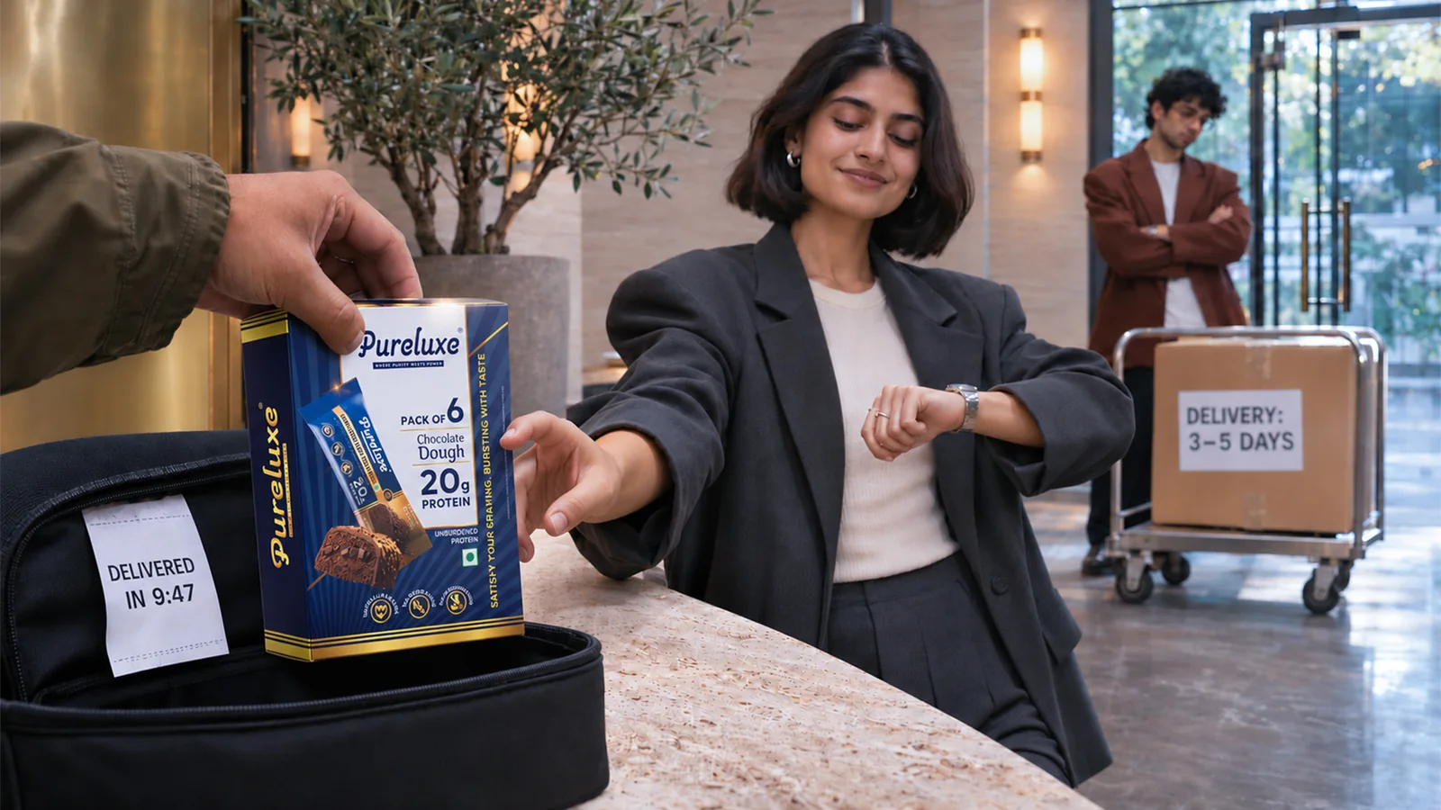
Quick commerce (Blinkit, Zepto, Swiggy Instamart) and e-commerce marketplaces (Amazon, Flipkart) both sell online, but they put very different demands on your packaging and listings.
| Factor | Quick commerce | E-Commerce |
|---|---|---|
| Why people shop | Immediate need, top-ups, impulse | Planned purchases, comparison, replenishment |
| Time spent per product | Seconds; often decided from the grid | Longer; shoppers open listings, read reviews |
| Screen space | Small tiles, several products per screen | Larger images, image galleries, long descriptions |
| What the main image must do | Identify brand, variant and size instantly | Earn the click, then support the full story |
| Assortment that works | Hero SKUs, popular variants, single packs | Full range, multipacks, bundles, gift sets |
| Where the story lives | Mostly on the pack itself | Pack, secondary images, description, reviews |
In practice, this means quick commerce rewards packaging that does the selling on its own, while e-commerce gives you room to explain. A beverage brand might list its two best-selling flavours in single cans on quick commerce, and its full range plus a mixed 12-pack on Amazon.
Should you launch on both? Not necessarily. Quick commerce depends on stocking dark stores city by city, so it suits brands that can keep inventory moving reliably. E-commerce reaches more pin codes with less inventory commitment per location. Many brands start where their operations are strongest and add the second channel once demand and supply are predictable.
03 · Thumbnail TestThe Thumbnail Test: How Your Pack Performs On A Digital Shelf
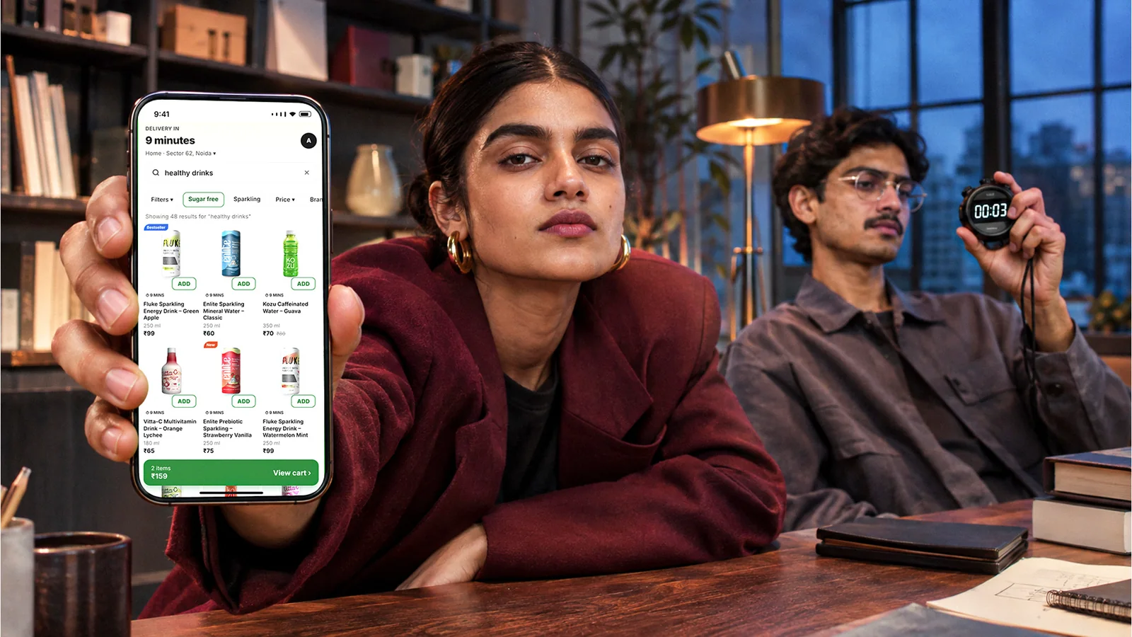
The quickest way to judge whether your packaging is ready for online retail is to see it the way shoppers do: small, and surrounded by competitors. It takes ten minutes and needs nothing more than a screenshot.
How to run it
- Open the quick-commerce app your customers use and search for your category.
- Screenshot the results grid.
- Place your pack image, at the same size, among the four or five products nearest to yours in price.
- Show the screenshot to someone who doesn't know your brand for three seconds.
- Ask them four questions: Which brand is this? What is the product? Which flavour, variant or size? Why would you pick it?
If they can't answer the first three without zooming in, the pack needs work before the launch campaign does.
Where packs usually fail
- The logo disappears. Thin typefaces, low-contrast colours or a small logo placed at the edge vanish at thumbnail size.
- The variant is unreadable. Flavour names in small type, or variants that differ only in a minor colour shift, look identical in a grid.
- Too many claims compete. Five badges on the front of the pack become visual noise. At small sizes, one clear benefit beats five small ones.
- The pack blends into the category. If every competitor uses the same colour cues, following them makes you invisible.
- The image doesn't match the real pack. Renders with exaggerated colours or outdated designs confuse shoppers when the delivered product looks different.
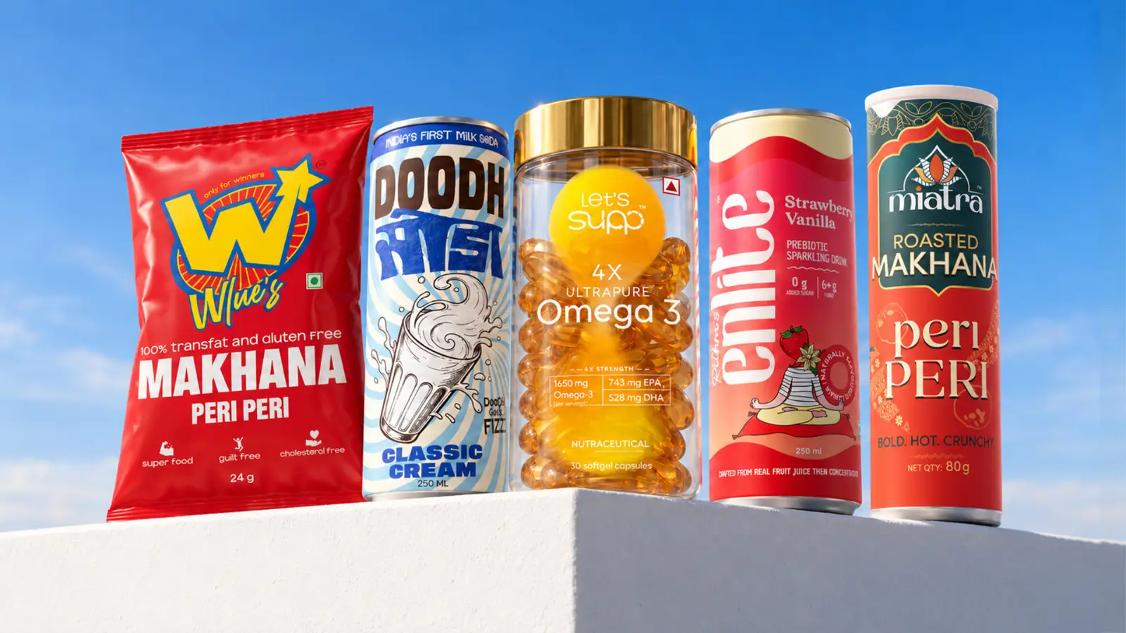
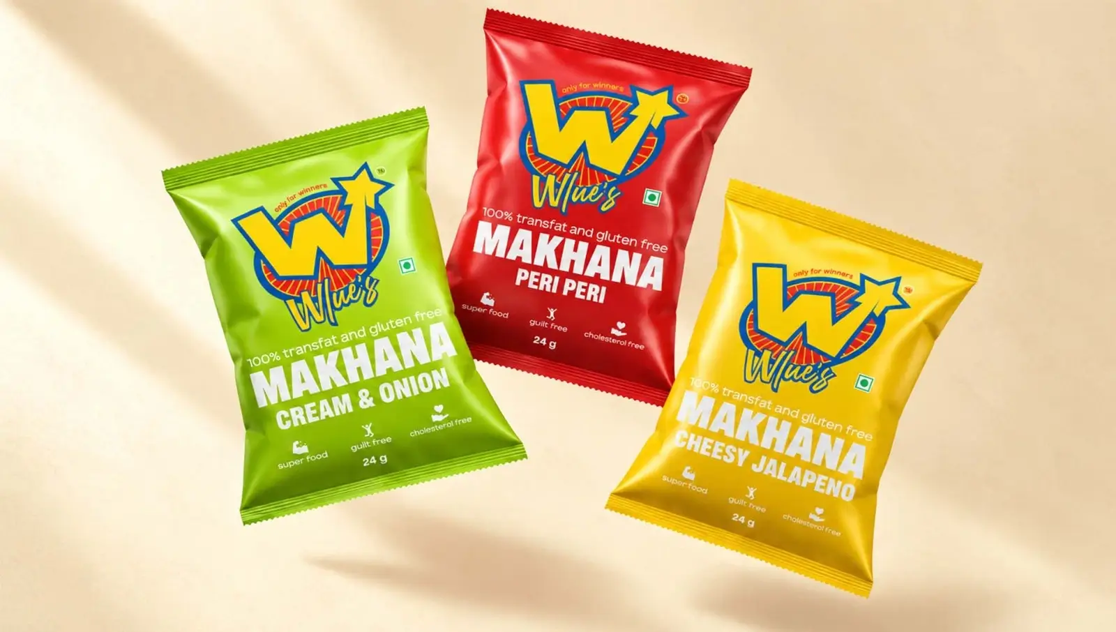
Breaking category cues is often the fastest way to stand out. When makhana brand Wlue's came to us, most makhana packs leaned on heritage and Ayurveda. Wlue's wanted to sell makhana to Gen Z as a fun, modern snack, so we built a retro superhero identity, a star-led logo and bright, colourful packs for its three flavours: Cheesy Jalapeño, Cream & Onion and Peri Peri. Next to the earthy, traditional packs common in the category, it is hard to miss.
04 · Packaging SystemsDesigning A Packaging System For Multi-SKU Ranges
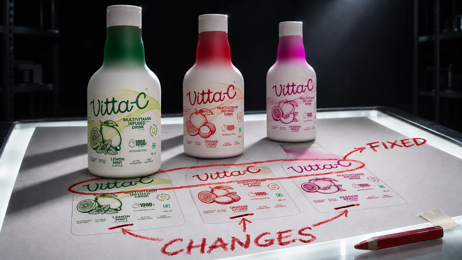
Most FMCG brands don't sell one product. They sell three flavours in two sizes, or a skincare range of six products. On a digital shelf, those SKUs often appear side by side, so the packaging has to do two jobs at once: make the range look like one brand, and make each product easy to tell apart.
The way to manage this is a packaging system: a set of rules that decides which elements stay fixed across the range and which change.
| Fixed across every SKU | Changes by variant |
|---|---|
| Logo, its size and position | Primary colour or colour band |
| Typeface and type hierarchy | Variant name |
| Layout grid and pack structure | Ingredient or flavour illustration |
| Brand colour or signature graphic element | Key benefit, where it differs |
| Front-of-pack information order | Size or count callout |
When the fixed elements are consistent, shoppers recognise the brand from across the grid. When the variable elements are distinct and repeated in the same place on every pack, they find the right SKU without reading.
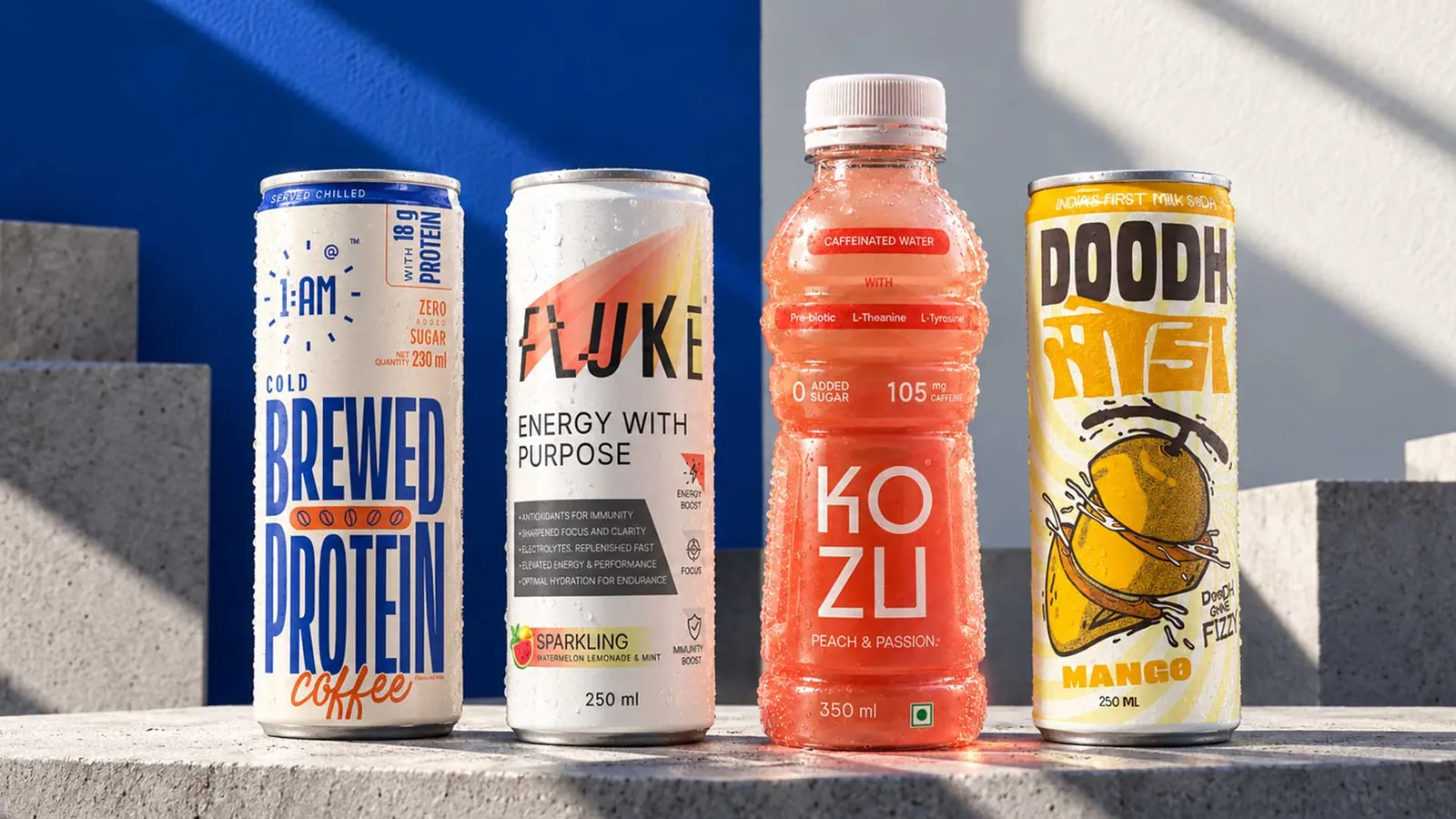
How 1 AM does it. For canned cold coffee brand 1 AM, we built one system across five SKUs: Brewed Protein, Classic Cold and three lactose-free variants (Classic, Hazelnut and Mocha). The wordmark, typefaces and layout never change. Each variant gets one colour of its own, from teal-and-cream for Lactose-Free Classic to deep purple for Hazelnut, and a vertical flavour badge in the same spot on every can. The key benefit, such as "Lactose Free" or "Brewed Protein" with its 18 g of protein, is set in oversized type so it reads before anything else.
Getting the variant signals right
- Use colour as the main variant cue, and test that each colour stays distinct at thumbnail size and in grayscale.
- Keep variant names short and in one consistent position. "Peri Peri" in a fixed spot beats a different layout on every pack.
- Standardise naming before you design. Decide whether you'll say "Mango" or "Alphonso Mango", "100 g" or "100g", and use it identically on pack and listing.
- Make sizes obvious. A 50 ml trial pack and a 200 ml full size shouldn't look like the same product in a thumbnail.
Let positioning shape the system
The system should also express where the brand sits. For functional beverage brand Fluke, aimed at a young, health-conscious audience, we kept the can clean and premium: a white background that gives the logo and functional benefits room, with each flavour signalled by an accent colour behind the logo.
Doodh Soda, India's first milk-based soda, called for the opposite: a bold identity and playful packaging with unapologetically desi, fizzy energy. When a product is new to its category, the pack also has to tell shoppers what it is before it can tell them why to choose it.
The two look nothing alike, but they pass the same test: recognisable brand, distinguishable variant, clear reason to choose.
05 · ListingsProduct Listings That Match The Pack
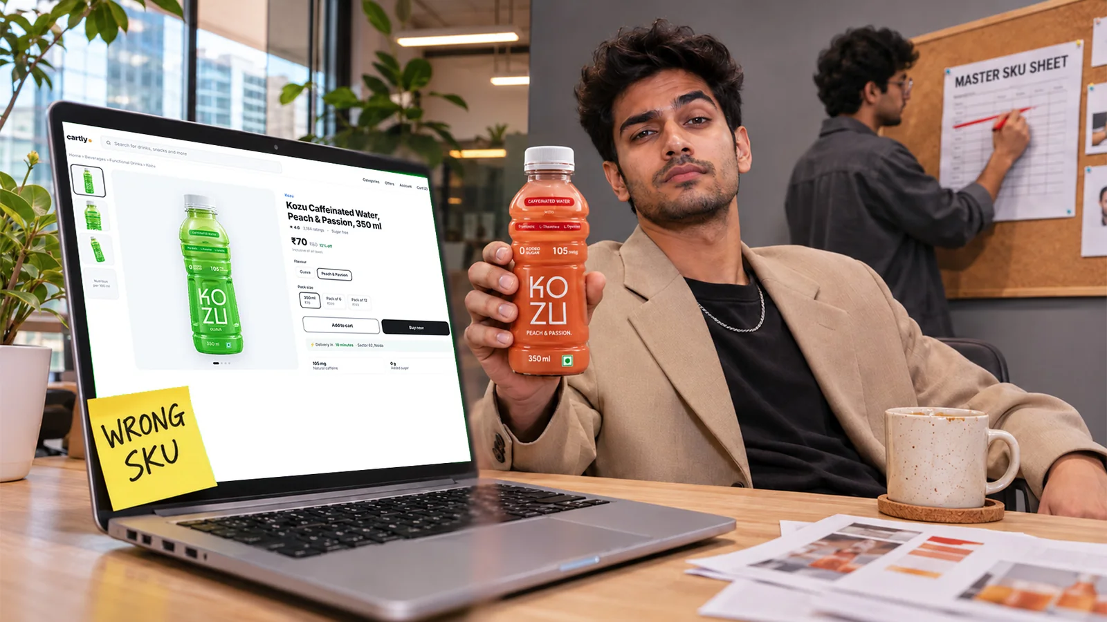
The pack earns attention; the listing confirms the decision. Each platform has its own image and content guidelines, so check them before you shoot or write, but the principles below hold across all of them.
Quick commerce: make the grid decision easy
- Hero image: the actual front of pack, straight on, on a clean background, filling the frame. No lifestyle scene as the main image, and no render that differs from the pack customers receive.
- Title structure: Brand + Product + Variant + Size, in that order, for example "(Brand) Roasted Makhana, Peri Peri, 75 g". Shoppers scan titles to confirm what the image suggested.
- Secondary images, where the platform allows: back of pack with ingredients and nutrition, a size or scale reference, and one image with the key benefit in large text.
- Short descriptions: two or three lines on what it is and why it's different. Detail belongs on e-commerce.
E-commerce: tell the full story
- Titles with search terms shoppers use, such as category and key attributes, without stuffing keywords.
- An image gallery that answers questions in order: front of pack, back of pack, product in use, size reference, key benefits, and how it compares within your range.
- Accurate details: ingredients, directions, shelf life, storage, net quantity and variant, all matching the pack exactly.
- Enhanced content where available, such as A+ content on Amazon, to explain the brand and the range.
- Reviews and Q&A: respond to questions and use recurring ones to improve the listing.
On your own D2C website, category pages, product schema, internal links and helpful content support organic discovery beyond the marketplaces.
Keep every SKU mapped correctly
For ranges with similar-looking packs, mismatches are common: the Peri Peri image on the Cheese listing, or the 200 g weight on the 75 g pack. Build a single master sheet with every SKU's name, size, barcode, image files and description, and use it for every platform. The pack, image, title and description should always describe the same product.
06 · GroundworkThe Commercial And Operational Groundwork
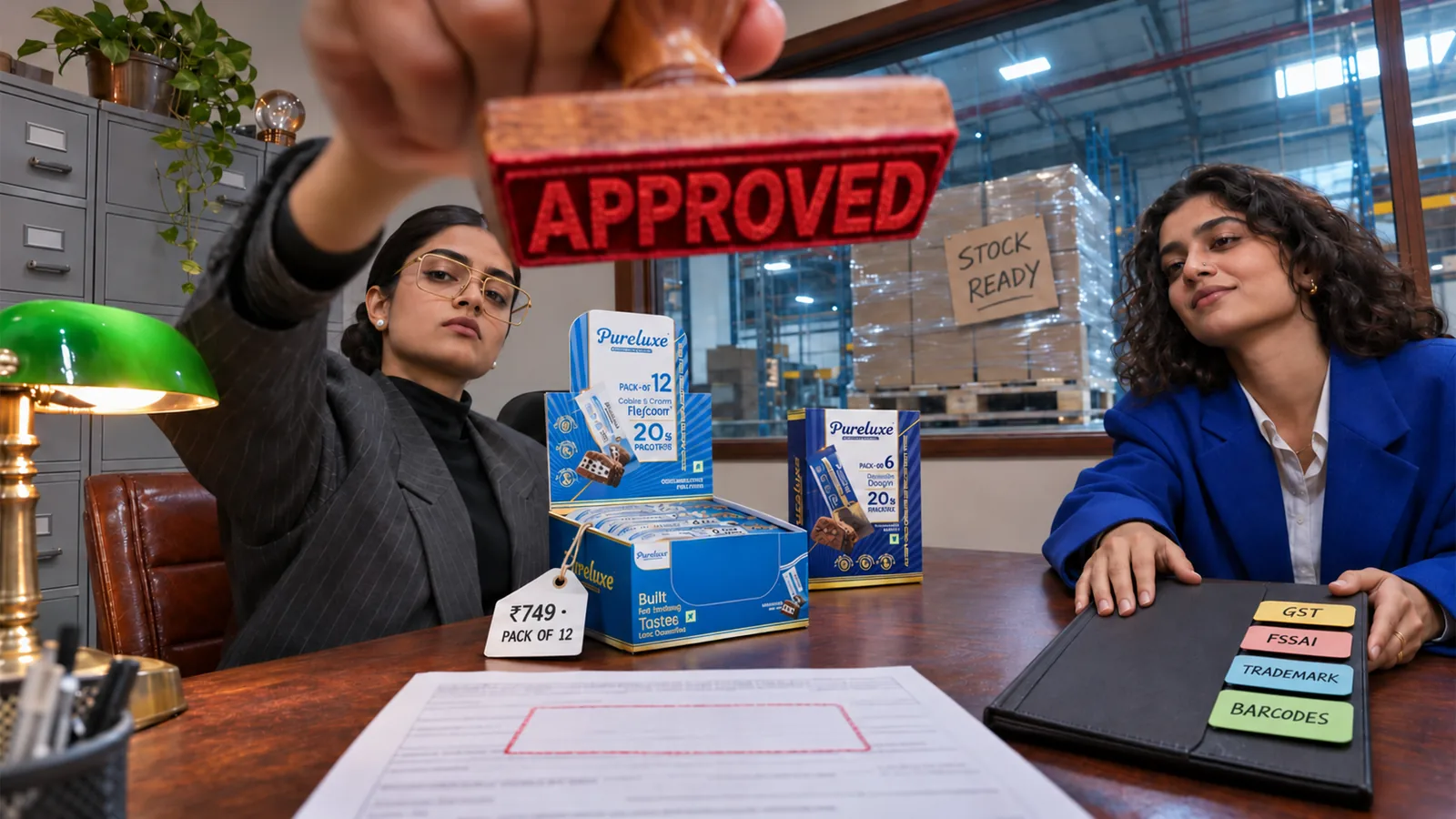
Strong packaging and listings only pay off if the product is priced to make money, approved by the platform and in stock when shoppers look for it.
Pricing and pack sizes
Build your price from the full cost of selling on each channel, not just manufacturing. Include packaging, freight to warehouses or dark stores, platform commissions or margins, advertising, promotions and returns. A price that works on your D2C site may lose money on a quick-commerce shelf.
Pack sizes can do some of the pricing work. Smaller single packs suit quick commerce, where shoppers buy for now. Multipacks and value packs suit e-commerce, where shoppers plan ahead. Use introductory offers to drive trial, but keep them time-bound: a premium brand that is always discounted stops looking premium.
Getting listed
The routes in are different on each type of platform.
E-commerce marketplaces (Amazon, Flipkart) have self-serve seller registration. You create an account, complete KYC, and list products yourself.
Quick-commerce platforms (Blinkit, Zepto, Swiggy Instamart) generally work through an application and a review by a category team, followed by a commercial negotiation. Distributors can also list products on a brand's behalf with a brand authorisation letter.
Quick-commerce category teams assess more than the paperwork. Category fit, price point, supply reliability and packaging suitability can all influence approval.
Documents to prepare in advance
- GST registration and company PAN.
- Bank account details.
- Trademark or brand ownership documents, or a brand authorisation letter for distributors.
- FSSAI licence or registration for food and beverage products, covering every category you plan to sell.
- Barcodes, MRP, net quantity, shelf life and storage instructions for every SKU.
- Approved pack images and product information from your master SKU sheet.
Requirements change and differ by platform and category, so confirm the current list with each platform before applying.
Inventory and availability
Quick commerce runs on stock held in dark stores close to customers, so availability is decided city by city and store by store. A campaign that sends shoppers to a product that shows "out of stock" in their area wastes the spend and frustrates the customer.
Before launch, confirm which cities and stores will carry the product, how much stock each needs, and how quickly you can replenish. Starting in one or two cities you can supply reliably is usually better than a thin national launch.
07 · LaunchLaunching And Measuring

A launch needs one clear objective. Driving trial of a new brand, introducing a new variant and entering a new city each call for different messaging, spend and measures of success. Pick the one that matters most and plan around it.
Adapt the message, not the brand
Social media and creator content have room for the brand story. An in-app banner has room for a product, a benefit and a price. Your D2C site can carry the full range. The core promise and the visual identity should stay the same across all of them. For 1 AM, we designed the cans, website and social feed as one system, which now carries the brand into quick commerce, retail and college campuses without changing its look.
Don't send traffic before stock is live
Confirm that listings are approved, displaying correctly and in stock in your launch cities before any campaign goes out.
What to track
| Stage | Measures |
|---|---|
| Discovery | Impressions, search rank for category terms, click-through rate |
| Consideration | Product-page views, add-to-cart rate |
| Conversion | Conversion rate, sales velocity per store or city |
| Availability | In-stock rate across launch locations |
| Retention | Repeat purchase rate, ratings and reviews |
| Profitability | Advertising cost of sale, contribution margin per SKU |
When numbers disappoint, check the causes together. Low click-through often points to the pack image or title. Clicks without sales can mean price, reviews or listing content. Sales that stop suddenly are often a stock problem, not a demand problem.
08 · ChecklistQuick Commerce And E-Commerce Launch Checklist
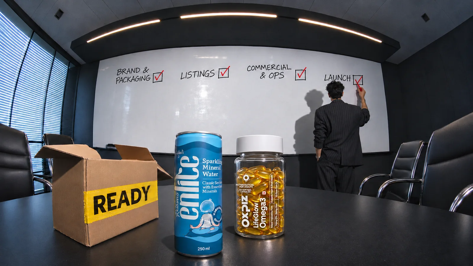
Brand and packaging
- Target audience and positioning defined.
- Pack passes the thumbnail test against category competitors.
- Packaging system set: fixed brand elements and variable variant cues.
- Variant names, sizes and colours consistent across the range.
Listings
- Hero images match the actual packs.
- Titles follow Brand + Product + Variant + Size.
- Master SKU sheet with names, barcodes, images and descriptions.
- Listings checked on each platform after approval.
Commercial and operations
- Channel-wise pricing covers all costs, with margin.
- Pack sizes chosen per channel.
- Documents ready: GST, PAN, trademark, FSSAI (if food), barcodes.
- Launch cities chosen and stock confirmed in each.
- Replenishment plan in place.
Launch
- One primary launch objective set.
- Campaigns scheduled only after listings are live and in stock.
- KPIs and targets agreed.
- Post-launch review date set before expanding.
Make Your Pack Work At Thumbnail Size

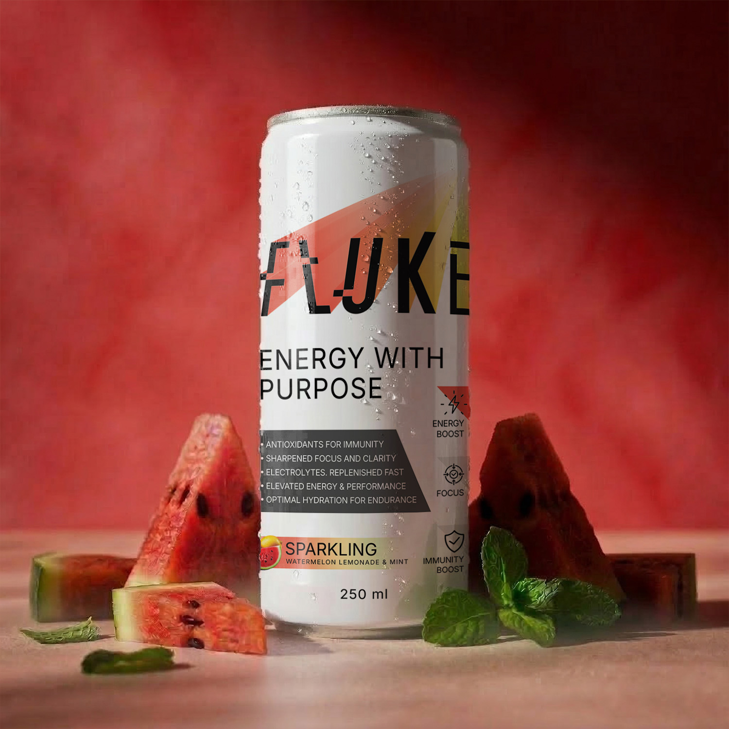
Online, the shopper's first and often only look at your brand is a small image in a crowded grid. If the pack can't say who you are, what the product is and why it's worth choosing at that size, the rest of the launch plan has to work much harder.
DN Designs builds brand identities and packaging systems for FMCG and consumer brands that hold up on store shelves, marketplace listings and quick-commerce apps alike, from 1 AM's cold coffee cans to Wlue's makhana, Fluke's functional drinks and Doodh Soda. If you're preparing a launch or a range refresh, start with a digital shelf review: we'll show you how your pack performs next to your competitors and what to change first.
FAQs
How do I get my product listed on Blinkit, Zepto or Swiggy Instamart?
Unlike Amazon or Flipkart, quick-commerce platforms don't usually offer instant self-serve listing. You apply through the platform's brand or seller portal, a category team reviews your product, and approved brands then agree commercial terms and supply arrangements. You can also go through an authorised distributor already supplying the platform. Have your GST, trademark, FSSAI (for food) and SKU details ready before you apply.
How many SKUs should a new FMCG brand launch with online?
Fewer than you think. Start with the products that best express your core proposition and that you can keep in stock reliably, often two to five SKUs on quick commerce. E-commerce can carry a wider range from the start, since it doesn't depend on stocking every dark store.
What makes a good product image for quick commerce?
The actual front of pack, shot straight on, on a clean background, filling most of the frame. The brand, product and variant should be readable at thumbnail size without zooming. Save lifestyle shots and benefit callouts for secondary images.
Should packaging be redesigned for quick commerce, or just adapted?
It depends on how the current pack performs at small sizes. If the brand and variant are clear in the thumbnail test, small changes such as a larger variant name or stronger colour coding may be enough. If shoppers can't identify the product in a grid, a redesign of the front-of-pack hierarchy is usually worth it before scaling spend.
Do I need an FSSAI licence to sell food products online?
Yes. Food businesses selling through e-commerce and quick-commerce platforms need a valid FSSAI licence or registration, and platforms display it on the listing. Make sure your licence covers every product category you plan to list, and check the current requirements on the FSSAI FoSCoS portal.