Why Is Skincare Packaging a Branding Problem First?
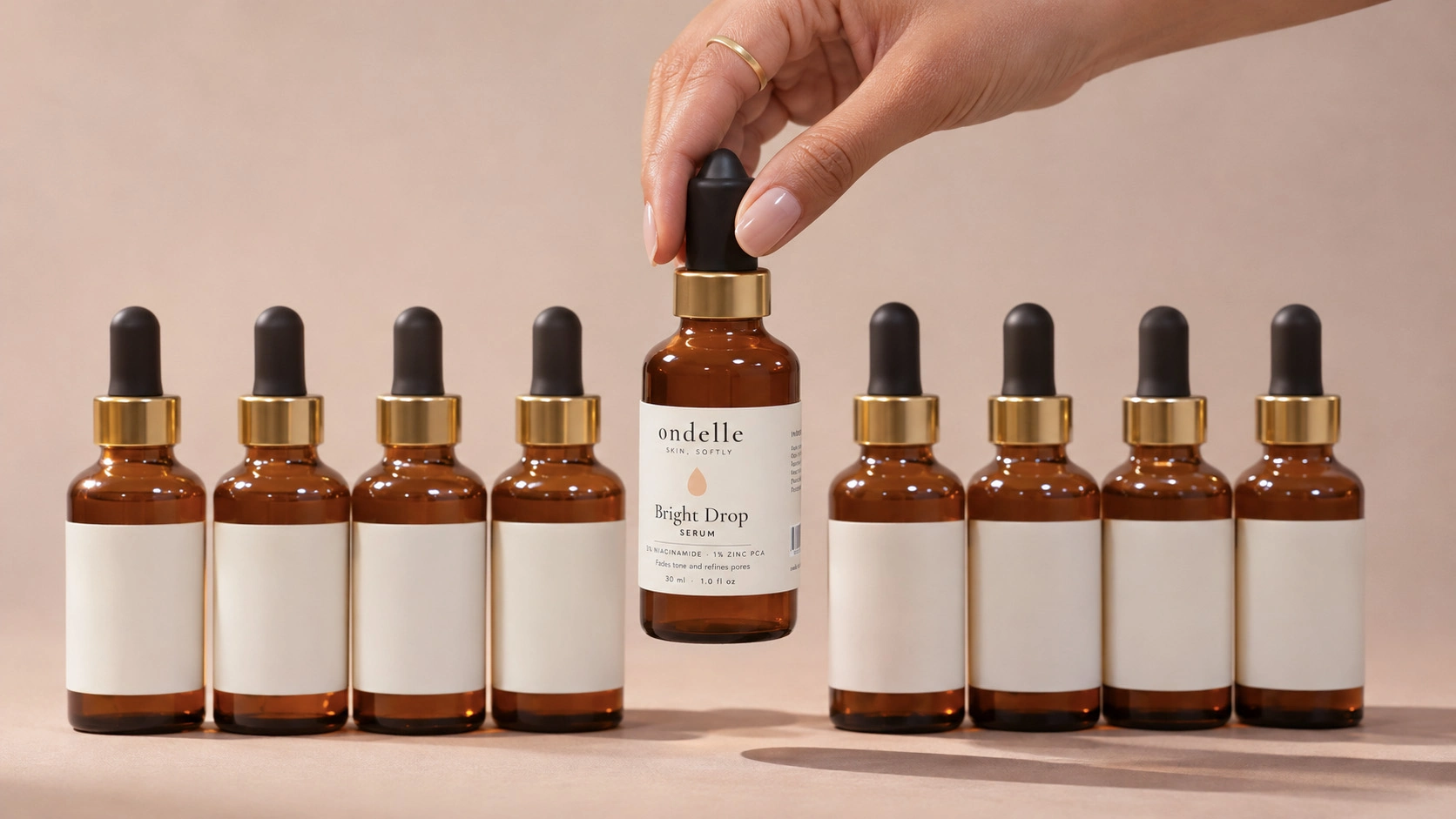
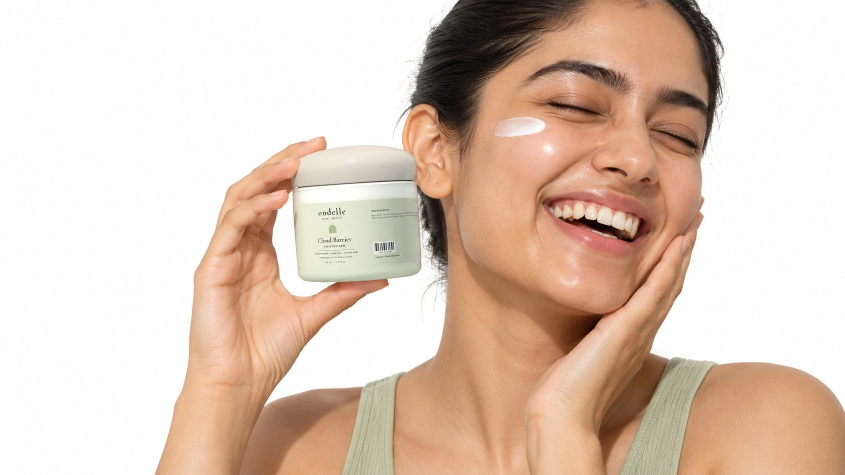
Most skincare products in a price band look alike on paper, so the pack does much of the persuading. Packaging design for skincare products has to start with a clear audience, position and personality. Without that foundation, a pack can look attractive and still fail to tell shoppers why they should choose it.
Founders often frame the project as "we need a nice bottle and label". The bottle and label matter, but they should come out of the brand strategy rather than stand in for it. A serum's pack works as a salesperson on a shelf, a thumbnail in a search result and a reminder on a bathroom counter, so it needs a clear message before it needs a look.
This is why skincare branding and packaging design work best as one project. When an identity is created by one team and handed to another to apply to packs, the strategic intent thins out at every handover. Treating them together keeps the logic intact from positioning to print.
Strong skincare brand packaging design carries four things:
Position
The one idea the brand wants to own, such as gentle efficacy, Ayurvedic heritage or clinical results, made obvious at a glance.
Proof
Hero ingredients, actives and claims that give shoppers a reason to believe, each one backed by evidence.
Personality
The brand's tone, expressed through typography, colour, language and the way the pack feels in the hand.
Practicality
Protecting the formula, dispensing it well, carrying the mandatory declarations and being made at the right cost.
How Skincare Differs From Makeup And Other Cosmetic Packaging
Skincare sits inside the wider field of beauty packaging design, but its priorities differ. Makeup packaging design leans on shade, applicators, mirrors and compacts, and is often bought on looks. Skincare is bought on trust and results, so the pack has to communicate efficacy, protect active ingredients and stay easy to use through a daily routine.
The basics of cosmetic packaging design (structure, materials, labelling and shelf impact) apply to both, but the weighting shifts. In cosmetic product design, the formula, container and pack should be developed together, and skincare raises the stakes because many actives are sensitive to air and light.
02 · The BriefThe Brief: Where Skincare Packaging Strategy Starts
A good brief saves rounds of revisions. Before sketching packaging design for a skincare brand, a strategy-led team works through these questions, because each answer changes the pack.
| Question | Why It Matters To The Pack |
|---|---|
| Who is the core customer, and what skin concern brought them here? | Sets tone, colour and language: a teenager with breakouts and a 40-year-old buying retinol respond to different cues. |
| What is the one idea the brand wants to own? | Decides which message leads the front panel and which waits for the back. |
| Which price band will the products sit in? | Determines how much the materials, finishes and structure need to justify the price. |
| Which formulas are in the launch range, and what do they need? | Texture and sensitivity to air and light narrow the formats before design starts. |
| Where will the range sell first? | Shifts the priority between shelf impact, thumbnail clarity and unboxing. |
| What comes after launch? | A range planned to grow needs a system with room for new products. |
| What are the budget and minimum order quantities? | Decides between stock and custom containers and which decoration methods are realistic. |
| Who signs off claims and label text? | Regulatory copy is a design input, not something to insert in the final week. |
Positioning is the hardest of these to answer and the most important, because every later decision is judged against it. Our brand positioning process settles it before any visual work begins.
03 · Visual CodesTurning Positioning Into Visual Codes
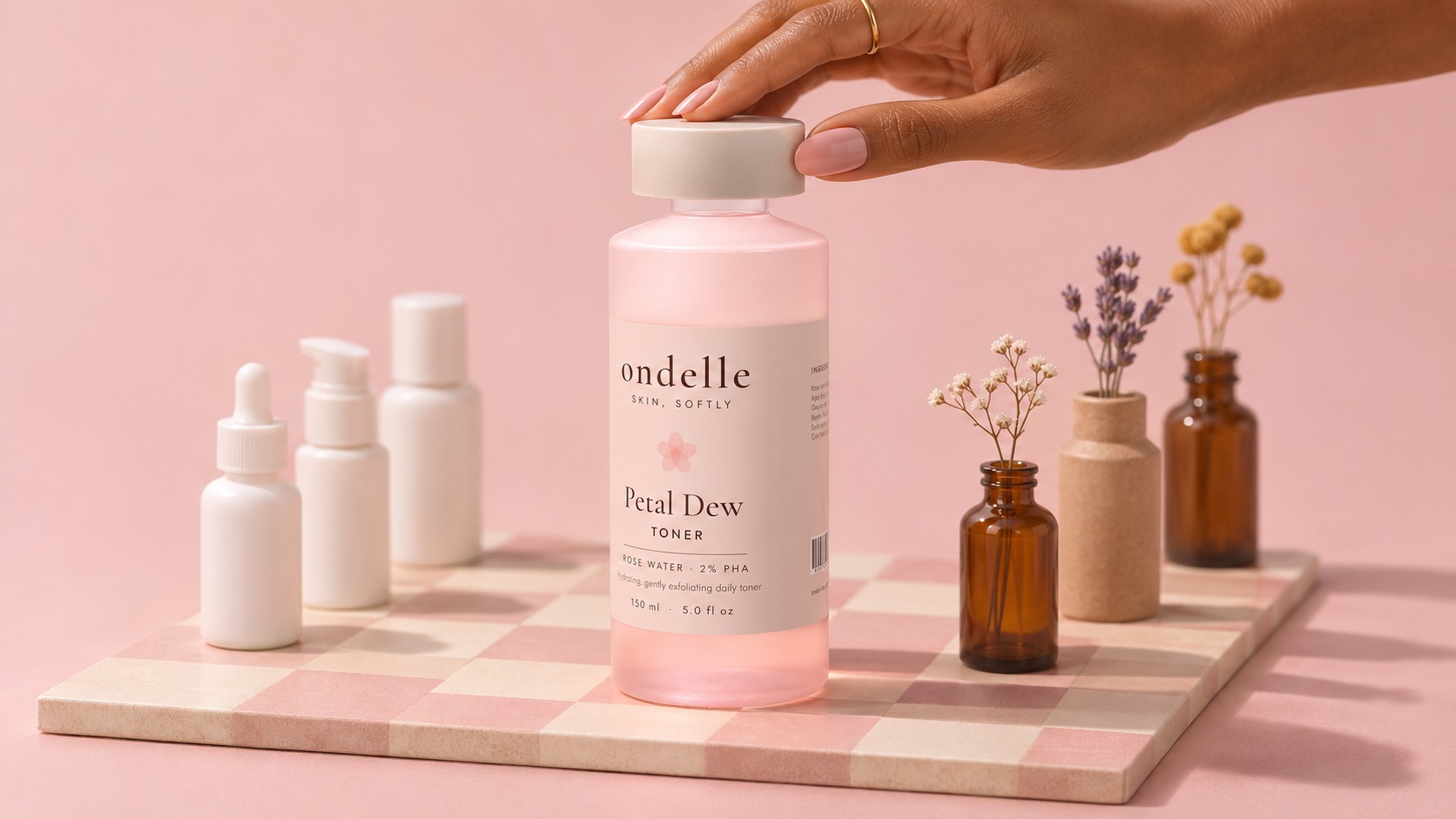
Every category has visual codes: the colours, shapes, type styles and materials shoppers have learned to link with a kind of product. In skincare, white packs with sans-serif type and percentages read as clinical, while kraft, earthy tones and botanicals read as natural. Heavy glass, generous space and restrained type read as premium.
The strategic decision is which codes to follow and which to break. Follow too many, and the brand disappears into the category. Break too many, and shoppers cannot tell what the product is or whether to trust it. A practical rule is to keep the codes that signal what the product is and break the ones that signal who it comes from. Creative skincare packaging design works within these limits rather than ignoring them.
| Positioning | Codes That Build Trust | Where To Break From The Category |
|---|---|---|
| Science-led | Clean layout, active and percentage callouts, functional dispensers. | A distinctive colour or graphic device instead of plain white. |
| Natural or Ayurvedic | Ingredient storytelling, warm palette, tactile paper. | Contemporary type and layout instead of leaves and kraft by default. |
| Premium or luxury | Weighty materials, space, restraint, a considered unboxing. | A signature structure or detail that becomes recognisable. |
| Youthful | Bold colour, informal language, compact formats. | A system that can mature with the customer rather than a passing trend. |
| Sensitive skin | Calm palette, short ingredient lists, reassurance cues. | A warm, human tone instead of medical coldness. |
Much modern skincare packaging design follows exactly this pattern: it keeps the clinical cues that build trust and breaks the colour or graphic codes to stand apart. Luxury skincare packaging design relies on restraint, weight and ritual, while premium skincare packaging design borrows a few of those cues, such as a heavier base or a single tactile finish, at a price the wider market can reach.
Building Distinctive Assets
Distinctive brand assets are the elements shoppers recognise as yours without reading the name: a colour, a shape, a graphic device or a type treatment. They need time and consistency to work, so choose a small number early and use them on every pack, listing and post. Changing them with each launch resets the recognition the brand has built.
04 · Impact And ExperienceDesigning For Impact And Experience
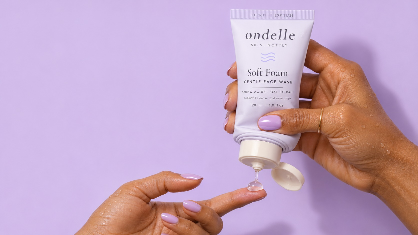
Impact gets a skincare product noticed and chosen. Experience gets it used, finished and bought again. A packaging design agency has to design for both, and for every moment in between.
| Moment | What Good Design Does |
|---|---|
| Noticing: shelf, thumbnail or feed | Shows a clear brand block, a distinctive asset and a product type that reads in seconds. |
| Choosing: in the hand or on the listing | Confirms quality and price through the hero benefit, key actives and the feel of the material. |
| Opening: carton, mailer or seal | Opens easily, shows it is tamper-evident and avoids wasteful or fiddly layers. |
| Using: morning and night routines | Dispenses cleanly in the right dose, grips well with wet hands and makes directions easy to read. |
| Living with it: the bathroom shelf | Uses labels that resist water and oils, keeps type legible and still looks good half used. |
| Finishing: last use, refill or disposal | Empties fully, offers refills where they fit and explains how to dispose of the pack. |
Small decisions shape this experience. A pump that dribbles, a cap that is hard to open with wet hands or a label that peels after a week can undo the impact the front panel created. That is why we recommend testing packs in use, not only on screen.
05 · Range SystemDesigning The Range, Not Just The Hero Product
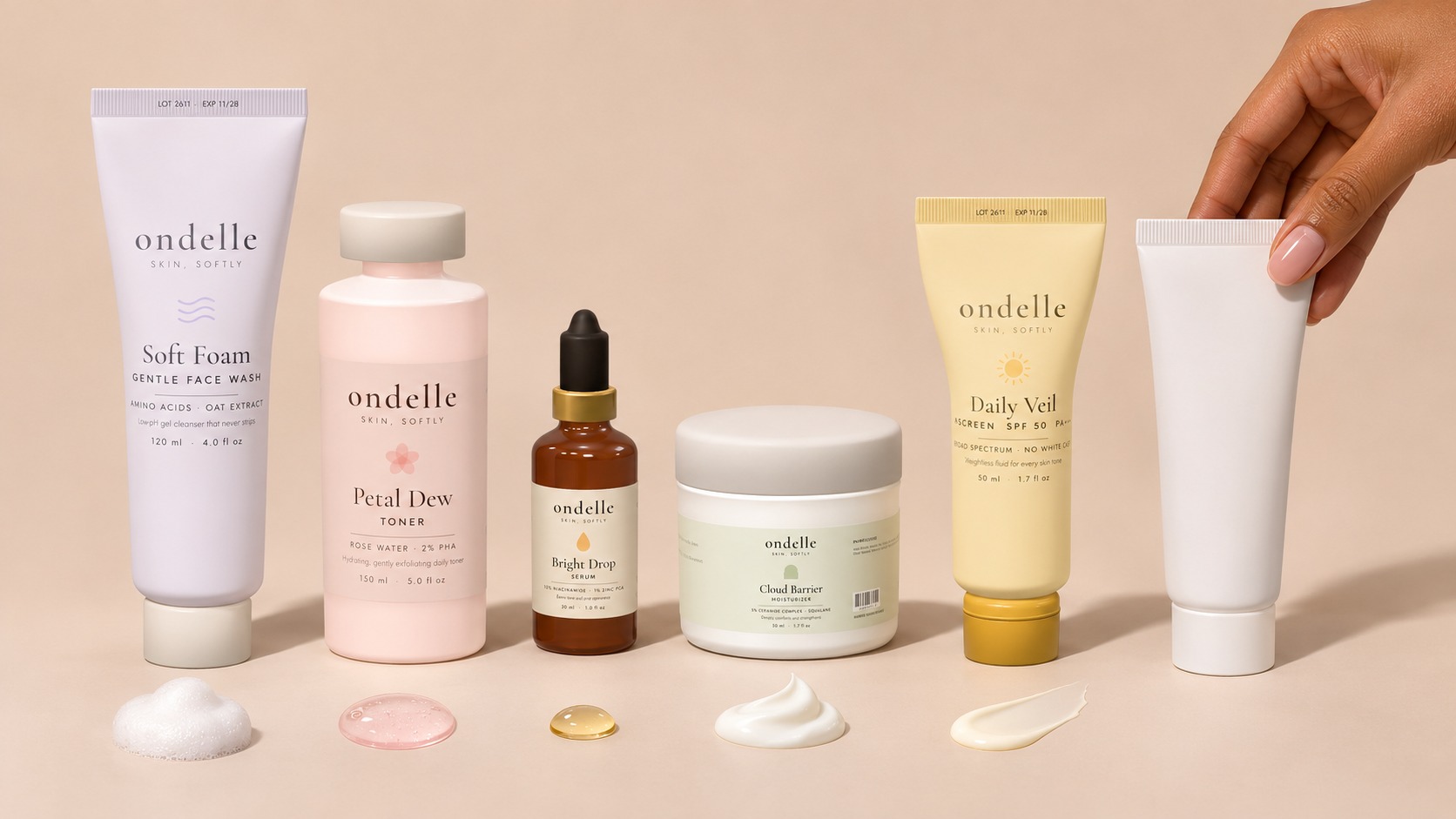
Many skincare brands design their hero product first and then try to stretch it across a cleanser, a sunscreen and a night cream. Designing the system first is quicker and cheaper over time, because each new product follows rules instead of starting from scratch.
Masterbrand-Led Or Product-Led
In a masterbrand-led range, the brand name dominates and products are told apart by type and variant, which builds recognition quickly. In a product-led range, individual products carry strong names of their own, which suits brands built around hero formulas. Our guide to brand architecture explains how to choose between them.
How To Code The Range
An SKU (stock keeping unit) is each distinct product variant, such as a 30 ml and a 50 ml serum. A range needs a clear, consistent way to tell SKUs apart, and the right approach depends on how customers shop.
| Coding Approach | How It Works | Suits |
|---|---|---|
| By skin concern | One colour or accent per concern, such as acne, pigmentation or hydration. | Brands that sell solutions to specific problems. |
| By routine step | Packs coded as cleanse, treat, moisturise and protect. | Brands that sell regimens and bundles. |
| By hero ingredient | Each SKU named and coloured around its active. | Ingredient-led, science-forward brands. |
Write the rules into your brand guidelines so every future pack, from a new serum to a travel kit, follows them: what stays fixed, what changes and where it goes.
06 · ProductionStructure, Materials and Decoration: Where Design Meets the Supply Chain
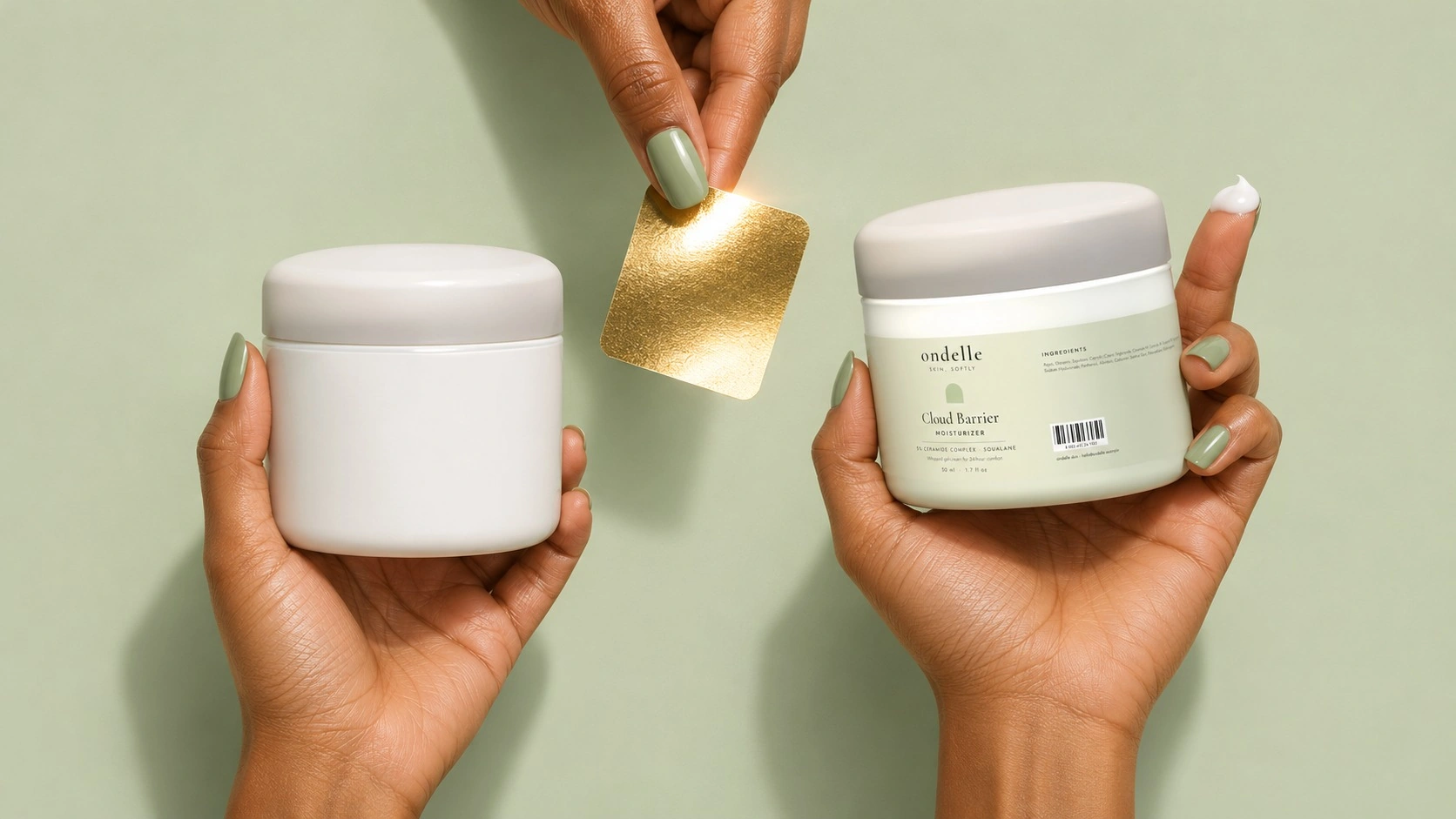
Every pack design is eventually made by a supplier, at a price and in a quantity that has to suit the brand. Three decisions set what is possible:
- The container (stock or custom).
- How it is decorated.
- How many units you must order, known as the minimum order quantity (MOQ).
Bringing suppliers into the conversation before final artwork avoids designs that look right on screen but cannot be made affordably. Ask whether a minimum applies per colour, decoration or component, because a pump, a bottle and a carton can each have their own.
Stock Or Custom Containers
Stock containers come from moulds a supplier already makes. They are faster and cheaper, especially at low volumes, which is why skincare packaging design for startups usually begins with them. Custom moulds give the brand a shape nobody else has, which can become a strong distinctive asset, but they add tooling cost and lead time. A common route is to launch on stock containers with strong graphics and invest in a custom structure once the range has proven itself.
Decoration Methods
| Method | Look And Feel | Considerations |
|---|---|---|
| Paper or film label | Flexible and full colour; easy to change between SKUs. | Suits small runs and frequent changes; choose water-resistant materials for the bathroom. |
| Screen printing | Clean and premium, printed directly on the container. | Limited colours per pass; set-up costs favour longer runs. |
| Hot foil and embossing | Metallic shine or raised texture. | Adds cost; use it where it carries the brand idea. |
| Shrink sleeve | Graphics all the way round complex shapes. | Sleeves can complicate recycling, so check material compatibility. |
| Printed carton | Space for storytelling, regulatory text and finishes. | Adds material; skip it where it does no work. |
Sustainability belongs in the same conversation. Using one material where possible, adding recycled content and cutting secondary packaging that does no work all reduce impact. Plastic packaging must also comply with India's Plastic Waste Management Rules, as amended. These include requirements to provide the producer's, importer's or brand owner's name and registration certificate number, either on the packaging or through permitted alternative methods, such as a QR code or product information brochure.
07 · The LabelSkincare Label Design: Working Within the Rules
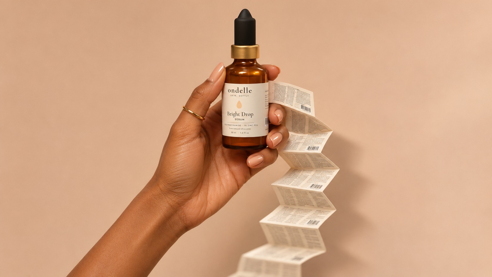
In India, the rules that shape cosmetics packaging design come mainly from Rule 34 of the Cosmetics Rules, 2020 and from the Legal Metrology (Packaged Commodities) Rules, 2011. Together, they require the product name, manufacturer details and licence number, a full ingredients list, batch number, dates, net quantity, MRP, consumer care details, directions and warnings. On a 30 ml dropper or a 15 ml tube, this text can take more space than the design.
Expiry wording has also changed recently. The Cosmetics (Amendment) Rules, 2025, notified on 29 July 2025, clarified that "use before" means before the first day of the stated month and "date of expiry" means the last day of it.
A Hierarchy That Respects The Brand And The Law
We recommend designing the back panel and carton at the same time as the front, not after it. Set the minimum legible size for the declarations, test it printed at actual size, and let the front panel carry only what sells: brand, product name, product type, hero benefit and net quantity. On very small packs, a carton or a peel-open booklet label can create the space a container lacks.
Claims Are A Brand Risk
"Clinically proven", "dermatologist tested", and percentage results are persuasive on pack and damaging if they cannot be supported. Agree every claim with the formulator and a regulatory expert before artwork, and keep the evidence on file. Claims that a product treats or cures a condition can raise the question of whether it is still a cosmetic at all.
08 · ChannelsDesigning for How Skincare Is Bought in India
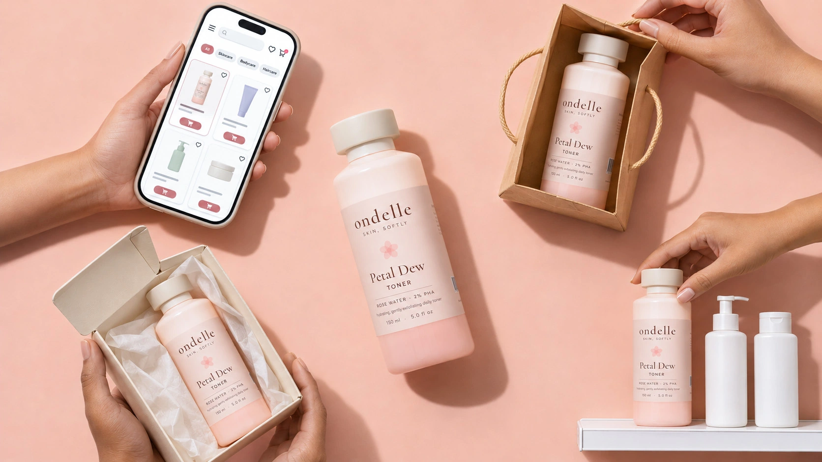
Skincare shoppers in India move between channels. Many discover products on social media, compare them on marketplaces, top up on quick-commerce apps and still buy from pharmacies and beauty stores. Beauty product packaging design has to work in all of these places, and each one asks something different of the pack.
| Channel | What The Pack Must Do |
|---|---|
| Marketplaces such as Nykaa and Amazon | Read clearly as a small square image on white, show the product type and hero benefit at thumbnail size, and support a set of listing images such as texture, ingredients and the back label. |
| Quick-commerce apps | Be identifiable in a tiny tile within seconds; strong colour coding helps repeat buyers pick the right SKU. |
| Pharmacies and modern trade | Hold attention from a distance, form a branded block with neighbouring SKUs and survive handling. |
| Brand website (direct-to-consumer orders) | Photograph well for product pages, arrive undamaged in a shipping box and make opening feel considered, with a branded mailer, a simple card on how to use the product and outer packaging that is easy to open and recycle. |
| Social media | Look good in hands and on shelves in creator content; a distinctive shape or colour makes it recognisable in a video. |
For brands that sell mainly online, our D2C branding work covers the listing, website and unboxing alongside the pack.
09 · TestingHow to Test Skincare Packaging Before It Goes to Print
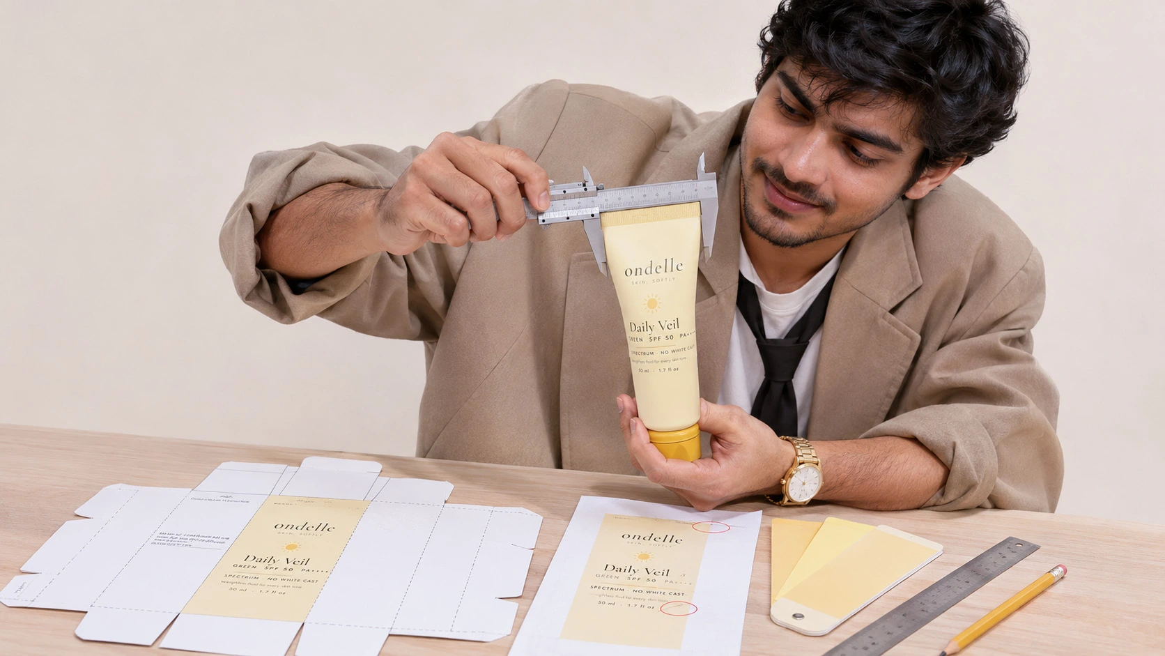
Testing is where cosmetic product packaging design either holds up or falls apart, and every check below costs less than a reprint. Run them on the chosen route before files are released to suppliers.
- Physical mock-ups: print the artwork on the real container, or a close match, and check colour, finish and legibility in the hand.
- Colour proofs on the substrate: approve colours on the actual glass, plastic or board, not on a screen.
- Thumbnail test: view the pack at marketplace and quick-commerce tile sizes next to competitors.
- Shelf test: place the range among competitor packs and see what stands out from a couple of metres away.
- In-use test: open, dispense and handle the pack with wet hands, and check how it looks after a week on a bathroom shelf.
- Legibility check: read the back panel at actual size, under bathroom lighting and on a curved surface.
- Range check: line up every SKU to confirm they look like one brand and are still easy to tell apart.
- Claims and regulatory review: have the final text checked by your regulatory expert.
- Supplier sign-off: confirm dielines (the flat templates that show cuts, folds and print areas), print areas and decoration methods with each supplier.
What to Prepare Before You Brief a Design Team

Whether this is packaging design for a skincare startup or a range extension for an established brand, the more of this you have ready, the faster and sharper the first round of work will be. Gaps are fine, as long as you know where they are.
- Product list: every launch SKU with its formula type, size and key actives.
- Formulator notes: texture, stability needs and any packaging restrictions.
- Audience: who the customer is, their main skin concern and where they shop.
- Competitors: the brands you will sit beside, on shelf and online.
- Price points: the intended MRP for each product.
- Channels: where you will launch first and where you plan to expand.
- Suppliers: any containers or suppliers already chosen, with their MOQs.
- Regulatory text: draft ingredient lists, claims and mandatory declarations.
- Budget and timeline: including any fixed launch dates.
How DN Designs Approaches Skincare Packaging Design
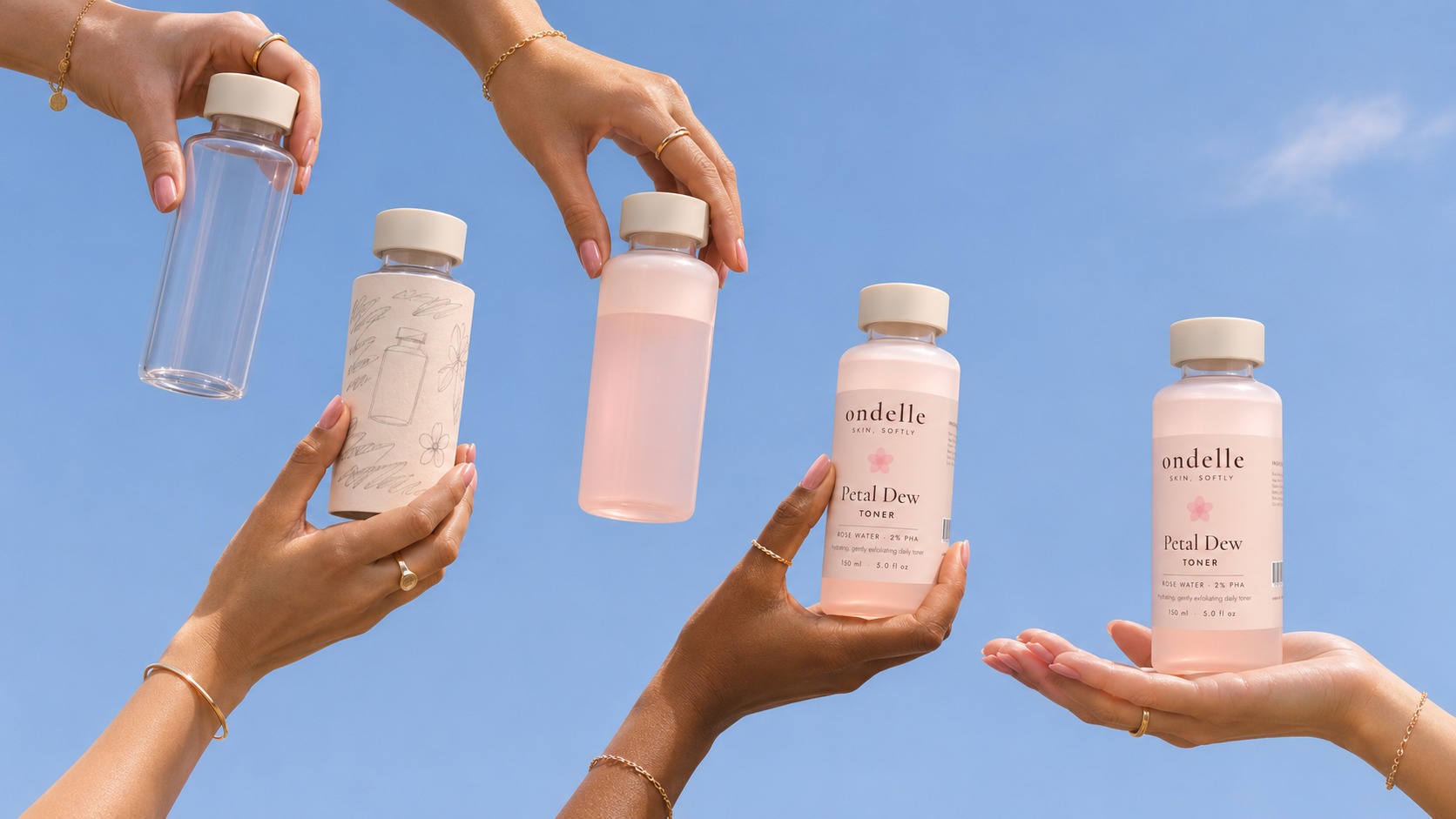
DN Designs is a strategy-led branding and packaging design agency in Noida, working with startups, emerging D2C brands and established companies in beauty, personal care, wellness and other consumer categories. If you are comparing a skincare packaging design agency with a broader cosmetic packaging design agency, the difference that matters most is whether strategy and design sit in the same team.
We handle skincare brand identity and packaging design together, so the brand and the pack tell one story, and we build packaging systems designed to scale across SKUs and product extensions. Every project moves through five stages:
- Understand: research the business, market, audience and competition.
- Strategise: define positioning, differentiation and brand direction.
- Create: develop the identity and the packaging system.
- Implement: carry the brand into consistent physical and digital experiences.
- Evaluate: assess the work against agreed brand and business objectives.
Our skincare packaging design services cover strategy, structure, graphics and production artwork. You can browse projects across categories on our case studies page.
12 · ConclusionWhere Good Skincare Packaging Starts
The skincare packs that work hardest are rarely the most decorated. They come from a clear position, create impact on shelf and screen, feel good to use every day, and are built as a system that suppliers can make, and the label can live with.
If you are preparing a launch or a redesign, start with the brief questions in section 02 and the checklist in section 10. Answering them honestly will improve the work, whichever team you choose.
Frequently Asked Questions
What is the best packaging for skin care products?
There is no single best option, because the right pack depends on the formula. Airless pumps suit serums with actives that react with air, amber or opaque bottles suit light-sensitive formulas, tubes suit sunscreens and gels, and jars suit rich creams. Choose the format that protects the formula and is easy to use, then design the brand around it.
How long does a skincare packaging design project take?
It depends on the size of the range, whether the brand identity already exists and whether custom structures are needed. A project that includes strategy and identity takes longer than a label refresh on stock containers, and custom moulds usually add the longest lead time. Plan backwards from your launch date and leave room for mock-ups, supplier sign-off and printing.
Should a skincare startup use stock or custom containers?
Most new brands are better served by stock containers decorated with strong, distinctive graphics. They are quicker to source, cost less at small volumes and leave more of a skincare startup packaging design budget for the formula and marketing. A custom structure makes sense once the range has proven itself and the brand wants a shape that becomes a recognisable asset.
How do I choose the best skincare packaging design agency for my brand?
Whether you shortlist a specialist skincare packaging design studio, a skincare packaging design firm or a broader beauty packaging design agency, look for four things: strategy work before design, packaging systems rather than single packs, experience with production and suppliers, and a clear process for labels and claims. Ask to see how past work performed as a range, not just as hero shots.
How do I know if my skincare packaging needs a redesign?
Common signs include shoppers confusing your SKUs, packs that disappear in marketplace thumbnails, a range that looks like several brands, a change in positioning, or a back panel struggling to fit updated regulatory text. A redesign does not always mean a rebrand: the logo and core colours often stay while the system, hierarchy and structure improve.
How many packaging design routes should a brand review?
Two or three genuinely different routes are usually enough to make a real choice. More than that tends to produce small variations and slower decisions. Ask to see each route on the hero product and at least one other SKU, as a mock-up and at thumbnail size, so you judge it as a system rather than a single pack.
What files should I receive at the end of a packaging project?
Whichever skincare packaging design company you work with, you should receive print-ready artwork for every SKU and component, the supplier dielines used, editable master files, and the colour references and finish specifications for printing. Ask for packaging guidelines as well, so future products and new suppliers can follow the same system without starting again.