
The Nutraceutical Shelf Has a Credibility Problem
Supplement buyers aren't shopping the way snack or beauty buyers do. They're putting something inside their body, based on a label they usually have ten seconds to read.
That changes the entire branding job. A few things make this category harder than most:
- Technical, not emotional, information: Actives, dosages, absorption rates data most buyers can't evaluate on their own.
- A trust deficit built by the category itself: Years of overclaiming across supplement brands have made shoppers sceptical by default.
- Sameness at scale: Bold fonts, "clinically proven" stamps, before-and-after language nearly every competitor is reaching for the same tactics.
The result: a category that's visually loud and emotionally flat.
Everyone's shouting, so nothing actually stands out.
Most brands respond by adding more claims, more badges and more copy to justify the price. It rarely works. It reads as overcompensating, not convincing.
The brief that actually works is simpler: don't be louder. Be the one that makes sense.
That single shift is where real branding for a wellness brand begins.
And that's the approach we adopted for one of our clients - Let's Supp.
Step One: Strategy, Not a Logo
Founders usually want to start with colour palettes and packaging mockups, which are the visible part. But visuals built on top of a fuzzy idea just produce a good-looking supplement label design with nothing underneath to hold it together.
The process has to start with one clear, ownable idea. A single strategic insight that shapes every decision after it.
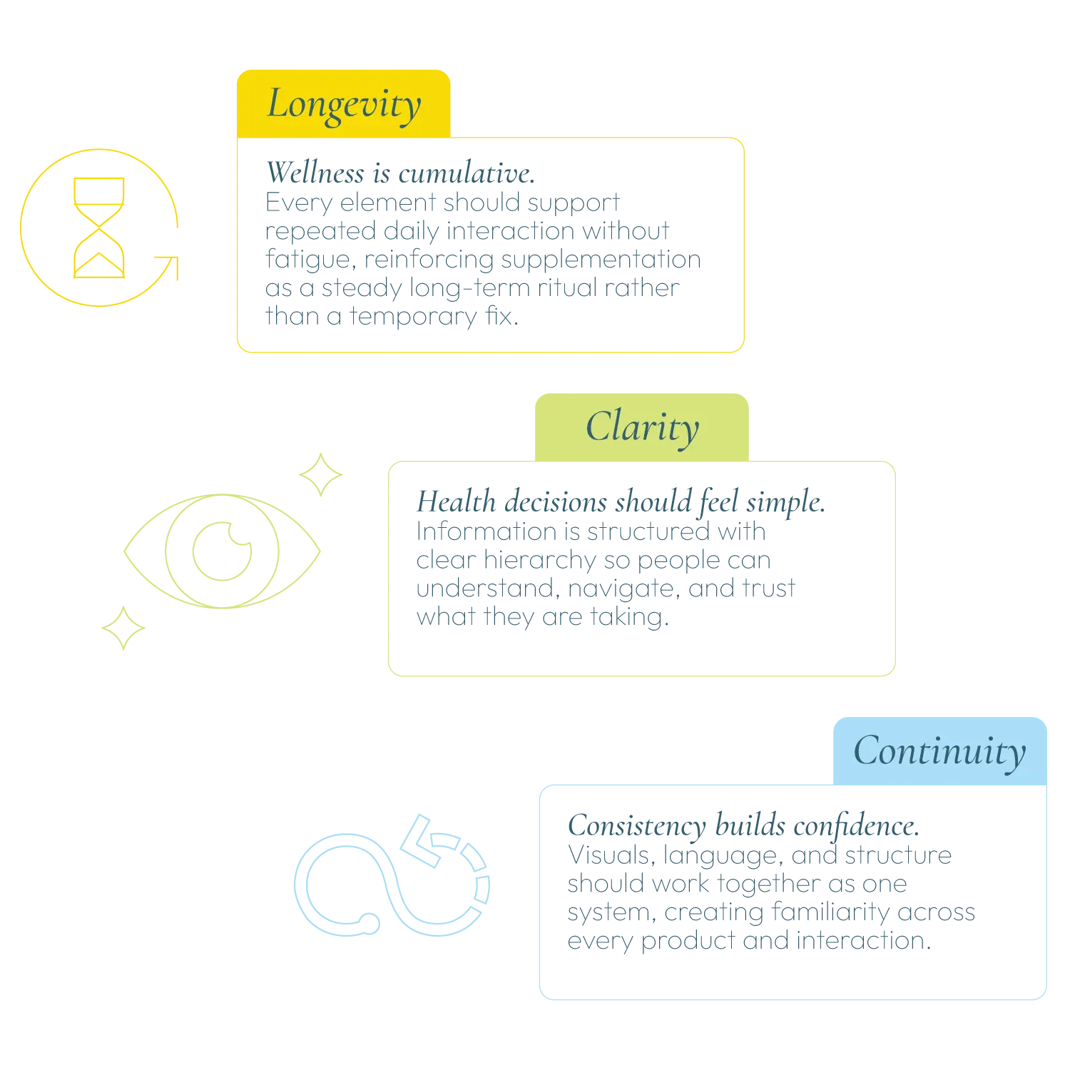
That's exactly where Let's Supp started. The insight wasn't about ingredients or efficacy claims. It was about behaviour: wellness isn't won through intensity; it's won through consistency. Supplementation isn't a one-time performance act; it's a daily ritual.
That idea, continuity, became the thread running through everything we built after it.
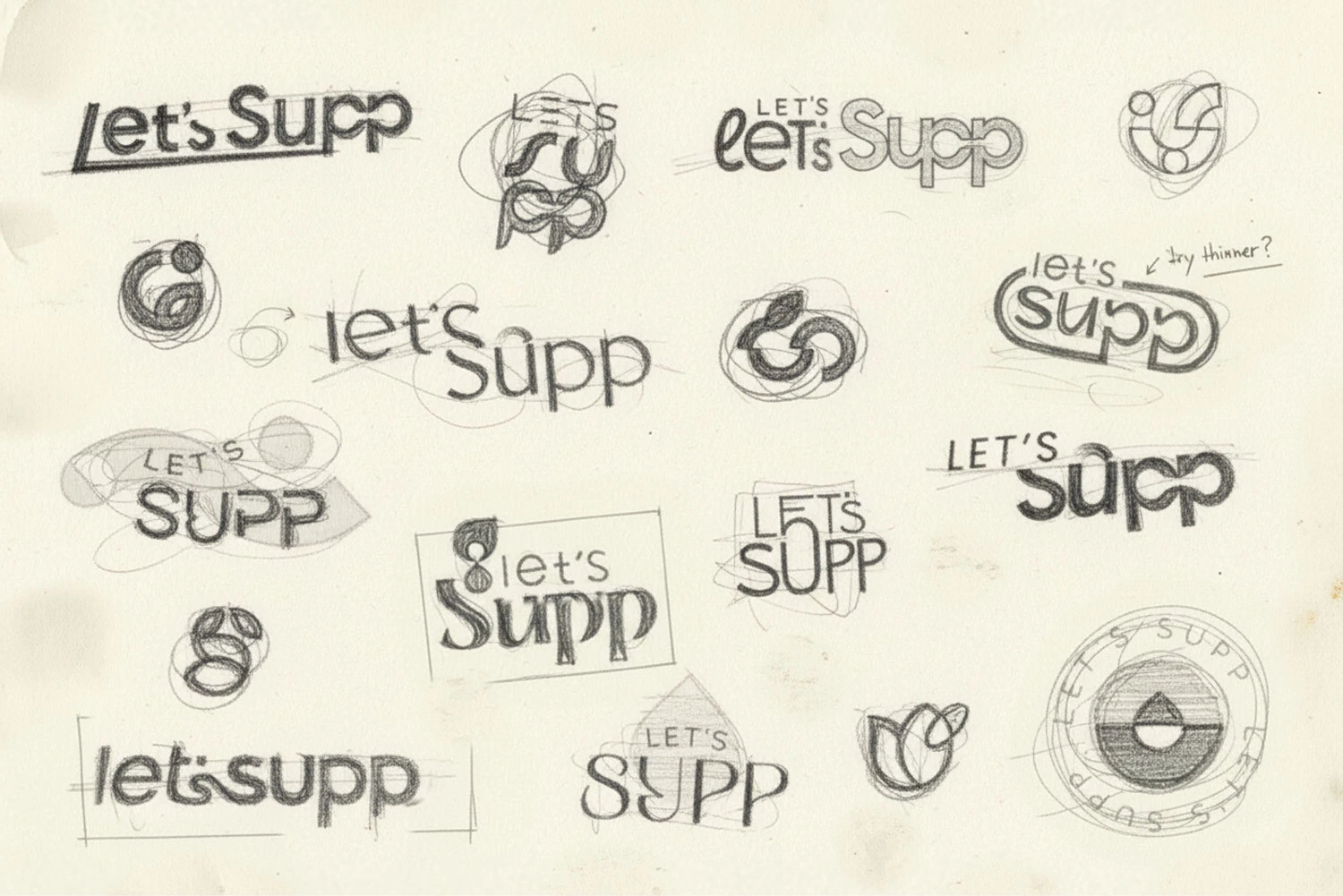
We expressed it through the infinity structure - a symbol for uninterrupted nourishment, daily repetition and sustained well-being. The symbol became the structural logic behind the entire identity system.
It is this kind of strategic backbone every serious nutraceutical branding project needs before a single visual gets made.


Step Two: Strategic Insight Woven into Brand Identity
Brand identity is everything that makes a business recognisable:
- The logo and visual mark
- Colours and typography
- Tone of voice
- Messaging
Instead of reading as separate decisions, strategic brand design makes all of this work together.
Get it right, and a shopper can spot the product across a shelf, trust it in seconds, and remember it. Get it wrong, and even a great product disappears next to louder competitors.
For Let's Supp, we built the identity around three interlocked ideas:

Step Three: The Logo Has to Carry the Idea
A logo isn't decoration; it's compression. It has to fold everything the brand stands for into a mark a shopper recognises in under a second, without reading a word.
For Let's Supp, that meant the continuity idea couldn't stay abstract. It had to become visible:
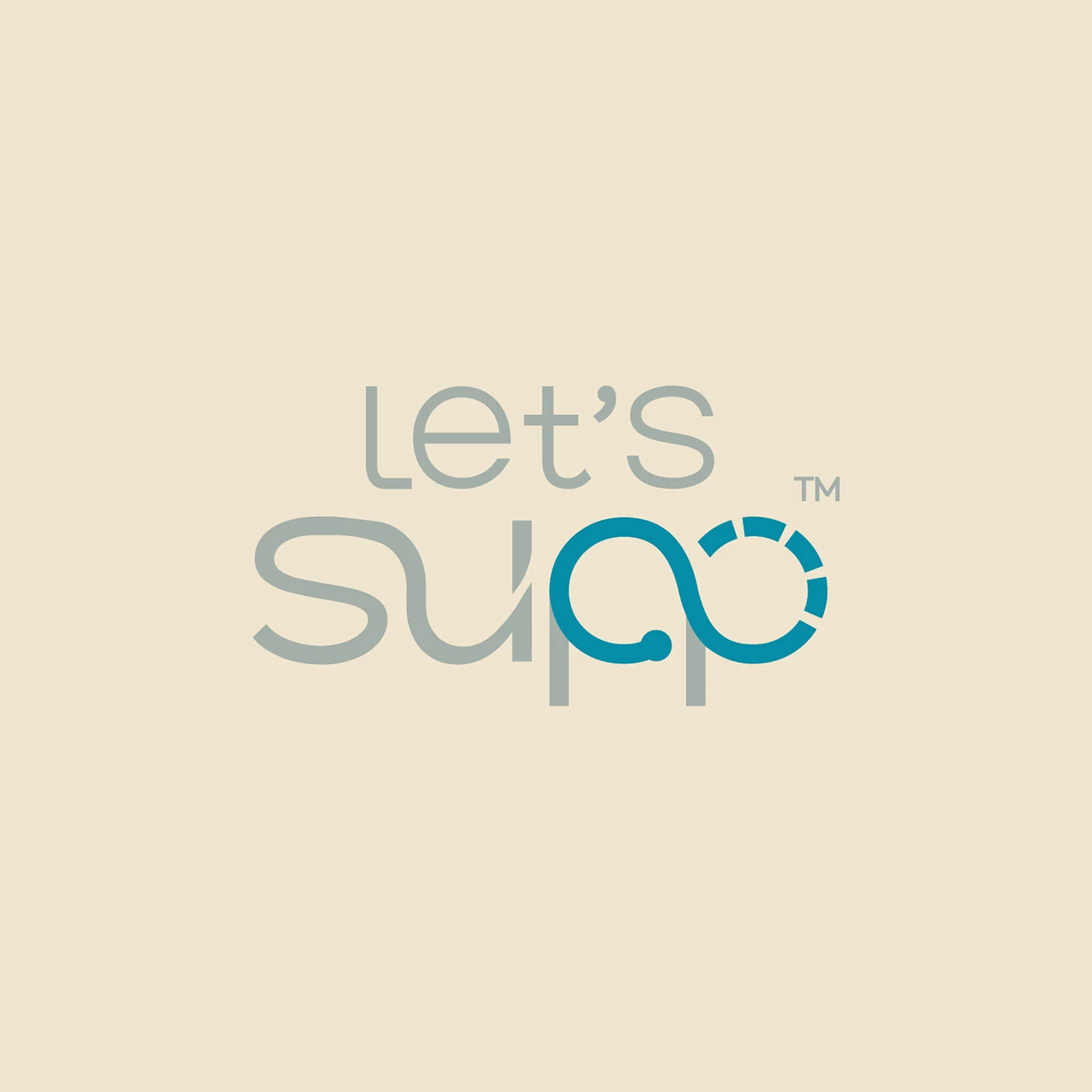
- The infinity structure is worked directly into the mark - in the double "P" in Supp of Let's Supp.
- It's a visual shorthand for the brand's core belief, not just a stylistic add-on.
- It's a logo that reads as the strategic idea, drawn, not decorated after the fact.
That's the difference between supplement branding built with intent and one assembled to build trust and loyalty.


Facing a Similar Branding Challenge in the Wellness Space?
Talk to Our TeamStep Four: Packaging Is Where Trust Gets Won or Lost
This is the actual moment of decision. Every nutraceutical packaging design either earns the pick-up or loses it in the same ten seconds.
Most supplement packaging design in this category tries to win by adding more claims, more icons and more justification. With Let's Supp, we went the other way.
We built the system around:

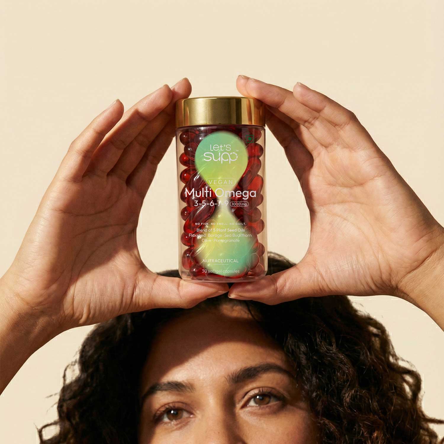
- A structured information hierarchy so buyers easily understand what they're buying without decoding a wall of text. The infinity symbol guides the composition and reinforces the idea of continuous wellness.
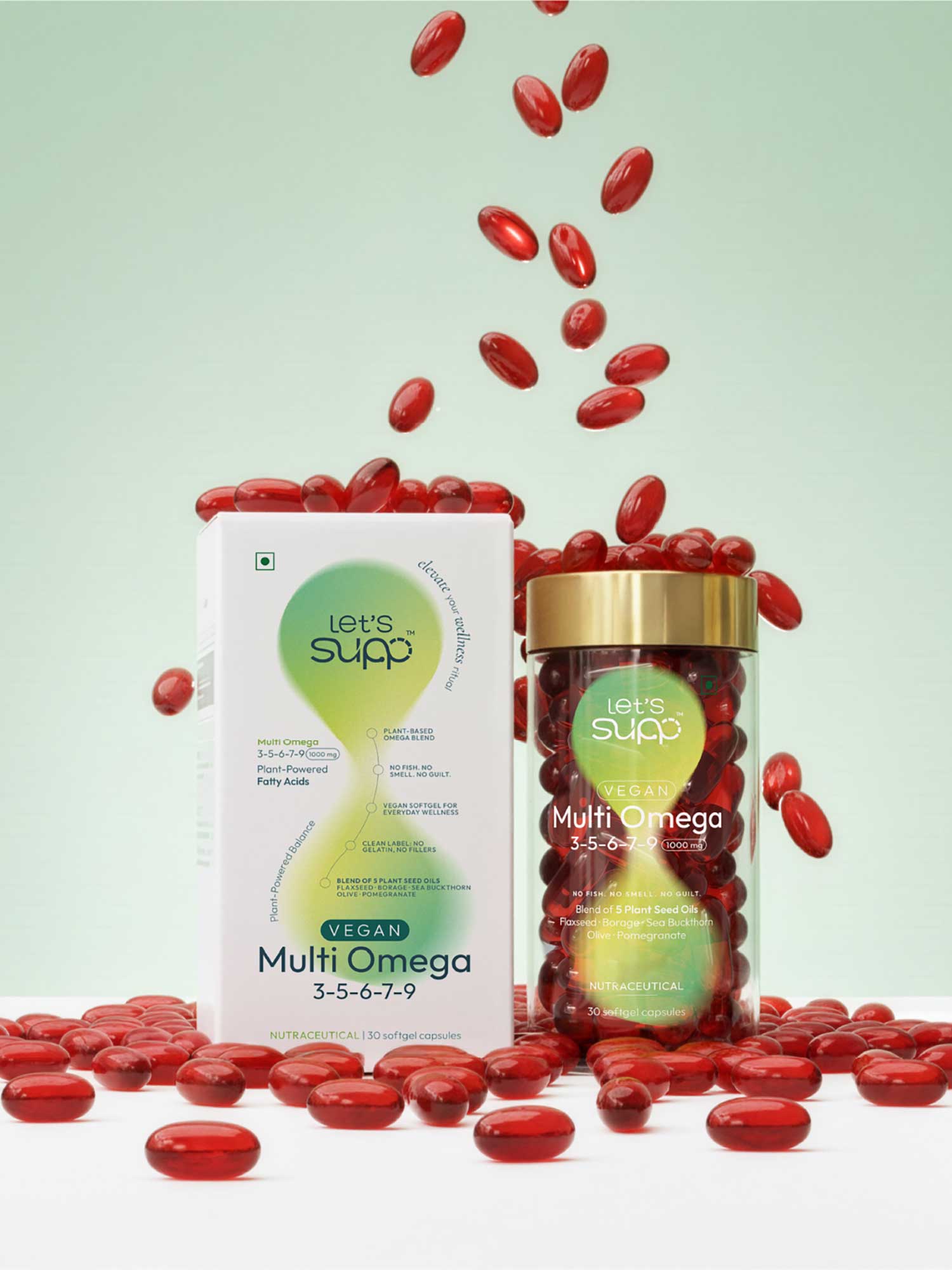
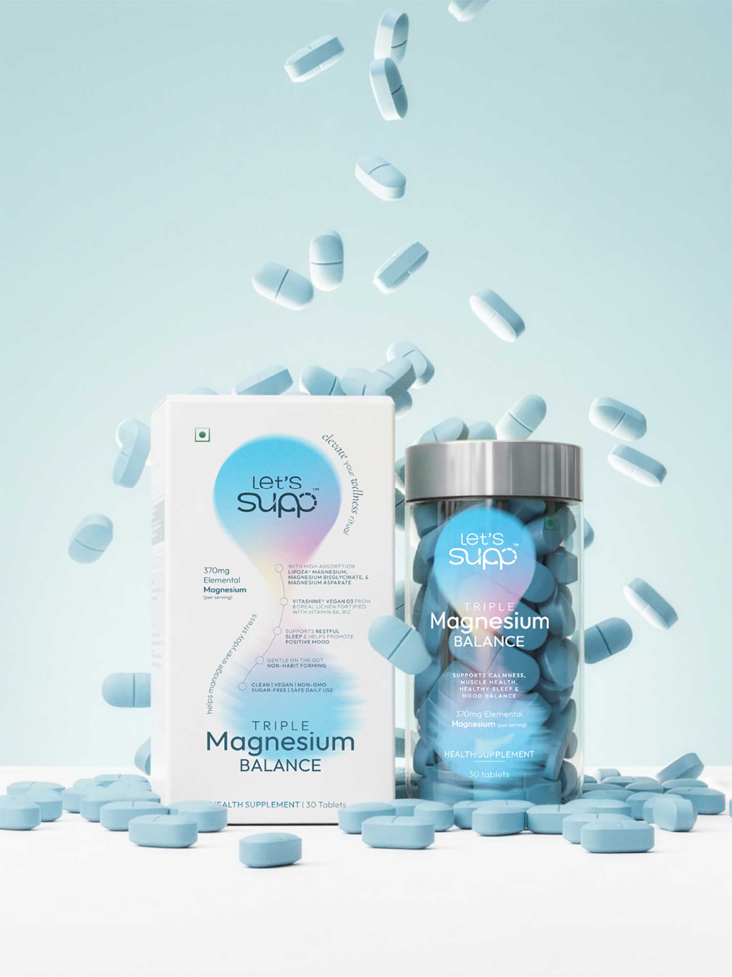
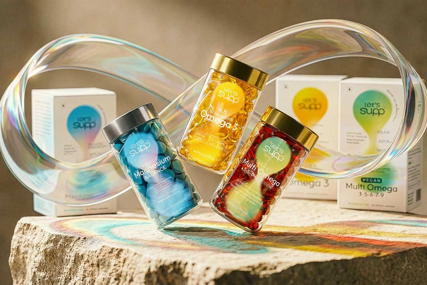
- Transparent containers that let the product speak for itself and not hide behind the pack.
- A calm, uncluttered visual tone because in this category, calm reads as more credible than loud, not less.
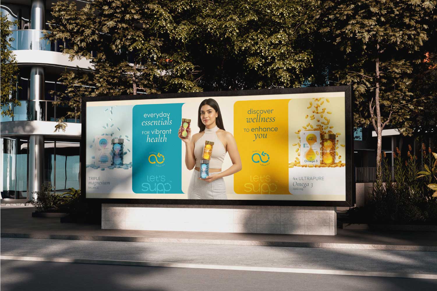
- The use of different colours helped separate product categories while keeping every SKU visually tied to a single identity, so the range reads as a single considered brand, not a loose collection of products. The thoughtfully chosen palette complements the brand's philosophy of holistic, sustained wellbeing.
The Let's Supp packaging design reduces fatigue and simplifies decision-making. That's wellness packaging design doing its job efficiently: reducing hesitation instead of adding to it.
Protect, energize, and thrive withAdvanced Omega 3 care
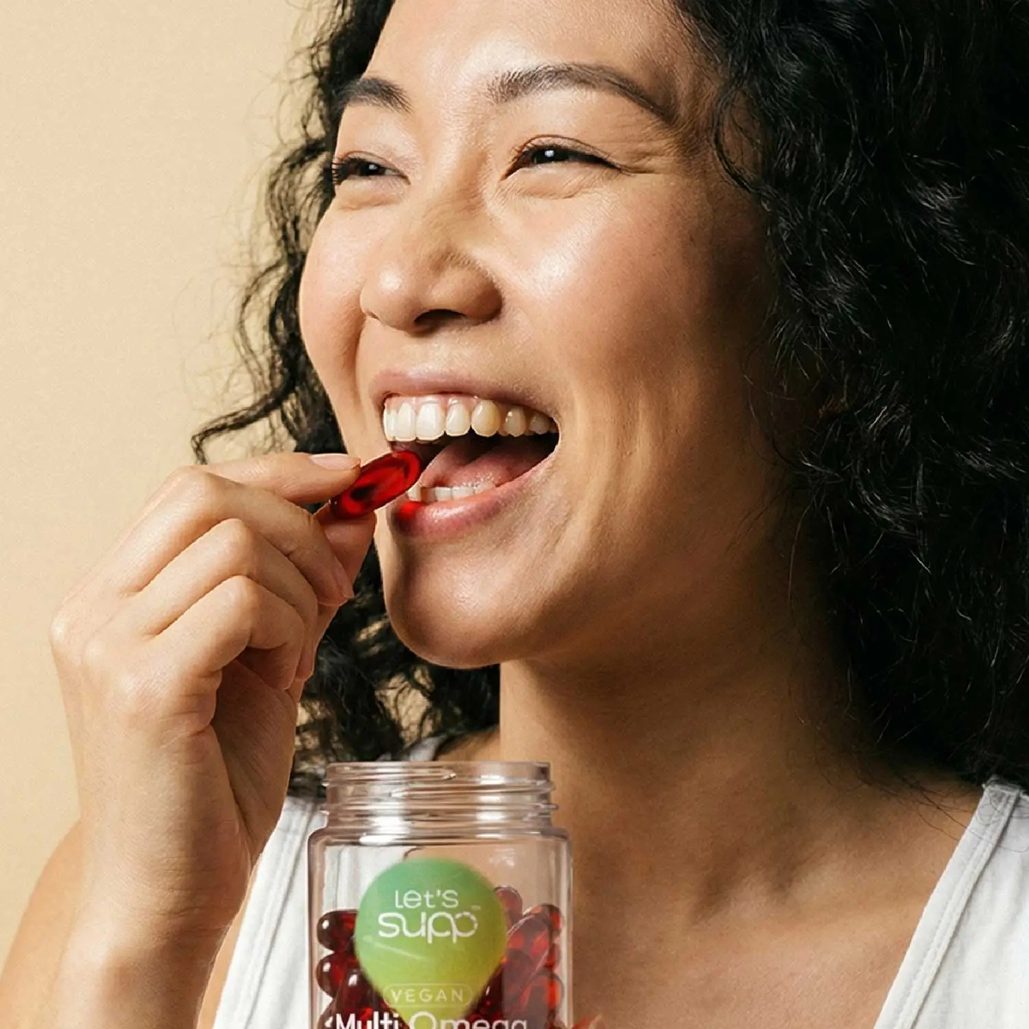
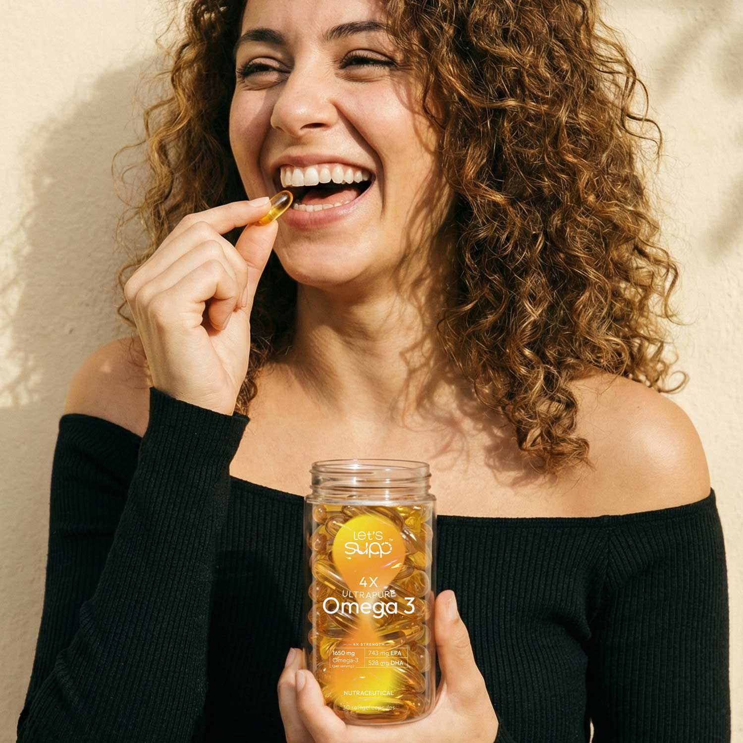
No Fish. No Smell. No Guilt. Just Pure Plant BasedVegan Omega
Daily Stress? Restore your inner calm withMagnesium Balance

Need Packaging That Earns the Pick-Up?
See Our Packaging WorkStep Five: One Idea, Every Touchpoint
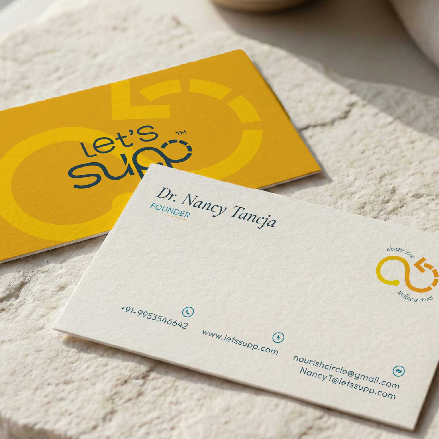
Branding doesn't end at logo and packaging. A mismatch between the bottle and the website, or the website and the social feed leaks the trust just built.
This is where a lot of wellness branding quietly breaks down: one designer on the pack, another on the site and a freelancer on social media. Then three months later nothing looks like the same wellness product. Holding one idea across every surface isn't optional. It's what makes a brand recognisable.
Health and wellness branding has to hold together at every customer interaction consistently:
- Packaging
- Website and UI/UX
- Social content and creatives
- Day-to-day brand communication
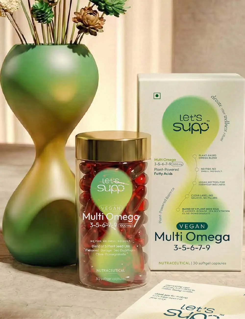
For Let's Supp, the same continuity principle governing the logo and the pack carried straight into the interface, the website and every piece of social content.
Same calm voice. Same visual language and the same idea at every customer touchpoint.

Step Six: From a Single Sale to a Daily Ritual
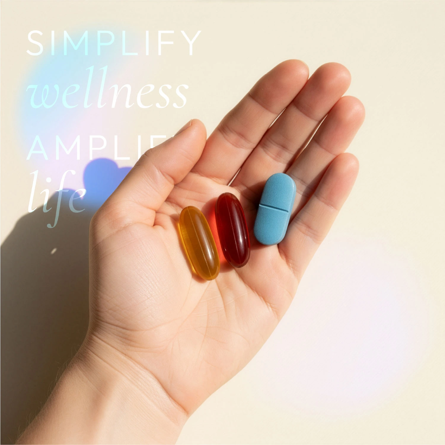
None of the strategy, the logo, the label, and the website exists to win one purchase. They exist to earn a repeat one each time.
That's the actual measure of good supplement branding, not "did they buy it once," but "did the brand earn a place in their routine."
For Let's Supp, that's what the system was built to do: move a category that usually sells one-off purchases toward something people return to without thinking twice.
Where Wellness Brands Usually Go Wrong
Not every supplement brand gets this far cleanly. Most stumble at a handful of predictable points, and it's rarely the product that's the problem.
A few patterns show up again and again:
A founder gets a logo made in a rush to hit a launch date, then tries to build strategy backwards from a mark that was never meant to carry one.
When there's no clear idea behind the brand, the label ends up overcompensating with more claims, more badges and more copy because there's nothing else to lean on.
The website goes to one team, the pack to another, and nobody owns the job of making sure they read as the same brand.
New SKUs, new campaigns, and new packaging refreshes, all completed to meet a launch deadline. Each one made a little differently, until the brand that shoppers trusted three months ago barely resembles the one on shelf today.
Let's Supp avoided this precisely because the process didn't split these decisions across disconnected teams. One idea, continuity, ran through identity, packaging, and digital because one team owned all three from the start.
Want a Brand System Built This Deliberately?
Start a Project09
What It Actually Takes to Build A Strong Nutraceutical Brand
At its core, the nutraceutical branding approach is straightforward
Done well, wellness product branding stops being about standing out for a moment. It becomes about being the brand someone reaches for without thinking.
10Building a Supplement or Wellness Brand of Your Own?
Let's Supp isn't a one-off. It's how DN Designs approaches every nutraceutical branding or wellness branding project that comes to us: identity, packaging, website and communication treated as one system, not five separate projects handed to five separate people.
If you're starting a supplement brand, or want to rebuild a wellness product brand that's lost its shape, reach out to us and let's discuss what this could look like for your brand.
If you want to know more about Let's Supp branding work, check out our full case study on the brand.
Ready to Build a Nutraceutical Brand That Earns Trust?
Call us at +91 94160 11100 to start the conversation.